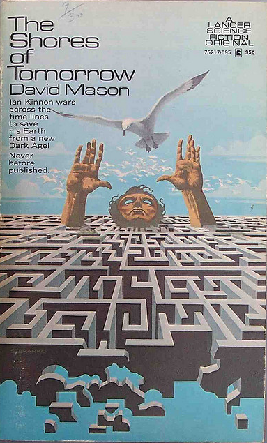
(Jim Steranko’s cover for the 1971 edition of The Shores of Tomorrow (1971), David Mason)
The covers for this post are both literal and metaphoric mazes. Most come from two intriguing and highly recommended novels about mazes — no surprise there — Robert Silverberg’s brilliant The Man in the Maze (1968) and Philip K. Dick’s bizarre, hallucinatory, depressing as all hell A Maze of Death (1970). The artist of the uncredited cover for the 1971 edition and Don Punchatz’s cover for the 1969 edition of The Man in the Maze place human figures in and around impossible shapes/optical illusions. These covers narrow in on the emotive responses of someone trapped within — futility, loss, encroachment. The uncredited cover for the 1969 edition, Bruce Pennington’s cover for the 1982 edition, and Michael Presley’s cover for the 1975 edition of Silverberg’s work draw an actual maze…. I actually find the emotional resonance of this group less than the more stylized manifestations.
John Schoenherr’s arching brush strokes for the 1965 edition of Avram Davidson’s Masters of the Maze (1965) evoke distant passageways, an underground oppression, trapped with the beasts…. Wilson McLean’s cover for the 1971 edition Douglas Mason’s Horizon Alpha (1971) depicts the sprawling metropolis as a veritable maze, encroaching on the individual (the eye), peering from the masses, trapped…. Leo and Diane Dillon’s cover for the 1968 edition of Blish and Knight’s A Torrent of Faces (1967) — another overpopulation novel — is similar. The stylized shapes of the metropolis are maze-like — the individual is trapped amongst the crowds….
What are your favorites? (do you know of any others? I have a few more waiting… a part II perhaps…
Enjoy!

(Richard Powers’ cover for the 1969 edition of Three Novels (1967), Damon Knight)

(Uncredited cover for the 1971 edition of The Man in the Maze (1968), Robert Silverberg)

(Bruce Pennington’s cover for the 1982 edition of The Man in the Maze (1968), Robert Silverberg)

(Don Punchatz’s cover for the 1969 edition of The Man in the Maze (1968), 1968)

(John Schoenherr’s cover for the 1965 edition of Masters of the Maze (1965), Avram Davidson)

(Uncredited cover for the 1977 edition of A Maze of Death (1970), Philip K. Dick)

(Tito Salomoni’s cover for the 1987 German edition of A Maze of Death (1970), Philip K. Dick)

(Wilson McLean’s cover for the 1971 edition Horizon Alpha (1971), Douglas R. Mason)
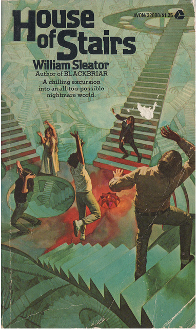
(Uncredited cover for the 1975 edition of House of Stairs (1974), William Sleator)

(Leo and Diane Dillon’s cover for the 1968 edition of A Torrent of Faces (1967), James Blish and Norman L. Knight)

(Uncredited cover for the 1969 edition of The Man in the Maze (1968), Robert Silverberg)

(Michael Presley’s cover for the 1975 edition of The Man in the Maze (1968), Robert Silverberg)
For similar posts consult the INDEX

Man, I’ve been wondering about the book “House of Stairs” for a long time. I read it when I was in the 6th grade and just could not remember the title or the author…!
I had no idea who he was when I came across the cover. I read about the author on SF encyclopedia — his books seem rather disturbing for the young audiences they are meant for….
http://www.sf-encyclopedia.com/entry/sleator_william
Interstellar Pig was always a favorite of mine.
I’ve never read any of his works…
Really disturbing, which is probably why middle schoolers loved them. “House of Stairs” was easily the most memorable book I read in middle school. I reread it not very long ago, and thought it held up pretty well. And honestly, it was even more disturbing when I read it as an adult.
Wow, I had no idea this book was so formative for so many people!
A”maze”ing post. Loved all the artwork in this one. I’ve been looking for House of Stairs for a few years now after reading so many positive reviews.
Thanks! It is for younger readers…. But, it’s fun to read a “juvenile” every now and then.
I have the same reaction regarding ‘House of Stairs’! I was probably 12 when I read it. Thought it was too creepy and never finished it. It was the first title to come to mind when I saw the title of the post.
Ahh, too creepy — that’s what I was thinking…. But yeah, a pretty notable cover.
I believe the cover of House of Stairs refers to some weird music that would cause hypnotic convulsions among those trapped in the house.
Really does not sound like a young adult sci-fi novel….. Sounds pretty terrifying! haha
it’s quite striking how different an impression is given of a book’s content by the cover art. The late ’60s/early ’70s version of the Silverberg book look like they contain completely different stories to the ’80s one.
I guess, to a great degree, it’s a matter of publishers trying to sell books by tapping into trends in the market.
I have to admit, I rather have good art on a cover than for said art to realistically portray the story 😉 Give me Robert Powers or Robert Foster any day…
I anything this cover is the closest to what I envisioned the maze to look like….
But, was not in anyway imaging those horrid 70s clothes he has on… But, as a piece of art it’s rather awful.
Joachim, I always find Schoenherr evocative; he has one of the best batting averages as far as quality covers go. Michael Whelan`s cover for Man in the Maze was good but probably doesn`t count, since we are outside/at the beginning of the maze.
Yeah, I tried to find images of people inside the maze — but yes, some of the later editions had intriguing covers of people standing outside….
I have that Pennington cover of the Silverberg. I’ve always rather liked it. So evocative.
I have the Walotsky cover — bleh.