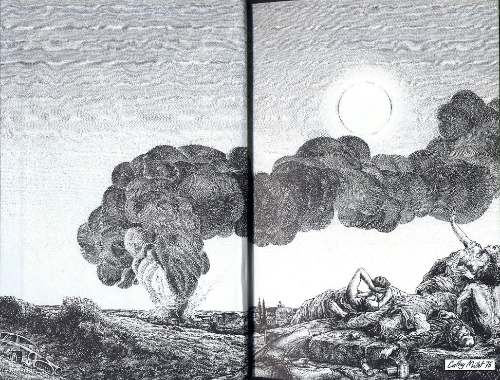
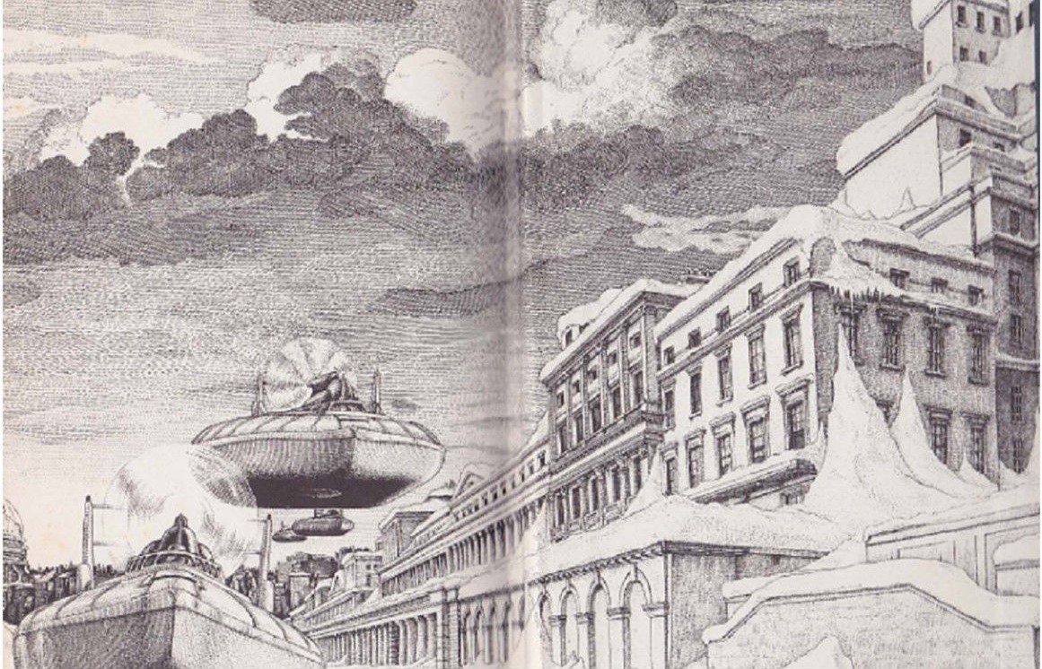
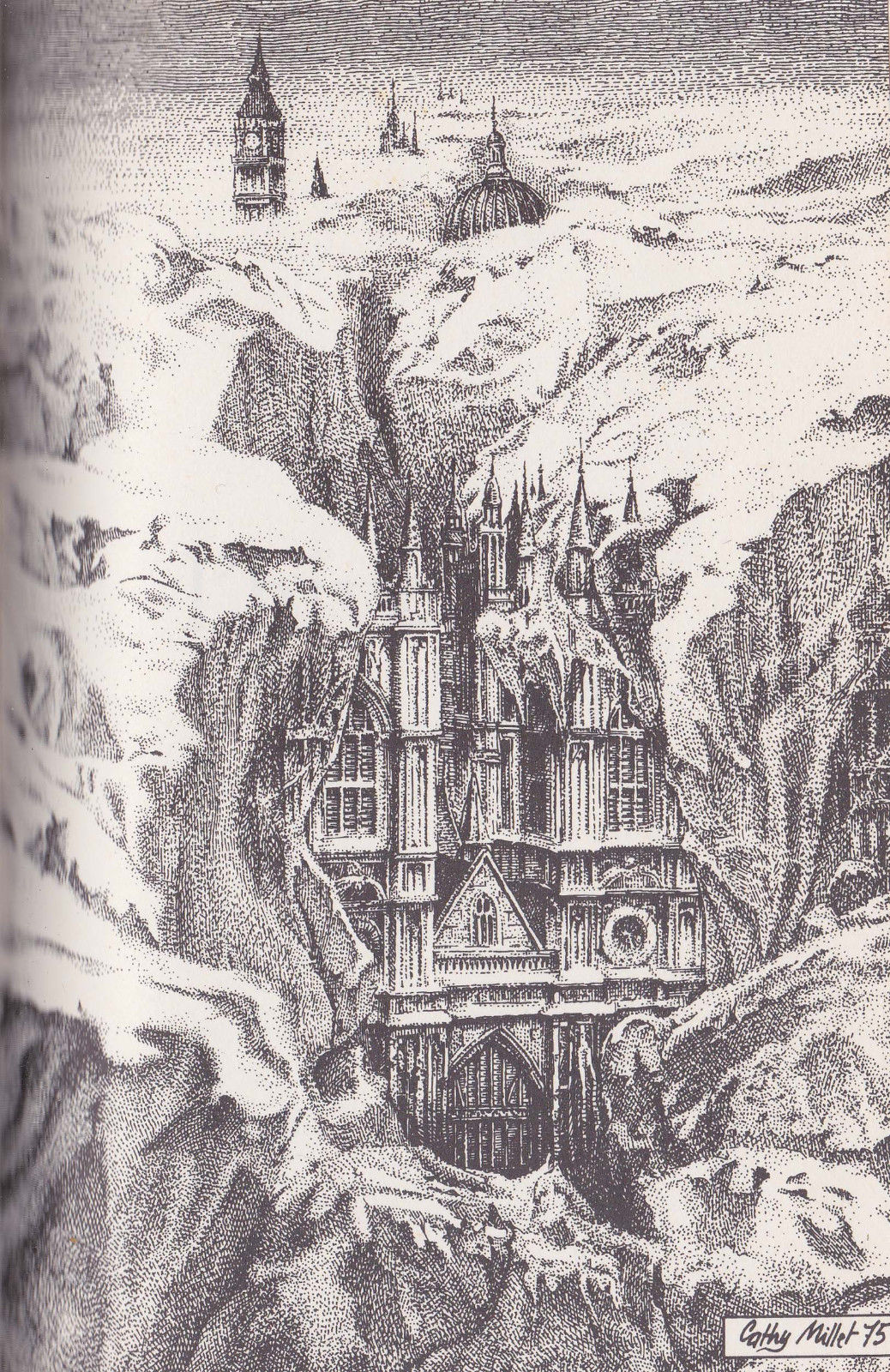
(Interior art for the 1975 French OPTA edition of The Death of Grass (1956) and The Long Winter (1962), John Christopher)
I cannot ascertain the identity of Cathy Millet. There is a well known Catherine Millet—a French writer, art critic, curator, etc. However, I do not think they are the same. If you know more information about who she might be, please please please let me know! (French articles are fine — I can read them easily).
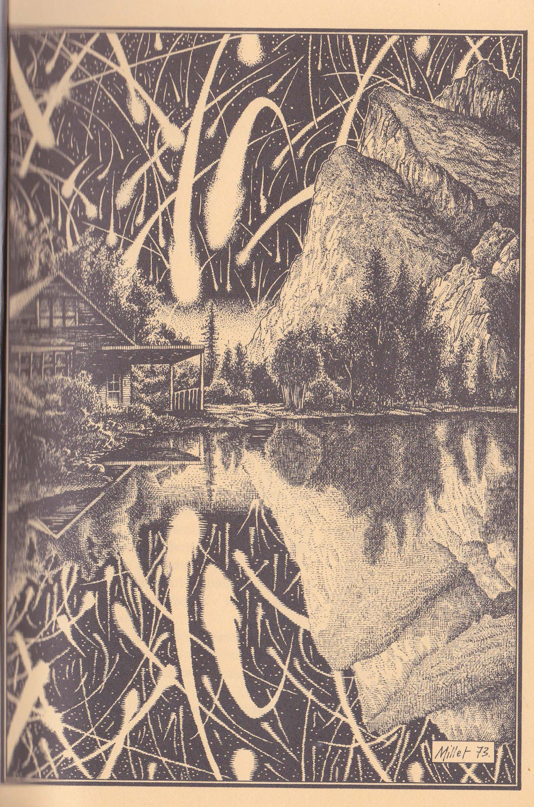
Cathy Millet created a handful of covers and larger number of interior illustrations for the French publisher OPTA. Here’s her incomplete isfdb.org listing which I used as a jumping off point. The ones which caught my eye are her spectacular interior illustrations for two John Christopher post-apocalyptic fictions—The Death of Grass (1956) and The Long Winter (1962) (both links lead to my reviews). The Long Winter illustrations convey the crisp terror of the environmental transformation. The Death of Grass illustrations focus on the general devastation (above) and the effects of the disease itself (three below) on plant life.
Millet’s art is evocative and powerful!
What’s your favorite illustration?
Additional Adventures in French Science Fiction Art
- French comic book style 70s SF art by Serge Clerc
- Philippe Curval’s Photo Collages, Part I
- Philippe Curval’s Photo Collages, Part II
- Otherworldly Textures and the Patina of Decay (the SF art of Philippe Jean)
- Claude Lacroix’s Delicate Lines and Mutations (60s/70s covers for the French SF Magazine Fiction)
- 1970s Covers for La Grande Anthologie de la Science-Fiction (Robots, The End of the World, Aliens, etc)
- The Uncanny Bodies of Wojtek Siudmak
(Interior art for the 1975 French OPTA edition of The Death of Grass (1956) and The Long Winter (1962), John Christopher)
(Interior art for the 1975 French OPTA edition of The Death of Grass (1956) and The Long Winter (1962), John Christopher)

(Interior art for the 1975 French OPTA edition of The Death of Grass (1956) and The Long Winter (1962), John Christopher)
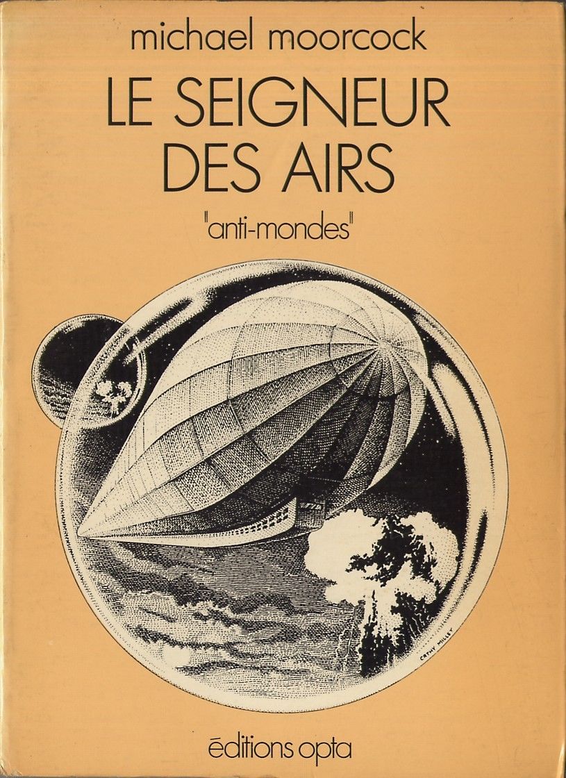
(1976 French OPTA edition of The Warlord of the Air (1971), Michael Moorcock)

(Fiction, #229 (1973), ed. Alain Dorémieux)

(Apothéoses, apocalypses et retours à zéro (1975), ed. Michel Demuth)

(Interior art for the 1973 French OPTA edition of The Two-Timers (1968) and Other Days, Other Eyes (1972), Bob Shaw)

(Interior art for the 1973 French OPTA edition of The Two-Timers (1968) and Other Days, Other Eyes (1972), Bob Shaw)
(Interior art for the 1973 French OPTA edition of The Two-Timers (1968) and Other Days, Other Eyes (1972), Bob Shaw)

(Interior art for the 1973 French OPTA edition of The Two-Timers (1968) and Other Days, Other Eyes (1972), Bob Shaw)
For book reviews consult the INDEX
For cover art posts consult the INDEX

I just read The Death of Grass a couple of weeks ago and was very impressed. Only the first illustration could vaguely be used for that story. I assume the others are for the other novel. But they do make me want to read The Long Winter.
I’m almost positive the 4th image (focus on the grass withering) is for The Death of Grass as well? I could be wrong.
I disliked The Death of Grass immensely (well, I gave it an average rating). I reviewed it recently: https://sciencefictionruminations.com/2019/12/31/short-book-reviews-harry-harrisons-captive-universe-1969-john-christophers-the-death-of-grass-1956-nancy-kress-an-alien-light-1987-and-joe-haldemans-mindbridge-197/
I enjoyed The Long Winter but it’s not a straight-laced post-apocalyptical novel — it’s satire: https://sciencefictionruminations.com/2012/06/12/book-review-the-long-winter-john-christopher-1962/
The one which might resonate with you as you enjoyed The Death of Grass is the far superior A Wrinkle in the Skin (1965): https://sciencefictionruminations.com/2019/09/03/book-review-a-wrinkle-in-the-skin-variant-title-the-ragged-edge-john-christopher-1965/#more-18632
I never read them. I don’t think “the death of grass” would ever catch my attention – that title sounds so – no offense – boring.
See my review for my perspective on the novel (linked above). Yes, it’s not the most evocative title — but it’s considered (not by me) one of the best and most influential post-apocalyptic novels of all time.
Far more interested in Millet’s art! Which was the purpose of the post 🙂
The art is gorgeous indeed. I possess no information on La Millet, sad to say.
Do you have a favorite illustration from the bunch?
You’d think I’d be able to find more information on her online…. But I’ve look and looked. That said I do not know the French resources for SF as well as the English-lang ones. Alas.
No, I’m pretty much just getting used to her style so can’t pick a favorite.
Millions of years ago, Metal Hurlant came to our shores as Heavy Metal magazine. Something about the way she models men’s bodies rings a bell from that magazine. Delve into that fandom?
I haven’t — yet.
I did watch the Heavy Metal (1981) animated movie as an undergrad (maybe around 2006) at a dorm screening. And I look through the scans whenever people post them online — like over at The PorPor Books Blog. http://theporporbooksblog.blogspot.com/
dazeddigital.com is another good resource…I hope your quest is rewarded!
Hi
Thanks for putting this together. I really enjoyed the style of these illustrations. I do like b&w illustrations. My favourites are probably the first image and the image for the two-timers. All the best.
Guy
Hello Guy, And thank you for visiting!
I get the impression that all the Millet illustrations for the Shaw illustrate Other Days, Other Eyes (1972). None of them remind me of The Two-Timers (not one of Shaw’s best) which I reviewed relatively recently.
https://sciencefictionruminations.com/2018/03/20/book-review-the-two-timers-bob-shaw-1968/