
(January 1957)
Part II of my series on Philippe Curval’s SF art–check out Part I first if you haven’t already. In Part I, I included only his covers from 1956, his most productive year for the French SF magazine Fiction. In this post I include the rest of his 50s work, seven covers published between 1957-59. Curval published SF more and more as the 1950s progressed and I suspect writing was more lucrative than art….
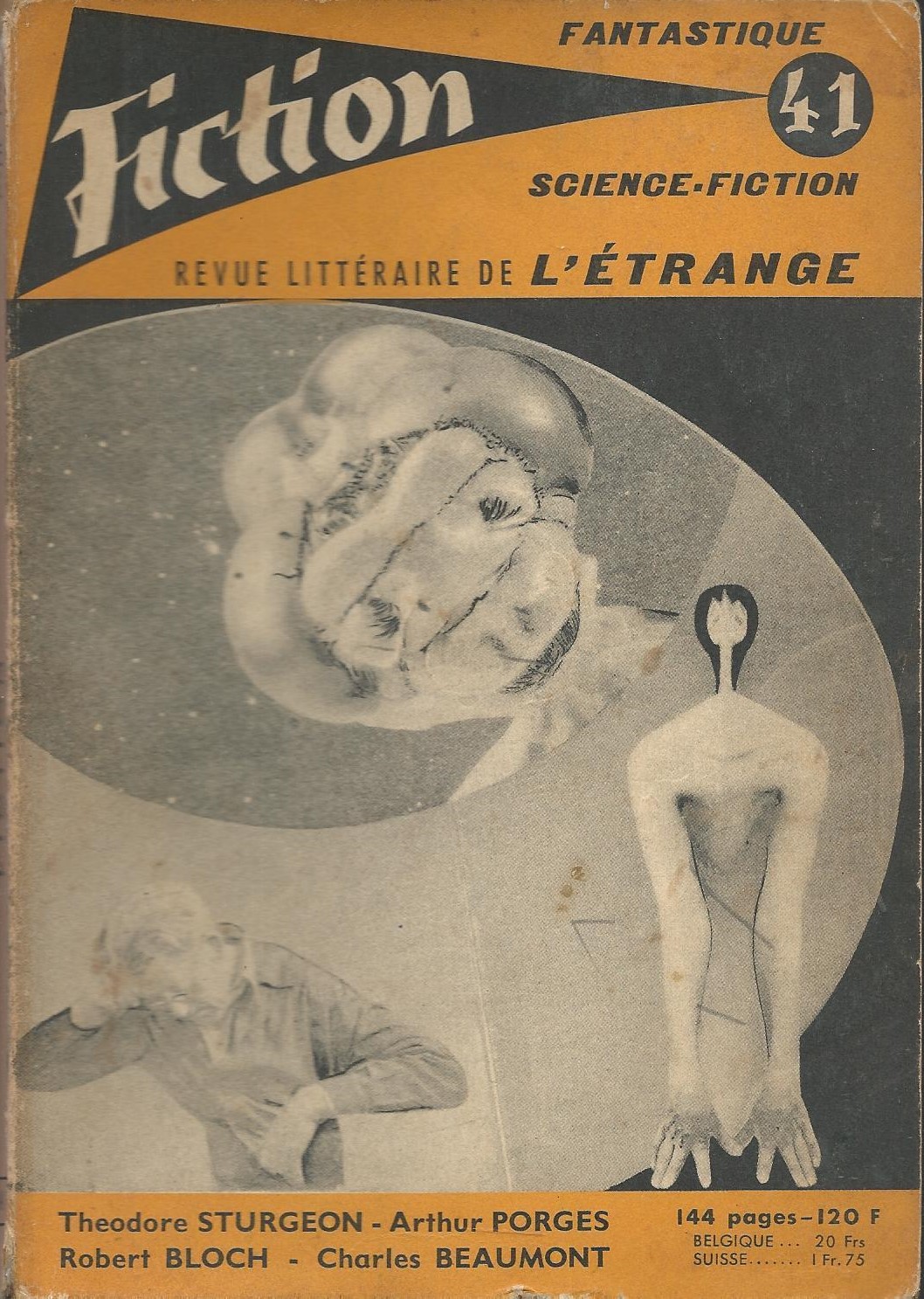
This selection includes what I find to be his most disturbing and evocative cover–Fiction 47. Cyclopean imagery combines with odd textures and hair-like growths. I am partial to SF covers that explore skin, mutation, hands, heads, growths, eyes, etc…. And speaking of disquieting heads/growths don’t look too closely at Fiction 41! (you’ve been warned).
What are your favorites?
Enjoy!
Other Adventures in French Science Fiction Art entries
Otherworldly Textures and the Patina of Decay (The SF Art of Philippe Jean)
French comic book style 70s SF art by Serge Clerc
Lacroix’s Delicate Lines and Mutations (60s/70s covers for the French SF Magazine Fiction)
The Uncanny Bodies of Wojtek Siudmak
Philippe Curval’s 1950s Photo Collages, Part I

(February 1957)

(March 1957)
(April 1957)

(October 1957)

(October 1958)

(January 1959)
For more Adventures in Science Fiction Cover Art consult the INDEX

Hi
I can see where you came up with disquieting. All the best for the New Year.
Guy
Hello Guy! Yeah, that cover creeps me out!
I hope you have plentiful and enjoyable reading adventures in 2018.
Probably the yellow one is the least terrifying lol. It’s a great sinister style he has. The freaky alien looking in observing is maybe my fav out of the bunch. Great collection
He’s an author as well — but only one of his many novels are translated into English (I can read the French of course but it would be more of a chore than enjoyment). I really need to acquire Brave Old World (1976, English trans. 1981)….
Is it a take on Aldous Huxley’s Brave New World I wonder?
Without doubt!
I get the vibe of Richard Powers, if Powers did photo-collages instead of painting. Liked #57 and #59 the best.
Trying to track down a few Powers covers that are “assemblages”…
I don’t see the comparison really — in the surrealist mold perhaps but it’s far more linked (and within a French genealogy!) to Max Ernst’s collages.
Here’s one of Powers’ “assemblages” — 1960
Joachim,
This set runs the gamut of the straight forward scene on #40 to the bug looking through the copula on #41; I don’t know what to make of the thing at the lower right? The remaining covers, excepting #62, don’t give me much sense of wonder. #62 is my favorite in this bunch, with the three figures on the dunes making me think of Ballard’s Vermillion Sands.
This haiku popped into my head after reading The Pillars of Eternity:
Early misery,
Straightened with inserted bones,
Now: Joachim Boaz.
Andrew
It’s been so long since I read The Pillars of Eternity. I remember the bleakness of the vision and the scarred main character (who resonated with me of course) but little about the actual plot… Did you like it?
I enjoyed The Pillars of Eternity very much, but thought the ending was not up to the rest of the book. I also read The Forrest of Peldain last year. It reminded me of Harry Harrison’s Planet of the Damned, both of which were intense. And I also read The Zen Gun that I thought fell flat at the end.
I listened to Harrison’s Planet of the Damned as an audio book recently. I also thought it was intense…. I enjoy more of Barrington’s short fiction than novels — which tend to be weird (not a critique) and not all that well constructed. I have a lot of older reviews of his stuff on this site… other than short fiction I haven’t returned to him recently.
Oh, these are awesome! I love #39.
Anything with ocular excess tickles my fancy….
Thanks for the comment (did you see part I of the series on his art?).
I didn’t see it.
Ah, it’s linked in the first sentence of the post if you’re curious 🙂