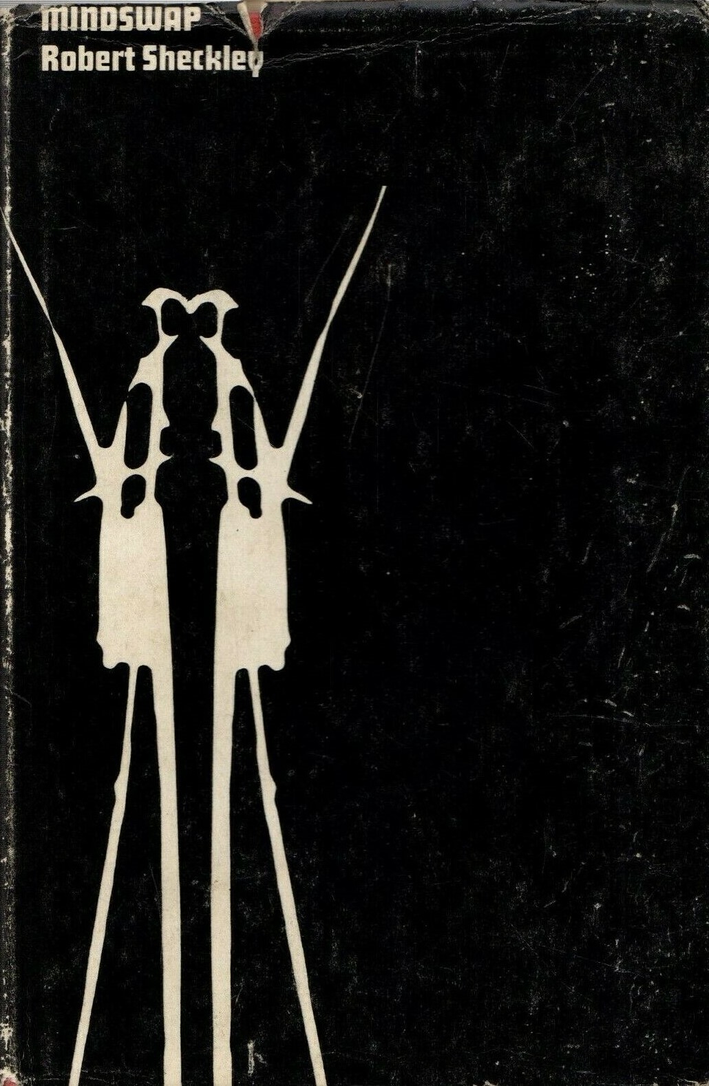
(The 1967 edition of Mindswap (1966), Robert Sheckley)
A few weeks ago I reviewed Clifford D. Simak’s The Werewolf Principle (1967) and came across Terry James’ cover (below) for the 1969 Science Fiction Book Club (UK) edition. The spectral shedding/transforming of the human figure matched the uncanny vibe of the novel. And I headed immediately to isfdb.org to browse his ouvre (note: a few volumes in the pub. series are clearly his but remain uncredited)! And I decided to put together a series of posts showcasing his work.
His art, the entire catalog of SFBC editions between 1968 and the mid-way point of 1971, works with little—a black background, white foreground, etc. In only one edition I’ve identified was he able to use shades of gray—the 1969 ed. of Algis Budrys’ The Iron Thorn (1967) below. This cover is my favorite of the bunch—it’s a literal interpretation of the title, a massive thorn made of iron, perhaps a vast arcology….
For more about details about the quality yet low art budget nature of the SFBC editions see the following article.
What is your favorite? Have you read any of the novels? (I own quite a few of them in various US editions).

(The 1967 edition of A Plague of Pythons (1965), Frederik Pohl)

(The 1967 edition of All Flesh is Grass (1965), Clifford D. Simak)
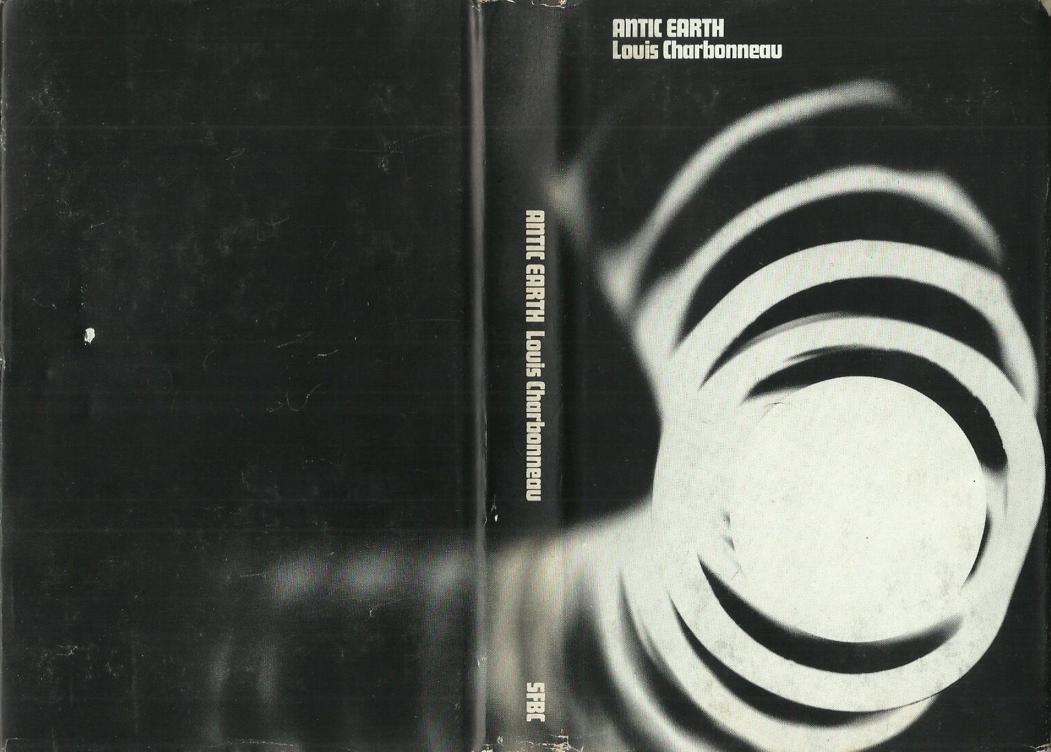
(The 1968 edition cover of Antic Earth (variant title: Down to Earth), Louis Charbonneau)

(The 1967 edition of The Anything Box (1965), Zenna Henderson)

(The 1968 edition of Twilight Journey (1967), L. P. Davies)

(The 1968 edition of Breakthrough (1967), Richard Cowper)
(The 1969 edition of The Iron Thorn (1967), Algis Budrys)
(The back cover of the 1969 edition of The Iron Thorn (1967), Algis Budrys)

(The 1969 edition of The Werewolf Principle (1967), Clifford D. Simak)

(The 1971 edition of Death of a Cosmonaut (variant title: Autopsy for a Cosmonaut) (1969), Jacob Hay and John M. Keshishian)
For book reviews consult the INDEX
For cover art posts consult the INDEX

Beautiful
Thanks for stopping by. Do you have a favorite?
Wow, love these stark contrasts to the detailed full-color paintings of the 70s SF softbacks I’m most familiar with.
Thanks for visiting!
The closest US 70s equivalent is the Doubleday publication line — cheap produced but elegant hardbacks primarily for libraries.
I have a few posts on them: Collage and Mechanism: Anita Siegel’s Art for Doubleday Science Fiction (https://sciencefictionruminations.com/2017/02/10/adventures-in-sf-cover-art-collage-and-mechanism-anita-siegels-art-for-doubleday-books/)
And the limited palette range of these: https://sciencefictionruminations.com/2016/08/01/adventures-in-science-fiction-cover-art-interview-with-emanuel-schongut-and-a-selection-of-his-1970s-sf-covers/
I think ALL FLESH IS GRASS is my favorite jacket, and a close second is THE IRON THORN. I wonder if SFBC was influenced by New Directions’s always-b&w covers?
I’m not sure. Before and after Terry James’ covers they had the same template. This was SFBC’s period of more distinct covers.
Hi I have to say The Iron Thorn cover is my favourite, I have read it and the Simak novels. The other covers are a bit stark for me. I have one SFBC, Asimov’s The Gods Themselves. The cover was okay but what I really liked was the Readers Union list on the back, the categories included (Country) The Crofter and the Laird, (Sportsman) A History of Country Cricket: Middlesex, (Victorian) The Early Victorians at Home.
Regards
Guy
Yeah, the Asimov cover is from after the Terry James period. They reverted to very bland interchangeable single color patterns like that one.
I’ve hear that The Iron Thorn is Budrys’ worst novel — thoughts?
Hi
I would have to read it again and look at some of his other novels to rank it. I am perhaps slightly more familiar with his short stories. That said it is very much a SF adventure of the period as I recall. That might not be a liability for me as I have low tastes.
Rich Horton describes it as “the underappreciated novel The Amsirs and the Iron Thorn” on his blog.
Thinking about it does raise some questions about his works in general I should look into. It is nothing like Who which I believe is considered his best. Of course Who is very much a cold war artifact today. I might suggest the novelization of Rogue Moon was his worst but that is because I really disliked it. You have given me something to think about, thanks.
All the best.
Guy
I think ROGUE MOON is definitely considered Budrys’ best novel, but there is a significant subset who hate it — including Jo Walton. His last novel, HARD LANDING, is very good. And lots of people like MICHAELMAS, which I thought rather middling.
I am due a reread of THE AMSIRS AND THE IRON THORN but there is more going on there than routine adventure, I think.
The Anything Box and Death of A Cosmonaut are the most compelling to me. They are mysterious and combine with the title, make me want to start reading… or at least look at the inside cover. Wait, did the blurb appear on the inside cover back then?
Thanks for visiting! Yes, blurbs mostly appeared on the inside flap of hardbacks. They still do for non-genre books. The back cover of mainstream lit is generally for words of praise by other authors, critics, etc.
Maybe that’s what’s confusing — these are hardbacks.
No, that didn’t confuse me. I just read somewhere that the back used to be the blurb and that putting praise (blatant marketing) on the back is a more recent thing. Guess that was wrong.
Oh, yeah, I’ve never heard of that. That said, praise on the back might be more recent — perhaps it was more art just art, like these, in the past.
These are distinctive and even interesting, but ultimately not my cup of tea. But I wonder if I had seen these titles first with these covers would I feel different? I tend to love the first cover I own for any title best.
This was the first cover I owned. It is terrible. I have no nostalgic connection to the art or the book.
Allan Mardon, 1971
Perhaps I would if I’d owned this one instead. Stanley Meltzoff, 1953