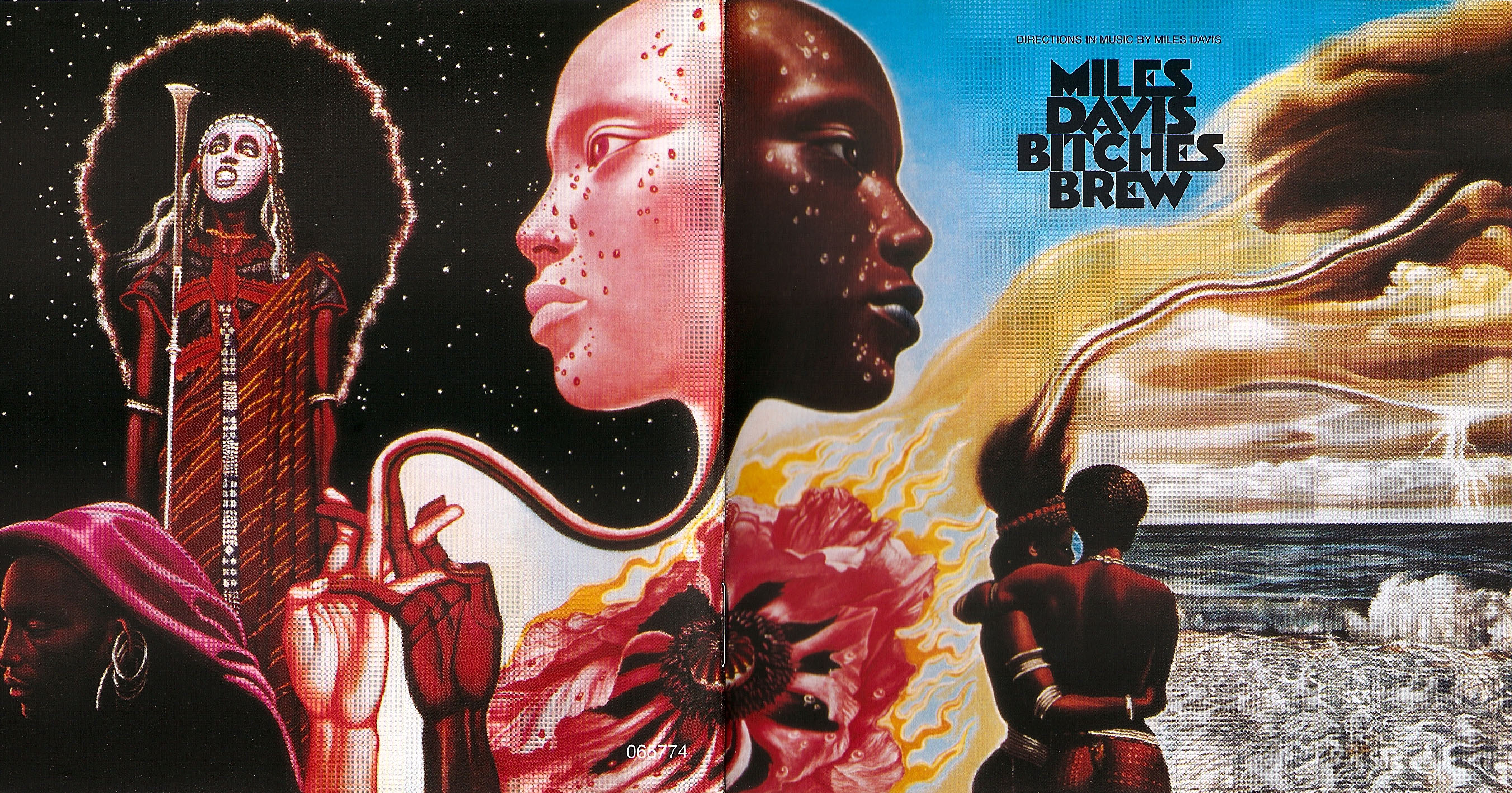
(Mati Klarwein’s 1970 cover for Miles Davis’ album Bitches Brew)
Mati Klarwein (wikipedia link) was a German artist of Jewish origin who fled the Nazis to British Palestine. After the fall of the Nazis, he received an art education in Paris and gained French citizenship. Famous for his album covers—notably Miles Davis’ famous Bitches Brew (1970) (above) and Santana’s Abraxas (1969) (below)—Klarwein also created (or his art was used for) SF covers. Characterized by an obsessive eye for the detail (click and zoom in on Lafferty’s Arrive at Easterwine scan I included from my collection), Klarwein’s almost mandalic covers draw on a wide range of artistic influences. Unfortunately, quite a few are uncredited or credited to the incorrect artist—his cover for the 1972 edition of The World’s Desire (1890) by H. Rider Haggard and Andrew Lang was credited to Vincent Di Fate of all people!
I recommend reading the wikipedia article to learn more about his non-cover art, art in films, and album covers. As his SF covers are stylistically unique, do you know of any that I did not include? Here’s the incomplete Internet Speculative Fiction Database link.
What are your favorites? Enjoy!
UPDATE: The artist behind the 1967 edition of The Eskimo Invasion (1967), Hayden Howard is up for debate. A commenter below indicates it might be Richard Powers… Until official confirmation I’ll put a “?” next to the citation.
For more SF art posts consult the INDEX

(Mati Klarwein’s cover for the 1973 edition of Arrive at Easterwine: The Autobiography of a Ktistec Machine (1971), R. A. Lafferty)

(Mati Klarwein’s (?) cover for the 1967 edition of The Eskimo Invasion (1967), Hayden Howard)

(Mati Klarwein’s cover for the 1972 edition of The World’s Desire (1890), H. Rider Haggard and Andrew Lang)

(Mati Klarwein’s cover for the 1972 edition of With a Finger in My I (1972), David Gerrold)
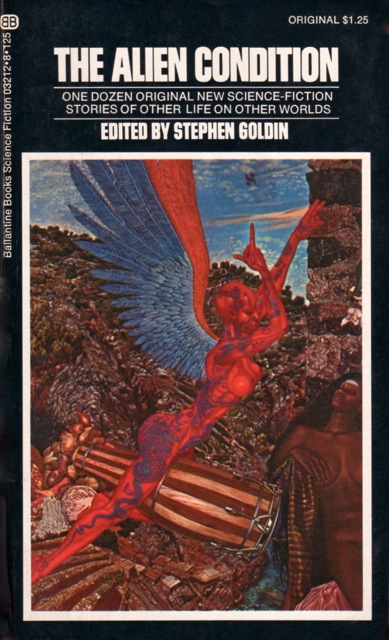
(Mati Klarwein’s cover for the 1973 edition of The Alien Condition (1973), ed. Stephen Goldin)
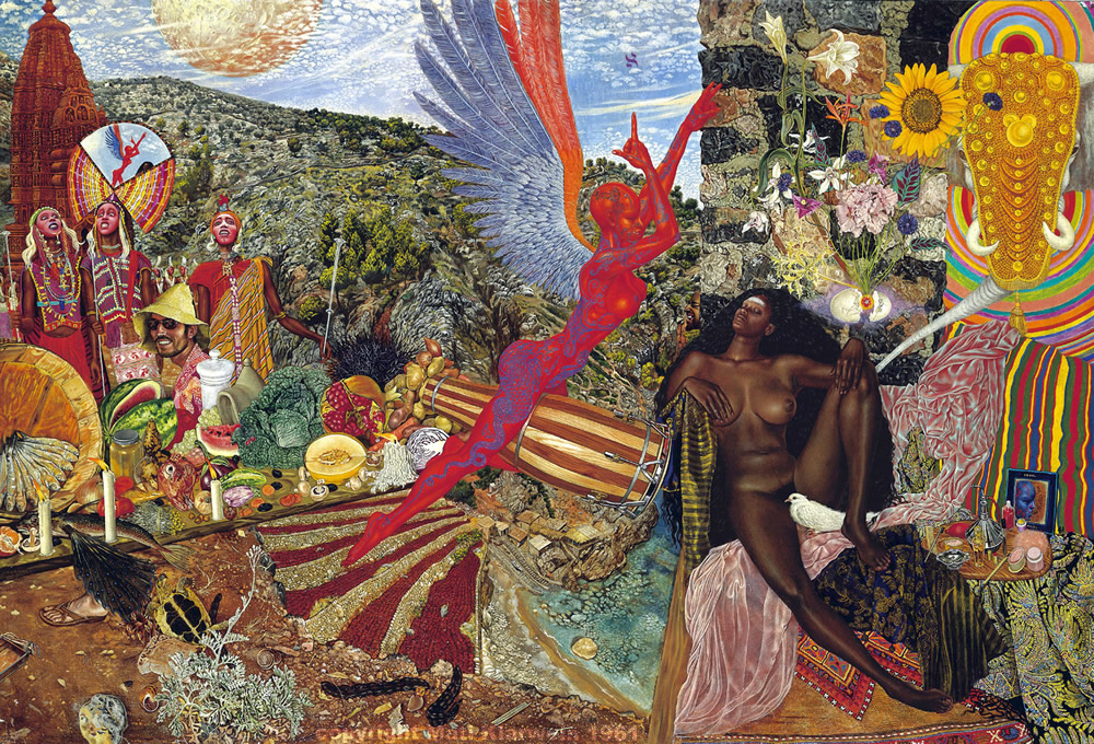
(Mati Klarwein’s Annunciation, 1961)
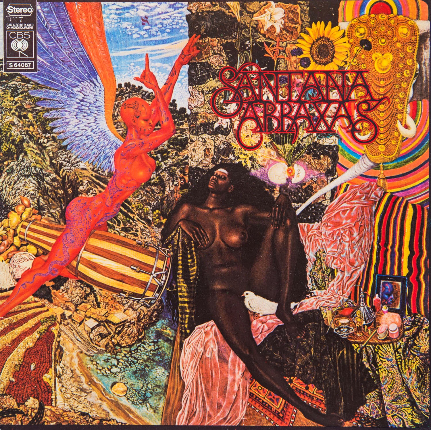
(Mati Klarwein’s Annunciation (1961) used as album cover art for Abraxas (1969), Santana)

(Mati Klarwein cover for the 1973 edition of The Midwich Cuckoos (1957), John Wyndham)
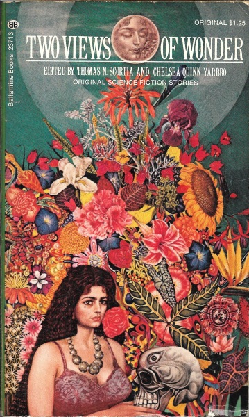
(Mati Klarwein’s cover for the 1973 edition of Two Views of Wonder (1973), ed. Thomas N. Scortia and Chelsea Quinn Yarbro)
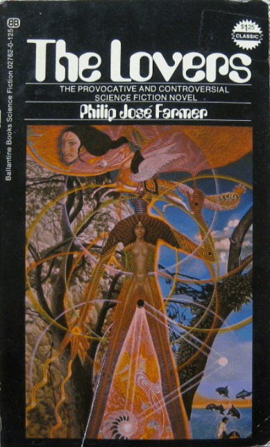
(Mati Klarwein’s cover for the 1972 edition of The Lovers (1962), Philip José Farmer)

Stunning artwork! Hey, I recognize that Santana album!
Thanks! Do you have a favorite cover? I get the impression that most of the SF covers were previously created pieces of art that were repurposed as covers — which was standard practice (art by Paul Klee, Max Ernst, etc often appeared on covers).
Hi
The only one of his covers I have is The Eskimo Invasion which I went looking for after seeing it here. My favourite is the The Midwich Cuckoos,
I have a bit of a John Wyndham thing going because I read so many of his books. I think they were assigned in school but I have blocked a lot of that out. I will have to try to get some more Klarwein. The Lafferty is stunning as well but Cuckoos is definitely the one for me.
Happy Reading
Guy
Hello Guy, I added one more I found — the 1972 edition of Philip José Farmer’s The Lovers (1961).
I own three of them — Lafferty, Howard, and the Gerrold (however, my Gerrold cover is somewhat misprinted — it’s on the blurry side so I didn’t bother to scan it in).
I enjoy his unique style!
I’m doubtful that the Howard cover is by Klarwein. The style looks different to me, and it’s five years earlier (1967) than the other covers – the early 1970s being the time when Ballantine seems to have begun using Klarwein’s art. My guess is that it’s by Richard Powers. It has that mix of collage and painting styles that’s often found in Powers’ work. Compare it with other covers done by Powers for Ballantine in 1967: Saberhagen’s “Beserker,” Clarke’s “Childhood’s End,” Silverberg’s “To Open The Sky.” http://www.isfdb.org/cgi-bin/publisheryear.cgi?19+1967 (The agate-section pattern of the background isn’t typical of Powers, it’s true, but then he wasn’t adverse to trying new things.)
I’m not seeing Powers at all, but you could be right.
The only element that seems sort of similar is the black symbol in the upper right of the Howard matches well to the symbol on the Saberhagen cover. The rest seems so different than what he was doing at the time…
Yes, the symbol drawn in black, but also the cut-out-and-pasted look of the tattooed body and the alien eyes strike me as Powers. Some of Powers’ covers in the mid-to-late ’60s were purely graphic, some were collagist, and some were very painterly. Many covers were a mix of these styles. Occasionally, his covers could be highly atypical – Powers was undeniably open to experiment – and they don’t immediately strike you as his work. Like this one: http://www.isfdb.org/wiki/images/f/f9/SXGNPLNTDS1970.jpg Powers’ experimentalism is what makes his oeuvre endlessly interesting!
Definitely! I even grown to enjoy his very comical early 60s stuff — which for a while was off putting. There’s a reason he’s one of my favorites!
By comic early 60s I mean — > 1961