
Luciana Tom Matalon, “Untitled” (1971)
Non-English language science fiction presses present a fascinating territory to explore. Their volumes provide not only a window into what SF was available to read but also the distinct visual language used to convey those works. Italian SF cover art remains a firm favorite–from Karel Thole’s Philip K. Dick covers to the haunting landscapes of Mariella Anderlini. And a new artist joins the ranks!
Luciana Tom Matalon was born in 1937 near Venice and studied art in Milan. Her paintings, sculpture, and jewelry have appeared in exhibitions around the world. She has a short biography on her eponymous foundation website. You can also search her art by decade–there are quite a few that are “science fictional” yet did not appear on covers. If anyone knows of more specifics of her science fiction art (process, interaction with presses, etc.), let me know in the comments!
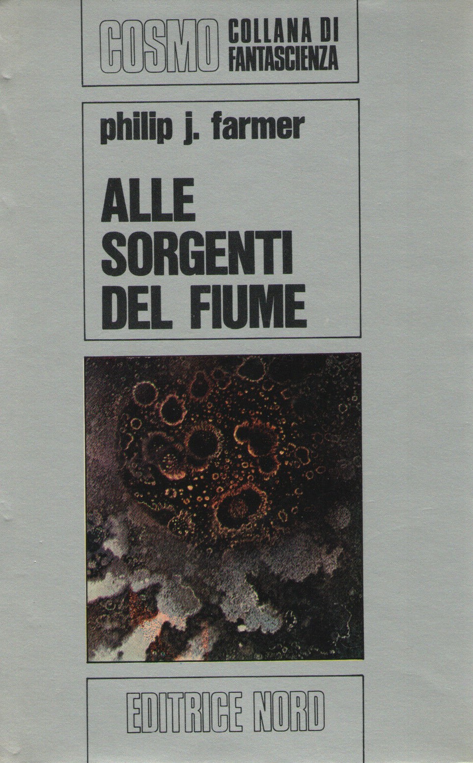
She created fifteen science fiction covers for the Cosmo Collana di Fantascienza series of the Italian press Editrice Nord between 1971-1975. The Internet Speculative Fiction Database also identifies one 1979 cover of John Brunner’s Stand on Zanzibar (1968) for a Spanish press–there is a chance that multiple others go uncredited.
Her art evokes a glimpse at an empyrean conjunction–like a Hubble telescope image that presents an immense cosmic expanse as a digestible (and gorgeous) moment. There’s an appealing texture to her art: from the lattice work of the 1975 Italian edition of Lloyd Biggle, Jr.’s Monument (1974) the pockmarks of the 1972 cover for Philip José Farmer’s Flesh (1960).
Matalon’s cover for the 1979 Spanish edition of John Brunner’s Stand on Zanzibar (1968) might be my favorite of the bunch–the urban expanse radiates outward like a cracked windshield.
Which novels/collections have you read? Do you have a favorite Matalon cover?
Enjoy!

Luciana Tom Matalon in her studio
Cover Gallery

Cover for the 1974 Italian edition of Gordon R. Dickson’s Dorsai! (1959)

The 1972 Italian edition of Philip José Farmer’s Flesh (1960)
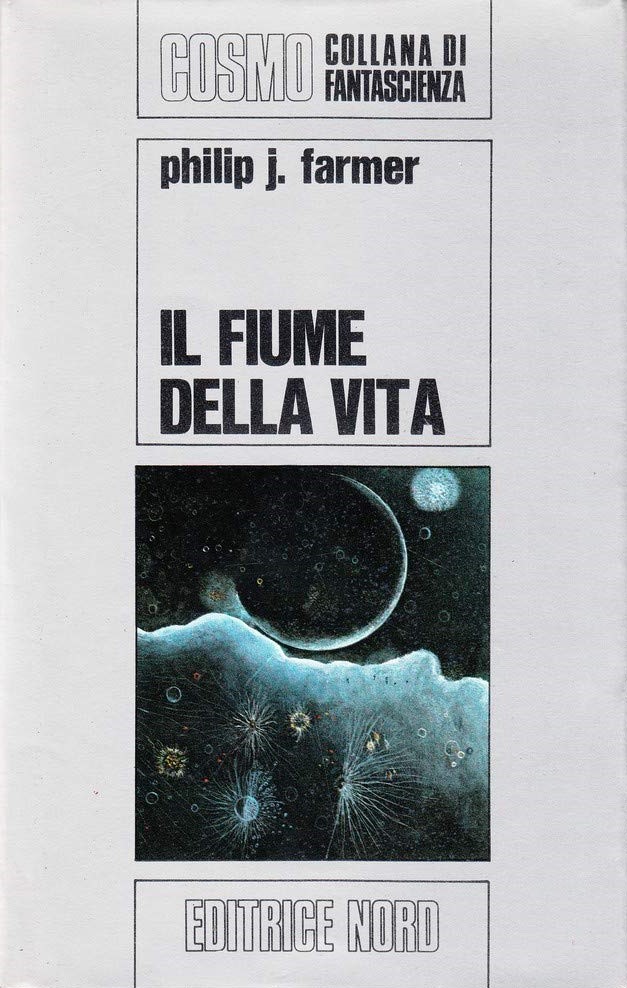
The 1971 Italian edition of Philip José Farmer’s To Your Scattered Bodies Go (1971)
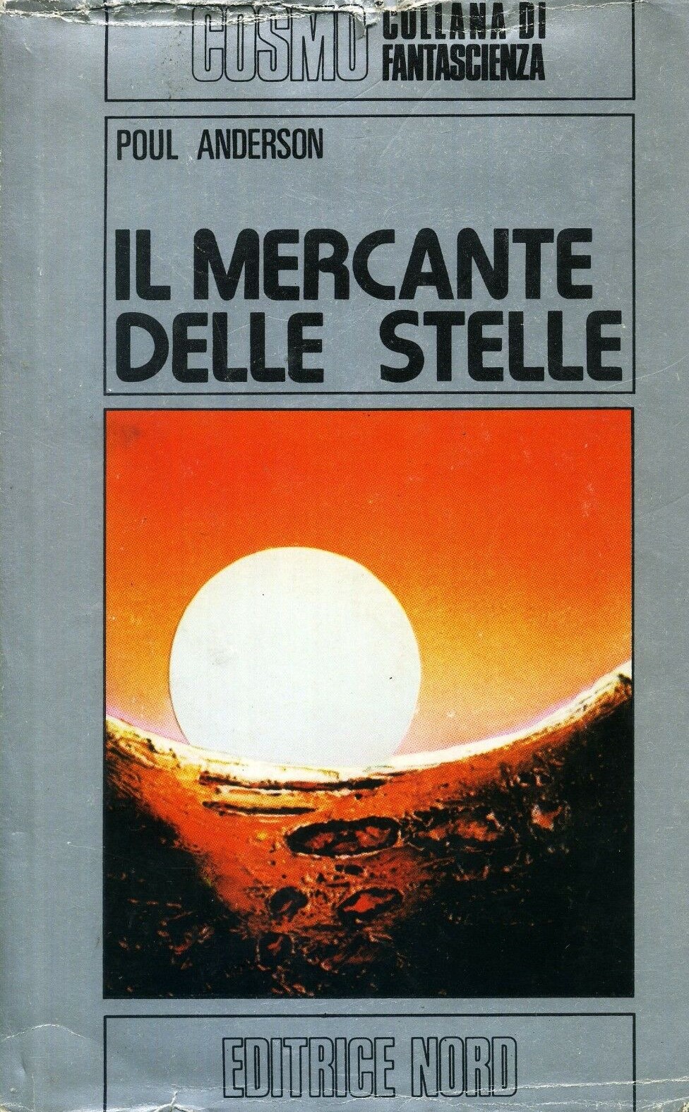
The 1975 Italian edition of Pol Anderson’s Trader to the Stars (1964)
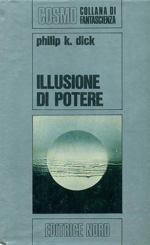
The 1971 Italian edition of Philip K. Dick’s Now Wait for Last Year (1966)
The 1975 Italian edition of Poul Anderson’s The Trouble Twisters (1966)
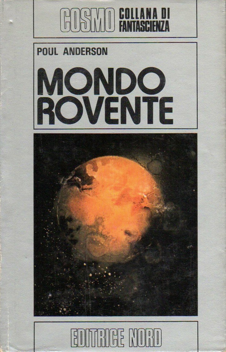
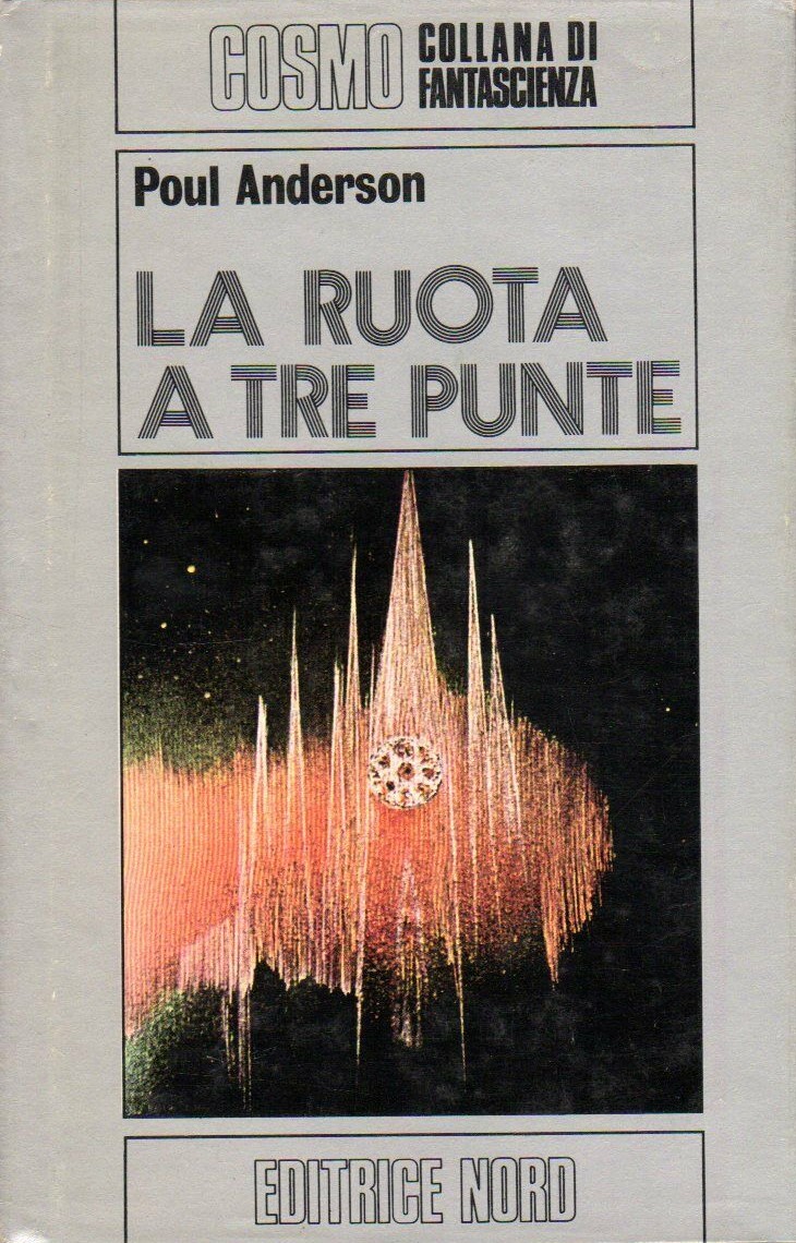
The 1974 Italian edition of Poul Anderson’s Satan’s World (1969)
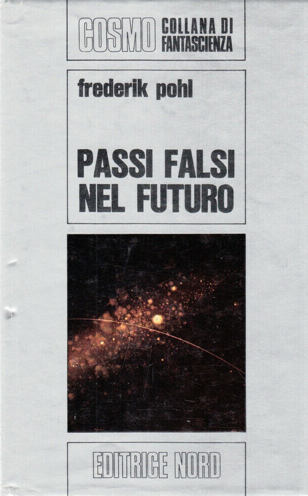
The 1971 edition of Frederik Pohl’s The Age of the Pussyfoot (1969)
The 1975 Italian edition of Philip José Farmer’s Traitor to the Living (1973)
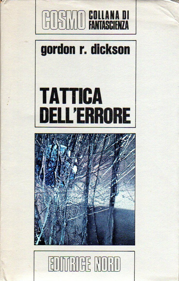
The 1972 Italian edition of Gordon R. Dickson’s Tactics of Mistake (1971)
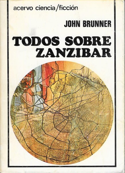
The 1979 Spanish edition of John Brunner’s Stand on Zanzibar (1968)

The Italian 1971 edition of Robert Silverberg’s To Live Again (1969)

The Italian 1972 edition of L. Sprague de Camp’s Lest Darkness Fall (1941)

The 1975 Italian edition of Lloyd Biggle, Jr.’s Monument (1974)
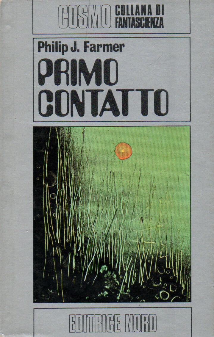
The 1972 Italian edition of Philip José Farmer’s The Fabulous Riverboat (1971)

The 1972 Italian edition of Henry Kuttner and C. L. Moore’s Fury (1950) and “Clash By Night” (1943)
For cover art posts consult the INDEX
For book reviews consult the INDEX
For TV and film reviews consult the INDEX

I love the titles! LEST DARKNESS FALL becomes “The Depths of the Past” which is really very pretty. I love her aesthetic but I can see why US publishers didn’t use her much. It’s less concrete than is usually popular here.
Fun foreign trip, thanks Dr. B.
Some of the Italian translations are nicer than the English originals — that PKD for example…
Do you have a favorite of the bunch?
I think the cover of EVERYBODY ON ZANZIBAR is my favorite, such a lovely thing.
Your direct translations of the Spanish and Italian titles make me giggle…. But yes, it’s great!
They’re often more poetic, though in this case I admit this one makes me chuckle, too.
Yup — Farmer’s The River of Life vs. the clunky To Your Scattered Bodies Go… Although I enjoy the idea of scattered bodies “going.” But maybe The River of Scattered Bodies….
The Italian one is “By the River Source” which, well, not the best…captures some of the spirit, if you translate it as “At he Source of the River” but there really isn’t a good title for the book IMO. “Riverworld” does nothing for me, and “To Your Scattered Bodies Go” sounds like someone was just careless and forgot to clean their cosmos properly.
Yeah, that’s the title for The Fabulous Riverboat. I mean, they are looking for the source of the river…
Il Fiume della Vita (the 1971 Italian edition of To Your Scattered Bodies Go) is The River of Life.
I whizzed right past that one! Yep, thass me, Mister Attention to Detail.
Returning to your original comment about how they probably weren’t what American presses wanted — I agree completely. As I mention, they seem like little peeks at cosmic immensity… I wonder if she was compelled by the publisher to insert that spaceship in the Dickson cover for Dorsai! It seems completely different then anything else of hers I’ve found.
I think no one could force her to do anything! Look at that art!
But I’m betting there was the back-and-forth of forcefully held views.
No matter it’s out of character it’s just gorgeous to see her truly singular vision in them all. It’s always fun to learn about the artists’ visions in these retrpspectives.
Haha, it was more along these lines, “is my Italian really that bad?”
Heh, no, it’s that ol’ seasick sense of talking at cross purposes. hic
Well i Love Farmers bests; but of course John Donne are difficult to beat.
/Mats, Sweden
Hello Mats,
Which Farmer? There are multiple (I suspect you might mean all of them?). Do you mean the John Brunner cover?
Yes hello! I meant “The scandal writer of Flesh” , and order works.
Classic, tasteful art. I like those covers!
Do you have a favorite from the bunch?
The traitor to the living cover!
Yeah, that’s in my top group as well — although, a terrible book….
https://sciencefictionruminations.com/2012/05/17/book-review-traitor-to-the-living-philip-jose-farmer-1973/
Yeah, Farmer is hit or miss for me!
Me too — I love his 50s/60s stories.
The Alley God (1962): https://sciencefictionruminations.com/2016/04/24/book-review-the-alley-god-philip-jose-farmer-1962/
Strange Relations (1960): https://sciencefictionruminations.com/2014/01/26/book-review-strange-relations-philip-jose-farmer-1960/
And unfortunately, don’t care for To Your Scattered Bodies Go or its increasingly dismal sequels…
Haha, yes The Riverworld series is… dubios 😁
As a teenager, I loved his World of Tiers. Dunno how this would hold up now, I fear touching those beloved artifacts of my youth and see them crumble to dust. 😬
I’ve been meaning to read the short story that was expanded into To Your Scattered Bodies Go… I might enjoy it more.
I think I have a few of his World of Tiers novels on the shelf, but haven’t read them.
At this point I’m more interested in his other 50s/60s novels and short stories — The Lovers (1961, Inside Outside (1964), etc.
You’re looking into how his favorite tropes of religion and sexuality had an impact to the genre?
Not in a systematic way — but his 50s/60s takes on the topic are far more interesting than his later SF in my view.
The King Kong story might be worth a look, though. If I remember correctly that’s from the 70s.
I remember enjoying Night of Light (1957, expanded 1966)
Yeah, he loved pulp Tarzan-esque type narratives. I have Lord Tyger (1970) on the shelf — “What if Tarzan had been written by William S. Burroughs instead of Edgar Rice Burroughs? A rich, insane, old racist attempts to raise a white Lord of the Jungle, but things don’t turn out that way, and the product of this obsession and the jungle he is supposed to become Lord over must live with the consequences.”
I love the textures she manages to evoke in so many of the covers you shared.
Thanks for stopping by — I’m glad you enjoyed them. Do you have a favorite?
Goodness. Completely amazed by these. Thanks for this post, Joachim. Favorite? Likely “Untitled” – both if them :). Happy New Year 🎉.
Thanks for stopping by. Unfortunately, that 1971 “Untitled” didn’t appear on a cover but was one of the science fictional ones I found on her website.
Here are some more! https://www.fondazionematalon.org/en/luciana-matalon/paintings/
These are absolutely gorgeous. I’d never heard of her before.
Thanks for stopping by. Do you have a favorite from the bunch?
Hmmm the J.R’s Monument one I think.
Yeah, it has a gorgeous iciness to it!
Pingback: Adventures in Science Fiction Cover Art: The Cosmic Glimpses of Luciana Tom Matalon | Journalism
Pingback: Adventures in Science Fiction Cover Art: The Cosmic Glimpses of Luciana Tom Matalon — Science Fiction and Other Suspect Ruminations – The Narrow Edge