 (Karel Thole’s cover for the 1986 edition of The Divine Invasion (1981), Philip K. Dick)
Following close on the heels of my post on European (Italy, France, and Spain) editions of Robert Silverberg’s SF I present fifteen Italian covers for Philip K. Dick’s novels and short story collections. Karel Thole, as always, puts in the best shift. But there are some other gems—for example Libero Vitali’s cover for the 1974 edition of PKD’s wonderful (and terrifying) novel A Maze of Death (1970). My favorite Thole cover of the bunch is for Urania #897 (1981), which contains contains various PKD short stories gathered by the Italian editors. Thole’s delightful ability to interject uncanny surrealist elements in his art matches perfectly PKD’s own stylistic tendencies.
Note: There’s a fantastic (but incomplete) resource that gathers thumbnail images of many of the PKD’s foreign editions. I have tried to find higher quality ones that also appealed to me for the sake of this post. But check it out for more encyclopedic coverage.
If you’re interested in other examples of Italian SF art see my posts on the Haunting Landscapes and Cityscapes of Allison A.K.A. Mariella Anderlini and also her striking Galassia Covers.
I’d love to hear your thoughts. And of course, if there are any Italian covers for PKD’s SF that you enjoy that I didn’t include I’d love to see them.
Enjoy!
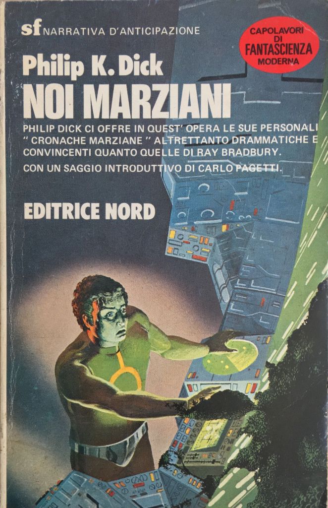
(Uncredited cover for the 1983 (?) edition of Martian Time-Slip (serialized 1963), Philip K. Dick)
(Karel Thole’s cover for the 1976 edition of The Preserving Machine (1969), Philip K. Dick)
(Uncredited cover for the 1972 edition of Counter-Clock World (1967), Philip K. Dick)
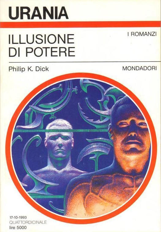
(Oscar Chichoni’s cover for the 1993 edition of Now Wait for Last Year (1966), Philip K. Dick)
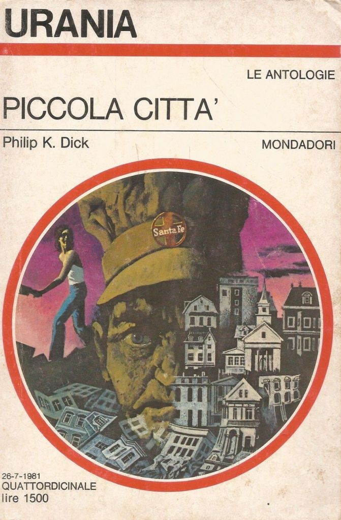
(Karel Thole’s cover for Urania #897 (1981), contains short stories by Philip K. Dick)
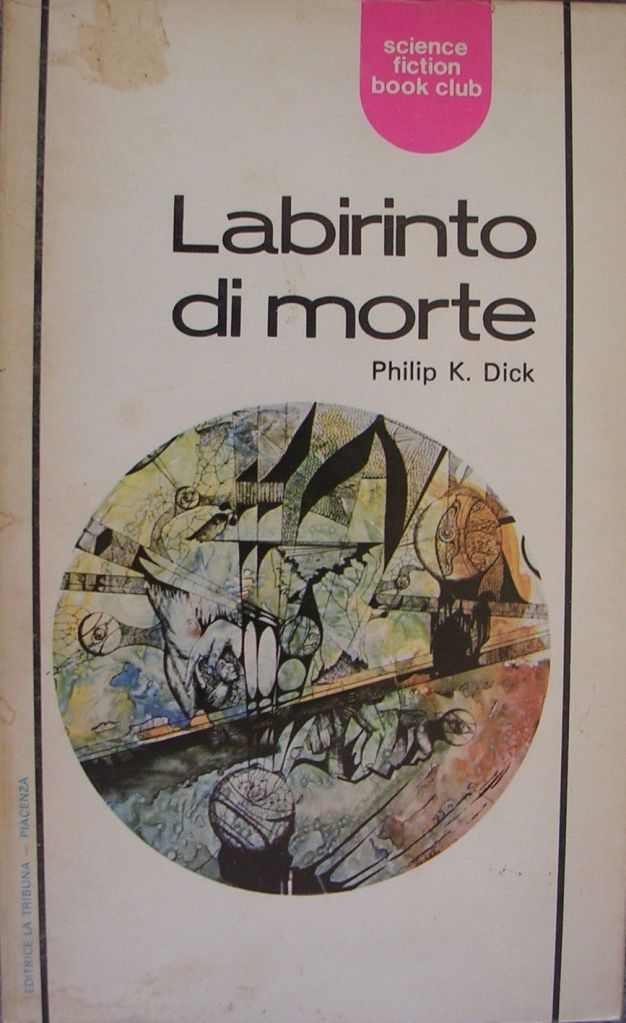
(Libero Vitali’s cover for the 1974 edition of A Maze of Death (1970), Philip K. Dick)

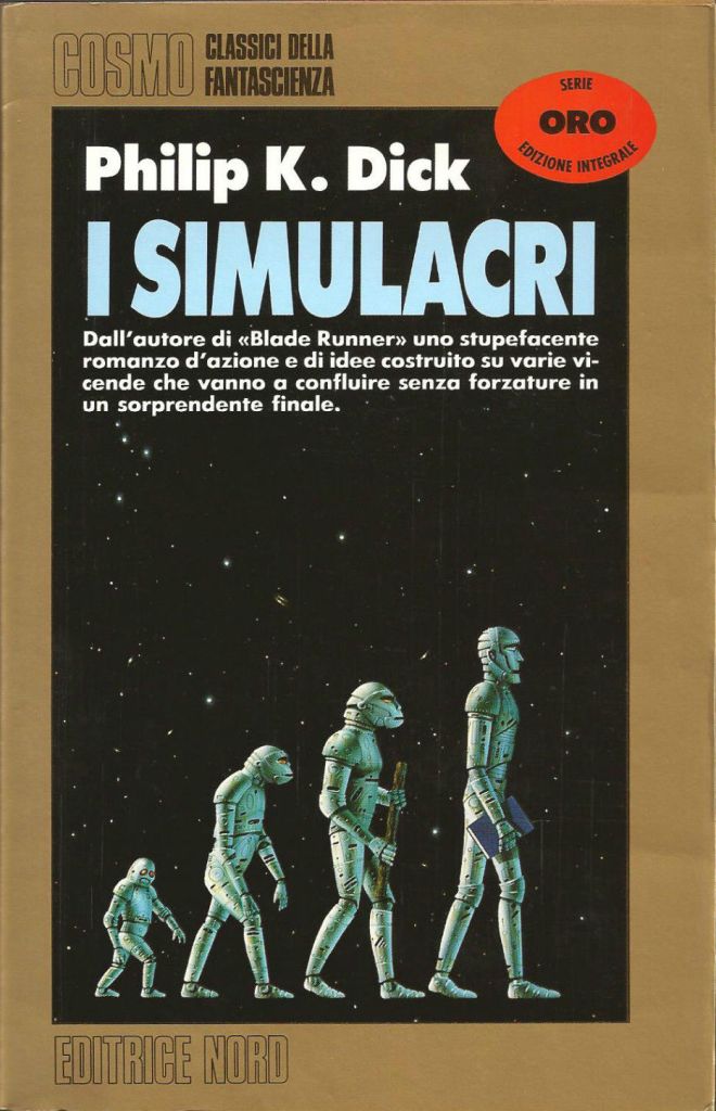
(Karel Thole’s cover for the 1980 Italian edition of The Simulacra (1964), Philip K. Dick)

(Ferruccio Alessandri’s cover for the 1970 edition of Clans of the Alphane Moon (1964), Philip K. Dick)

(Cesare Reggiani’s cover for the 1979 edition of A Scanner Darkly (1977), Philip K. Dick)
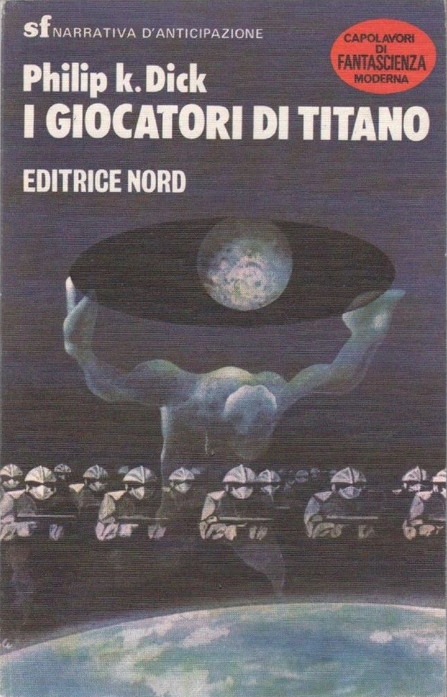
(Karel Thole’s cover for the 1980 edition of The Game-Players of Titan (1963), Philip K. Dick)
(Tim White’s cover for the 1994 edition of The Simulacra (1964), Philip K. Dick)

(Erberto Tealdi’s cover for the 1966 edition of The Penultimate Truth (1964), Philip K. Dick)
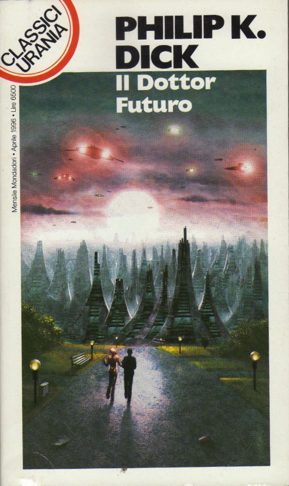
(Marco Patrito’s cover for the 1996 edition of Dr. Futurity (1960), Philip K. Dick)
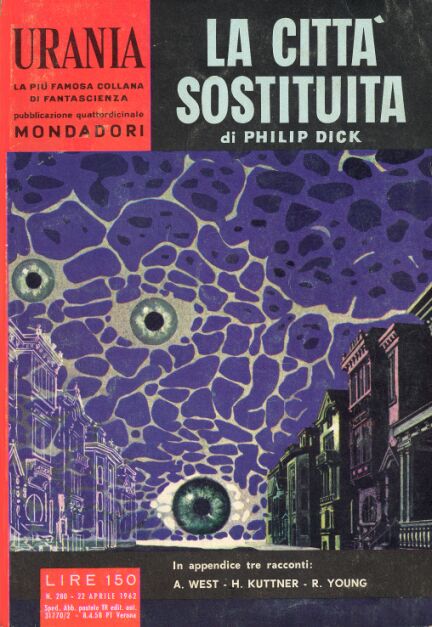
(Karel Thole’s cover for Urania #280 (1963), contains Philip K. Dick’s 1957 novel The Cosmic Puppets)

(Attilio Uzzo’s cover for the 1972 edition of Our Friends from Frolix 8 (1970), Philip K. Dick)
For more Adventures in Science Fiction Cover Art consult the INDEX

The Tim White cover is originally from the Granada 1983 publication of Sladek’s Roderick at Random
http://www.isfdb.org/cgi-bin/pl.cgi?199565
Good eye! Thanks. I was wondering if it wasn’t original to the volume as the Italian editions had their own artists — Thole and the ilk.
Do you have a favorite?
Quite a stunning collection of covers I think,although I don’t particularly like the one for “Martian Time-Slip” all that much,as to me it looks bland and doesn’t convey the weird spirituality that’s essentially the core of the novel.Karel Thole’s one for “The Divine Invasion” however,is very smooth and aesthetic,recreating the haunting surrealism that is Dick’s own.The woman in the astronaut’s suit looks very modernist.
Some capture the strangeness and uncertainty of his themes,not just an idea of the plot content.I like Tim White’s cover for “The Simulacra”,for it doesn’t seem to have anything to do with what the novel’s about,but the confusion between evolution and robotic machinery,seems to create it’s key themes of artificiality,deception and entropy.It just looks brilliant as well as being comical.
Karel Thole’s cover for “The Preserving Machine” is evocative of Dick’s quirky surrealism,while his one for “Urania” is more politically nightmarish,recalling “If There Were No Benny Cemoli”.I like his “The Game Players of Titan” with it’s sinister legion of weird aliens against a resistance of mythical symbolism.
These are only my personal preferences.
As Matthew indicates above, the Tim White cover was nabbed from an earlier UK edition of a Sladek volume so I doubt there was much thought other we can use an earlier cover with ROBOTS. haha.
Here’s another Thole cover for a PKD novel that I thought about after I put the post together — alas. 1970 edition of Solar Lottery (1955)
And the original canvas.
Yes,it’s quite funny really,as there isn’t much similarity between the two novels,but if you’ve read “The Simulacra”,you’ll know that cover seems perfect to represent it’s themes!
The one for “Solar Lottery” is more cerebral than the actual novel I think.
A guy chased by two dudes while getting shot down a futuristic hallway is “cerebral”? I mean, there’s a surrealist touch to the standard action but…
I don’t mind saying you’re probably right.I just thought it seemed surreal for the ethos of the novel.
The book cover is always the first contact with the text, the first look. The draftsman is as a messenger. The book has almost two authors. A lot of talent is needed.
I agree. Thanks for the comment 🙂
Do you have a favorite from this bunch? Read any of the PKD novels they illustrate?
Hello ! Sorry , I am only an occasional reader of science fiction, I don’t think of being ready to read PKD, I think that it is a very particular universe to be approached now for me. I read your articles, I plan to make an article in which I speak about the fashion space age and I need material,I need to see many things with this subject. But I am sensitive to the relation between books and images, in particular the art of the cover.
Sounds good. I too am fascinated by the interplay between book and cover. And all the disconnects and choices that have to occur…
Hi
Based on your many series on European cover I was inspired to buy t some Urania as well as some Libra Ediitrice while in Venice, most came from a very touristy shop that it has some boats in the shop with books in them , sadly they are so musty they live in the garden shed, oh well.
As for the covers you showed, the eyes have it, I like the creepy street scape in Thole’s cover for Urania #280.
Happy Reading
Guy
I remember your wonderful posts on Anderllini’s art a while back. I thoroughly enjoyed looking through them. Ah Thole, routinely brilliant. Here’s a favorite of his — the 1982 German edition of Michael Bishop’s Catacomb Years (1979)
Libreria Acqua Alti! They’d probably make as much money charging people for photographs of the store as actually selling books. But it’s fun anyway.
I really like Attilio Uzzo’s cover for Our Friends from Frolix – but I suspect it’s because of my fondness for classic 1930s Salvador Dali where lateral protrusions blend into landscape and anatomy.
Ah, I’ve been to Venice but at the time didn’t know that place existed.
Speaking of non-English SF: Often on my trips to France (research) I browse the French editions I come across. But reading SF in French (at least for me) is never very enjoyable…. And I want my reading experience to be enjoyable.
Did you enjoy the novel Friends from Frolix 8? A reader on twitter indicated they hated the novel… I remember little from my read through over a decade ago (must have been 18 or so).
Apparently,somebody on Goodreads thought it was a masterpiece.I read it in the mid-80s during my peak period for reading Dick,when I was easy to please and thought most of his novels were of at least a reasonably high standard,including this one.I think now though it probably showed a cynical tiredness,which was how I think he was regarding his work then when he wrote this.
I thought “A Maze of Death” was a masterpiece when I first read it,but this was the first novel of his I ever had.Your view of it above though,is probably right.You don’t have to fire only the balls in his literary canon for them to be the best!
I thought the covers for both novels were very good however,revealing something of the existential substance within.
I am reminded of Biblioklept’s recurrent series on selections of one star reviews from Amazon (one could use Goodreads to compile something like this as well) of the classics. At a certain point, I care far more for the content (and argument) of both good and bad reviews (and what other books the reviewer likes) than any proclamation of greatness or lack thereof.
This one is particularly funny: Moby-Dick
https://biblioklept.org/2013/02/27/selections-from-one-star-amazon-reviews-of-melvilles-moby-dick/
No,it’s alright Joachim,It was only in responce to what you said somebody on Twitter said about it,as opinions will vary about his stuff.That’s why I also made a comparison with “A Maze of Death”,which isn’t always considered one of his canonial works.
Yes,I don’t care for “Moby-Dick” either.
“Yes,I don’t care for “Moby-Dick” either.” — what? I love it! You missed my point.
No,not really,I was only responding to what the reviewer said.His opinions were similar to my own.Yes,but I can see the humour though.
Richard, if you want more PKD discussion than I can (or am willing to) offer check out Evan Lampe’s podcast and read through of all of his collected short fictions. I’ll have an update post about it soon but thought I’d let you know.
One Hundred Pages at a Time: https://hundredpages.podbean.com/
No I don’t really.I just meant to clarify my views about “Our Friends from Frolix-8” and what you said regarding what are supposed to be great works and reviewers’ astute opinions.Thanks for the link though.I’ve been well aware of his forthcoming podcast for awhile now.I’ve contributed a very large number of comments to his short fiction blog and the Neither Kings or Americans one concerning Dick.
The Plainman meat-and-potato style (or streamlined efficiency if you want to be flattering) of classic sf is probably a boon to translation into other languages.
There are a couple of Sheckley novels from the last years of his life which were never published in English and his many international fans means there are a lot of interviews in other languages. Having compared and contrasted the relatively simple fidelity of translations of some of his stories in French I was able to give these foreign originals a go and feel secure that I was getting a decent impression of the original. But it does eventually become very fatiguing, which is no way to enjoy reading.
In my case I read a lot of academic French for my profession and SF reading is firmly for relaxation (I read tons of depressing SF books of course but still…). If I read it in French it feels like work. Other than someone like Jules Verne who is super easy to read quickly — haha.
Any other classic SF authors you know who have works untranslated but published in foreign languages?
JB: ‘Any other classic SF authors … who have works untranslated but published in foreign languages?’
Stanislaw Lem, for one.
Wizja lokalna (Observations from the Scene/Observations on the Spot).
https://en.wikipedia.org/wiki/Observation_on_the_Spot
From 1982. So not one of the early potboiler Soviet sphere’ SF novels like, say, The Magellanic Cloud (Obłok Magellana) from 1955.
As it’s Lem, I suspect it’ll eventually see print.
That said, the number of authors who were incredibly prolific yet seldom translated is immense (Curval comes to mind — one of his novels and two short stories) — not sure Lem falls into that particular camp (thankfully!).
Actually I like all of the covers except for the ones for The Penultimate Truth and Clans of the Alphane Moon, both of which looked like they were knocked on somebody’s coffee break. On the other hand, Marco Patrito’s cover for Dr. Futurity has a real nightmarish quality to it. Same is true for the cover to Counter-Clock World. Uh, am I mistaken in seeing some sexual symbology in this one? I mean, is that a breast and a tongue that I see?
Never get tired of seeing Karen Thole’s art. Prolific wasn’t he?
Yeah the Counter-Clock World cover has a Hieronymus Bosch (with all its accompanying perversity) feel. I wish I knew the artist.
Thole = prolific, brilliant, and one of my favorites!
Seen this one? I mostri all’angolo della strada (The Monsters on the Street Corner, 1966)
I thought that cover was excellent for “Counter-Clock World”.It seems embody it’s weird theological themes.
Love it, it’s like a cross between Escher and Roger Dean.
Good comparison!
Being a sucker for all-things Darwin – including T-shirts with clever parodies of the famous “descent of man” tableau – I gotta go with:
“Tim White’s cover for the 1994 edition of The Simulacra (1964)”
As Matthew pointed out in an earlier comment, White’s art appeared first one the Granada 1983 edition of Sladek’s Roderick at Random
http://www.isfdb.org/cgi-bin/pl.cgi?199565
You could pretty easily find that edition if you wanted to add it to your collection.
Yes, I’ll look out for that one. Is that title referencing Tobias Smollett’s 18th-c book “Roderick Random” (about the “random” adventures of a ship’s surgeon)?
That I do not know. Alas.