
Atelier Heinrichs & Bachmann’s cover for the 1970 edition of J. T. McIntosh’s One in Three Hundred (1954)
In 2021, I posted Part I of my Adventures in Science Fiction Cover Art series on the Atelier Heinrichs & Bachmann. Between 1966 and 1971, they created a kaleidoscopic array of psychedelic visions for the German press Heyne Bücher. I described their art as follows: “Pop surrealism? Lowbrow art? The Andy Warhol effect? However you classify Atelier Heinrichs & Bachmann’s covers […] they’re gleeful and sarcastic.” And despite a few readers who disliked their exuberant/chaotic hilarity (someone described them as the “very nadir in SF cover art”), I stand by my positive assessment. And I bring you Part II of my series!
I have not been able to piece together more about the exact nature or members of the Atelier Heinrichs & Bachmann. Albeit, I have not reached out to the Phantastische Bibliothek Wetzlar as suggested by readers of my first post… I wrote in 2016 about the “Atelier Heinrichs” portion of the duo in my post on The Cryptic Diagrams and Collaged Heads: “They too were possessed by moments of kitsch and collage. I’m assuming that Bachmann joined the team for the years 1966-1971. Atelier Heinrichs produced covers before and after Bachmann (isfdb link). I cannot find more information in German or English about the exact names of the artists involved and the nature of their ‘atelier.'”
The covers in this post crisscross a vast spectrum of visual symbology and image fragments. If there are any fragments you can identify, let me know in the comments.
I find Atelier Heinrichs & Bachmann’s best work involves clustered human forms. For example, the nude torsos with disquieting ogling male crowd in the 1970 edition of Day Keene and Leonard Pruyn’s World Without Women (1960) or the background in 1970 edition of J. T. McIntosh’s overpopulation themed One in Three Hundred (1954). Other successful visual moments include the dense interlaced technology and humanity that appears to grow across the 1970 edition of Brian W. Aldiss’ Non-Stop (1958). In each of these instances, while there’s literal scene from the novel (to the best of my knowledge) described, the artists convey the main themes and/or mood of the story.
Do you have a favorite cover?

Atelier Heinrichs & Bachmann’s cover for the 1970 edition of Day Keene and Leonard Pruyn’s World Without Women (1960)
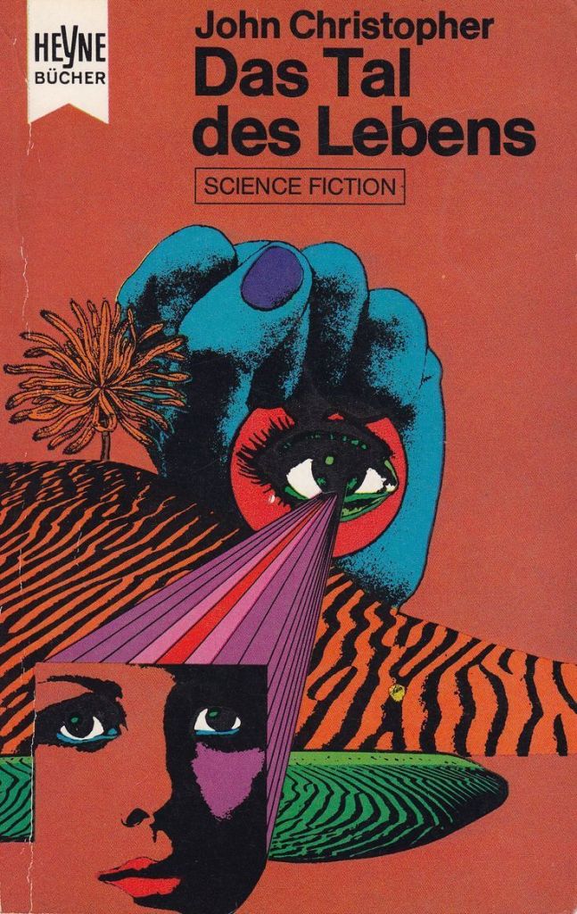
Atelier Heinrichs & Bachmann’s cover for the 1971 edition of John Christopher’s The Death of Grass (1959)
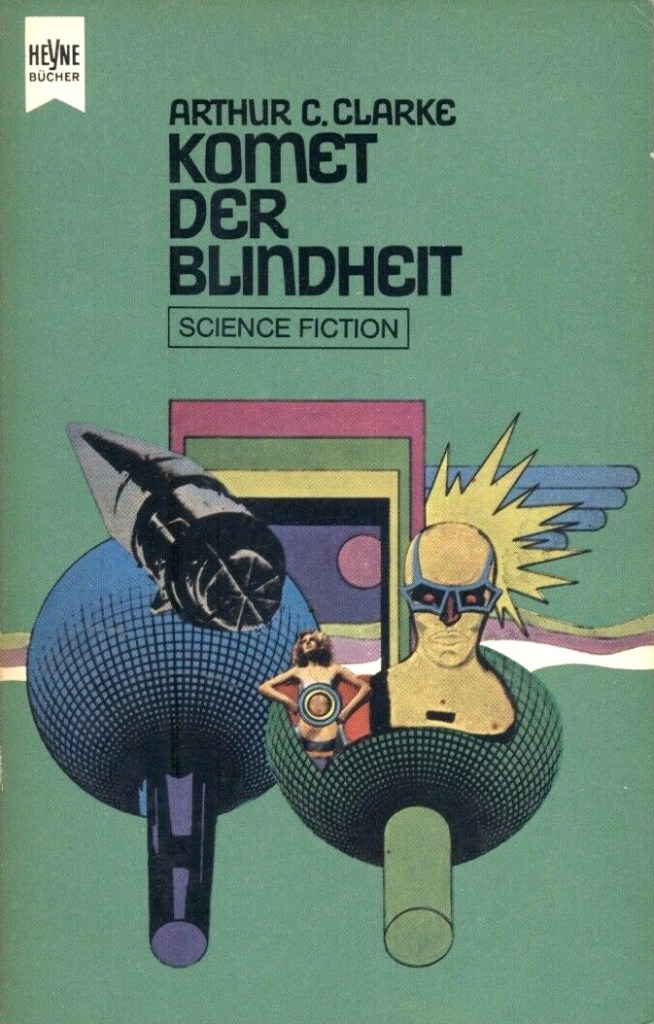
Atelier Heinrichs & Bachmann’s cover for the 1971 edition of Time Probe: The Sciences in Science Fiction, ed. Arthur C. Clarke (1966)
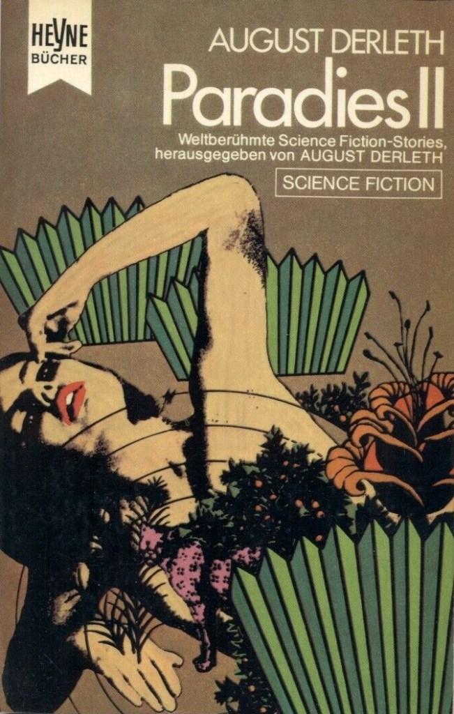
Atelier Heinrichs & Bachmann’s cover for the 1970 edition of Time to Come, ed. August Derleth (1954)
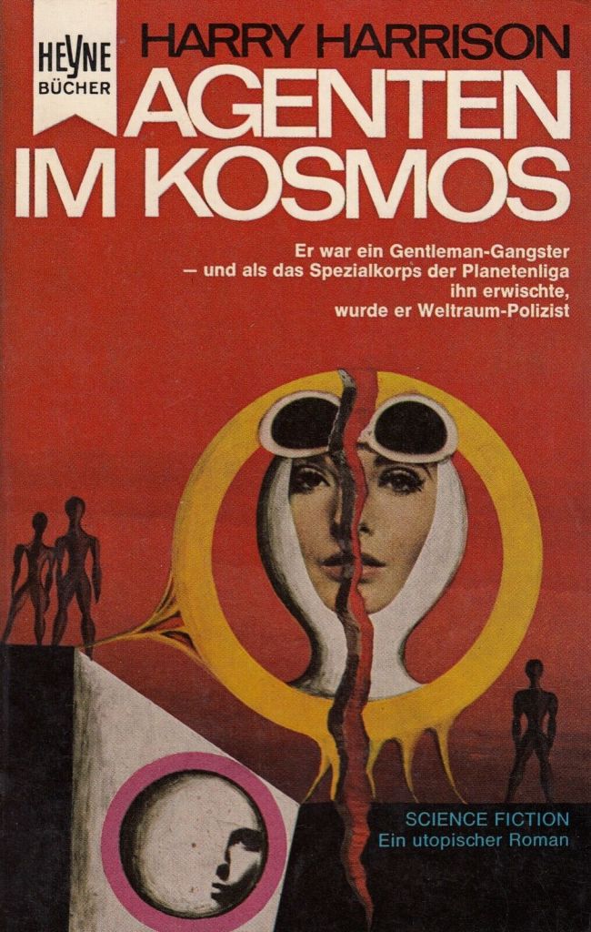
Atelier Heinrichs & Bachmann’s cover for the 1966 edition of Harry Harrison’s The Stainless Steel Rat (1961)
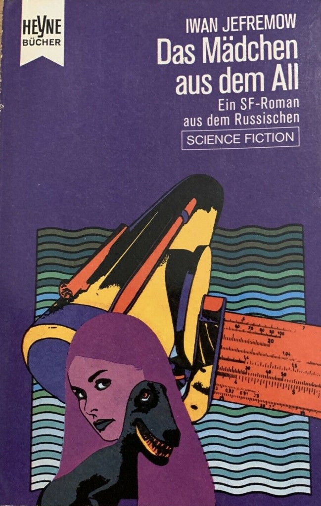
Atelier Heinrichs & Bachmann’s cover for the 1971 edition of Ivan Jefremov’s The Great Ring (1958)
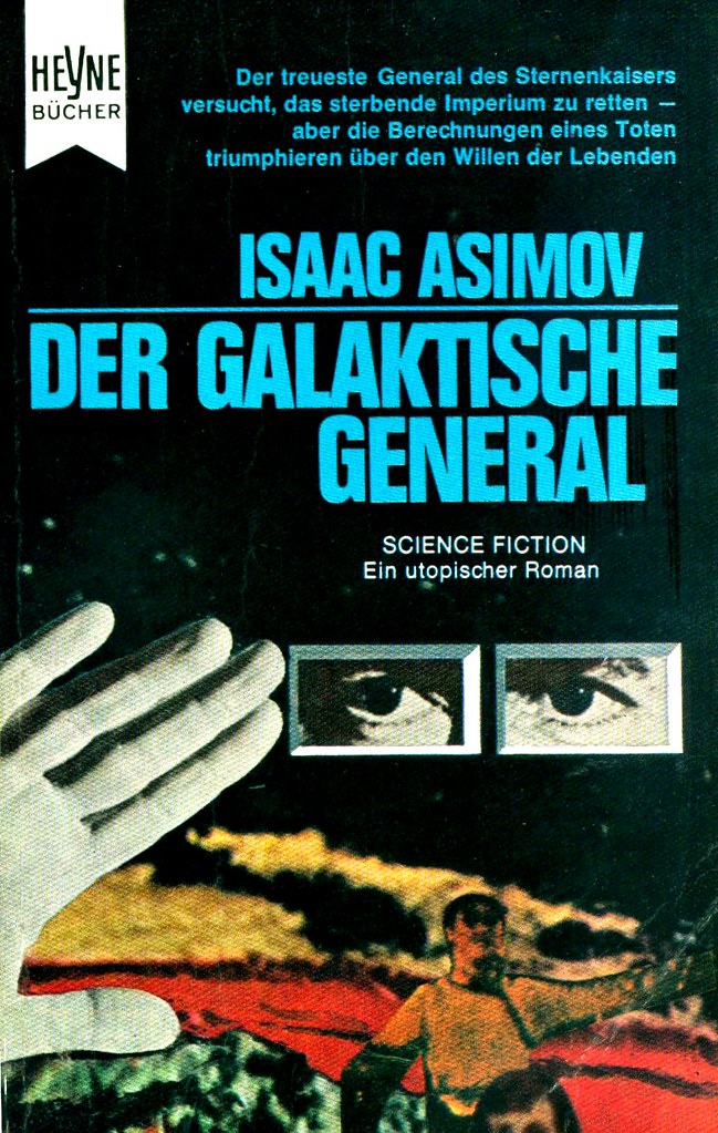
Atelier Heinrichs & Bachmann’s cover for the 1966 edition of Isaac Asimov’s Foundation and Empire (1952)

Atelier Heinrichs & Bachmann’s cover for the 1971 edition of Robert Silverberg’s Starman’s Quest (1958)

Atelier Heinrichs & Bachmann’s cover for the 1970 edition of Brian W. Aldiss’ Non-Stop (1958)
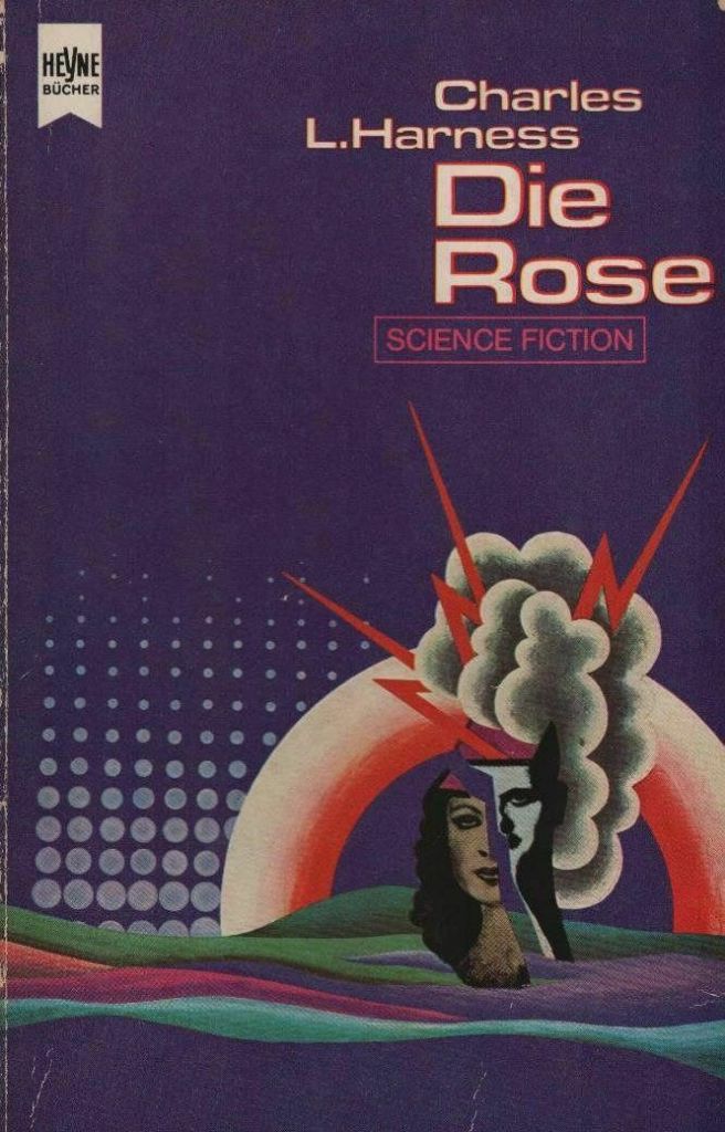
Atelier Heinrichs & Bachmann’s cover for the 1971 edition of Charles L. Harness’ The Rose (1966)

Atelier Heinrichs & Bachmann’s cover for the 1971 edition of Edmund Cooper’s The Last Continent (1969)
For cover art posts consult the INDEX
For book reviews consult the INDEX
For TV and film reviews consult the INDEX

The Jefremov cover…! I think the dinosaur is what does me in. I can’t decide if it’s my very favorite or the worst of the lot.
Both, I guess.
That weird/creepy dinosaur smile seems so familiar… as does the telescope which looks like something from Things to Come (1936). I’d air on the “worst of the lot” side of things. Haha.
Yyyeeeaaah…but still it’s got some kind of energy, like it’s a knowing wink at how goofy and campy it is…that counts to me, too.
I’m all for self-aware dinosaurs! hah. But yes, it’s gloriously campy…
The cover of the German translation of Asimov’s Imperium and Foundation initially confused me. I wondered about The Galactic General and mused that I read every book in the foundation series, but this one eluded me. Until I read your comment. Also its description as “an Utopia” on the cover made me chuckle. Asimov was probably the first author that made me aware that civilization is a cyclic phenomenon and evolution a still ongoing process: two observations that gave direction to the way my artistical vision has been developing. It is my understanding that Asimov never intended to make that sound as an Utopia. And I concur with your assessment that the design of these covers are heavily influenced by the pop art movement.
Thanks for stopping by!
Ah yes, The Galactic General title threw me for a loop as well — and then I realized it was simply an alternate title. If you don’t know about it, isfdb.org is the absolute best way to check publication for a SF book (note: the resource is constantly improving especially when it comes to foreign editions): http://www.isfdb.org/cgi-bin/title.cgi?17331
It’s been far too long since I read Asimov to have any firm memories of the Foundation novels. I remember enjoying them at the time.
Yup, definitely inspired by the pop art movement. There were a bunch of similar collage-style cover artists in the US as well. Hoot von Zitzewitz comes to mind: https://sciencefictionruminations.com/2011/10/05/adventures-in-science-fiction-cover-art-hoot-von-zitzewitzs-fantastic-flights-of-fancy/