
(Cover for the 1964 edition of Piano Player (1952), Kurt Vonnegut, Jr.)
My whirlwind tour of the surreal covers of non-English language presses and artists continues! We ogled the inclines and declines of The Futuristic Cities of Lima de Freitas (Portugal, Livros do Brasil under the Argonauta imprint); awoke our inner desires to create minimalistic stamps and prints with the twelve-month sequence of Mariella Anderlini’s covers for Galassia (Italy); and were transported to Anderlini’s later landscapes of stylized mountains and edifices for Libra Editrice (Italy). I have many ideas for our future explorations…
…but first a range of SF covers by Atelier Heinrichs, Munich for Heyne Bücher (Germany). I cannot find information online for Atelier Heinrichs (albeit my German reading comprehension is average at best and I do not know the standard German SF resources). It is definitely not a full name but perhaps an artist working at the “atelier.” See isfdb’s brief entry. Other covers are grouped under Atelier Heinrichs and Bachmann and they are different in style (perhaps in the future I’ll post them?).
Atelier Heinrichs cover for the 1964 edition of Kurt Vonnegut, Jr.’s Piano Player (1952) joins the pantheon of my favorite covers. Diagrams hinting at esoteric knowledge, relational lines between forms, the architectural organization, these are all elements that resonate with me. I will be the first to admit that the others are not as fascinating but are well worth the look.
Thoughts and comments are always welcome.
Favorites?
For more cover art posts consult the INDEX

(Cover for the 1965 edition of Mary’s Country (1957), Harold Mead)

(Cover for the 1966 edition of Ossian’s Ride (1959), Fred Hoyle)

(Cover for the 1966 edition of Im Dschungel der Urzeit (1966), ed. Clark Darlton)

(Cover for the 1967 edition of Grenzgänger zwischen den Welten (1967), ed. Wulf H. Bergner)

(Cover for the 1964 edition of Corps der Verzweifelten (1963), K. H. Scheer)
(Cover for the 1964 edition of Hothouse (1962), Brian W. Aldiss)

(Cover for the 1965 edition of Citizen of the Galaxy (1957), Robert A. Heinlein)

(Cover for the 1966 edition of Die Maulwürfe von Manhattan (1966), ed. Wulf H. Bergner)
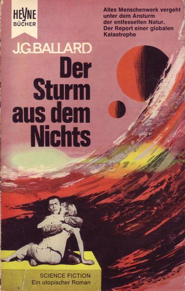
(Cover for the 1964 edition of The Wind from Nowhere (serialized 1961), J. G. Ballard)

(Cover for the 1965 edition of Die letzte Stadt der Erde (1965), ed. Clark Darlton)

(Cover for the 1966 edition of Deathworld (1960), Harry Harrison)
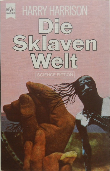
(Cover for the 1966 edition of Deathworld 2 (1964), Harry Harrison)

(Cover for the 1966 edition of Earth Abides (1949), George R. Stewart)

fascinating… heads, hands, eyes, hair, webs… the page as a frame! definitely not the covers for the rather conservative US market… love them!
Thanks for the comment!
I often get in this debate, I am not convinced that they are more radical than the US market. Different for sure, but, the 1960s in the US was the height of Richard Powers and Paul Lehr and Hoot von Zitzewitz (collages), and eventually Robert Foster (who also loved the collage)….
I would posit that a wide range of markets were part of a similar movement. In Europe (for example Lima de Freitas and Anderlini linked above) non-genre SF artists saw SF covers as a way to make some money. And they were part of contemporary movements….
And at least in my eyes this Hoot von Zitzewitz 1966 cover (same years as a few above)
And this Richard Powers 1966 cover…
…are indicative of the types of art each artist created AND were for major US presses. Both are not conservative…
What can I say,apart from the obvious?Yes they are radical.Ambiguous in their treatment of subject matter,but I suppose Richard Powers and others were also back then.Perhaps you could say these were more abstracted though.A few such as the Ballard and the Heinlein ones,look more orthodox,but are probably only representative.I haven’t read “The Wind from Nowhere”,which was Ballard’s first novel,but is as far as I know,an ecological disaster novel,unlike the surreal,cerebral ones that followed it.It’s not surprising therfore,that the cover is more bland than nearly all the others,although the background is quite striking.
I thought the “Player Piano” cover was too cerebral to reflect the inner quality of the novel.Did you like the book?I thought “The Sirens of Titan” and his later books I read,were far better.I feel the same about “Hothouse”,but the cover is closer to the content within.
I don’t see how are these more abstracted than the Powers image I posted?
I have not read Player Piano yet — my Vonnegut, Jr., knowledge is limited to Slaughterhouse Five and Cat’s Cradle.
I want the art to be amazing and the contents as well. If that reflects the content, so be it, but, I must be an outlier and push against some sort of symbiotic need for interconnection between the two. There would be so many horrid covers if they adequately conveyed the “inner quality” (or lack thereof) of the contents! hah
Richard, which cover is your favorite?
Strangely enough,the Ballard one I scorned a bit,but I said as much,the background is stunning.Also the Stewart one.It’s abstraction is cerebral and ethereal.I haven’t read it though.
I’m being a bit speculative about the comparison between Powers and these covers.He did very amophous shapes and forms in weird but very concrete backgrounds,but these seem placed in more indefinite surroundings,or the lack of them.At least the more surreal ones do I think.Mind you,the Laumer one you posted,looks different to a lot of the other stuff he did.
I’ve read “Player Piano” twice.It’s a political dystopia that’s light-hearted and full of humanistic harangue,as you would expect of him,but doesn’t fizzle much.
Hi Joachim
Another great post, I l love cover art but I am fairly conventional so I really enjoy being exposed to some different cover artists. I think my favourite is Hothouse but Corps der Verzweifelten is a close second. The Deathworld cover gives me the willies, but that was probably the intention. I also found your comparison of the Pangborn and Laumer covers interesting. I think this will lead to my going through my books with a more critical eye.
All the best.
Guy
I listened to Deathworld on audiobook and I have to say that cover has little to do with the book. I guess the intention (if they read the book or if the press even sent the book to the artist) was to create something really odd and dangerous looking? The entire planet is a death trap (suprise!)… It’s a weirdly good adventure story in some ways (I like “designed planets”).
Very striking! I like the little dwellings on the Scheer cover!
Yes, I’d like to look inside them!
Oh man, Joachim. Have I ever got some wild and wonderful covers to show you! (Just got in an absolutely MASSIVE amount of paperbacks – maybe a couple thousand – from a storage unit. If you’re interested, I’ll snap a few pics and post some time… Just need some time to unpack… and clean.. and organize… Oy.)
Adam, I’d love to see used SF books you’ve procured. A key component and point of my site (and why I do acquisition posts + cover art posts despite being most interested in writing reviews) is to inspire people, often by dangling cool covers, to dig their collections out of storage or to grab books at the local used book store.
I especially do this on my blog affiliated twitter account (https://twitter.com/sfruminations). If you’re ok with me tweeting the images you provide there, I’m all for that!
Yes, I can post some pics on your twitter account. I could do one of a number of themes:
– Women’s SF
– Classic SF (which, in the case of CL Moore and a few others, would mean a cross-over with the first category)
– non-English SF
– Completely random
Ah, twitter is different (it’s doesn’t have comments but rather it would require you to have an account, so never mind). You can go ahead and post any you might like here!
I should point out, that people who include images in their comments on my site have the image online somewhere (instagram, pinterest, etc). You have to provide a link for the image.
I’d love to see some non-English language SF…. At least first!
So, maybe what would be best is if you made an instragram account where you could slowly post images from your collection! And then link them here, especially if they relate to something we talk about 🙂
I dare to doubt whether “Atelier Heinrichs” created covers themselves, because the Atelier was responsible for the cover design of the science fiction series of Heyne Verlag using drawings by third parties. Later, the studio operated under the name “Atelier Heinrichs + Schütz”, then “Atelier Ingrid Schütz”. The cover illustrations, however, came from other graphic artists, not from the Atelier. The pictures were purchased by the publisher, the Atelier had nothing to do with them. When I look at some of the cover pictures used earlier, at least the collage pictures, I have the suspicion that some of these pictures could well have come from Karl Stephan, because in many cases they are reminiscent of the technique Stephan used (for example Heyne paperbacks 3050 or 3048). By the way, Karl Stephan liked to plagiarize himself, but also foreign illustrators.