
(Uncredited cover for the 1963 edition of The Changeling Worlds (1959), Kenneth Bulmer)
Part IV of my space station themed sequence (Part I, Part II, Part III)–if you have not yet checked them out I recommend you do.
Vincent Di Fate is the master of space station art. They are hyper realistic and detailed. Although I definitely prefer his earlier surrealist work (for example, here) there is a certain appeal to more technical depictions of future space technology. However, my favorite of the handful Di Fate pieces I cobbled together is his for the 1975 edition of The Other Side of Tomorrow (1973)—the screens are windows into the future, and a space station is featured prominently. I sort of enjoy Bob Eggleton’s cover for the 1993 Italian edition of To Open the Sky (1967) as well—although I suspect the cover was published on an English language book ![]() earlier, especially since there are no space stations in To Open the Sky.
earlier, especially since there are no space stations in To Open the Sky.
I am nearing the end of the images I have gathered on this theme (hence how many are from the 1980s + 1990s) so, as always, if you know of anymore that are not in my previous posts please provide a link in a the comments!
Enjoy.
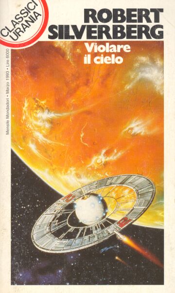
(Bob Eggleton’s cover for the 1993 Italian edition of To Open the Sky (1967), Robert Silverberg)

(Vincent Di Fate’s cover for the 1975 edition of The Other Side of Tomorrow (1973), ed. Roger Elwood)
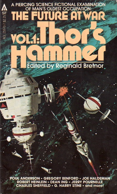
(Vincent Di Fate’s cover for the 1979 edition of The Future at War Vol. 1: Thor’s Hammer (1979), ed. Reginald Bretnor)

(Uncredited cover for the 1977 edition of The Silent Sky (variant title: The Rule of the Door and Other Fanciful Regulations) (1967), Lloyd Biggle, Jr.)

(Abbot?’s cover (is that what the signature reads?) for the 1960 edition of The Third Galaxy Reader (1958), ed. H. L. Gold)

(Vincent Di Fate’s cover for the 1976 edition of Analog Annual (1976), ed. Ben Bova)
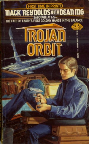
(Tom Kidd’s cover for the 1985 edition of Trojan Orbit (1985), Mack Reynolds with Dean Ing)
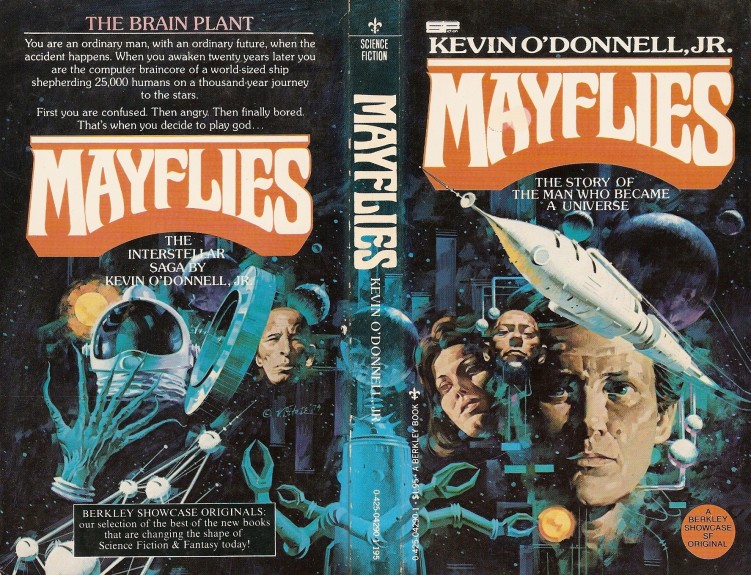
(Vincent Di Fate’s cover for the 1979 edition of Mayflies (1979), Kevin O’Donnell, Jr.)

(Chris Moore’s cover for the 1980 edition of High Justice (1977), Jerry Pournelle)
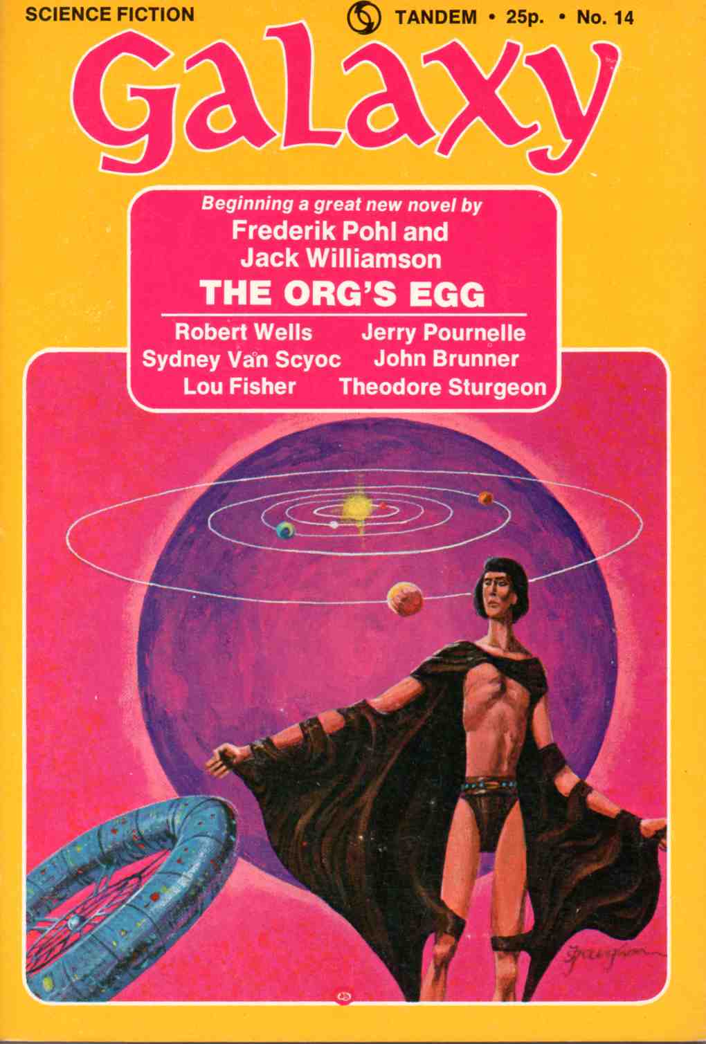
(Jack Gaughan’s cover for the April 1974 issue of Galaxy, ed. Ejler Jakobsson)

(Dean Morrissey’s cover for the 1992 edition of Flare (1992), Roger Zelazny and Thomas T. Thomas)

(Vincent Di Fate’s cover for the January 1977 issue of Analog, ed. Ben Bova)

(John Schoenherr’s cover for the October 1963 issue of Analog, ed. John W. Campbell, Jr.)

(Robert Braun’s cover for the June 1958 issue of Satellite, ed. Cylvia Kleinman)
For similar posts consult the INDEX

Especially liked the Schoenherr cover !
Not sure if it would pass inspection as a space station or just a really big space ship, but I’ve always liked the March 1980 cover for Analog, by Vincent Di Fate;
http://www.isfdb.org/cgi-bin/pl.cgi?57162
Were you the one that pointed out the Schoenherr cover to me?
Yeah, not whether that is a spaceship or not — one my primary issues selecting covers for this post!
No, wasn’t me, but that’s a good one.
My science fiction collection pretty much began when I started a subscription to Analog magazine in 1973. So the first sf artists I became aware of were the magazine’s regulars (Kelly Freas, Jack Gaughin and Vincent DiFate) and they are still close to my heart. One artist I didn’t like as a teenager was John Schoenherr. I thought his work was too weird and ugly. Now that I’m older, I’ve done a complete 180 about him. I now find his stuff fascinating and I can’t enough of them.
BTW, speaking of Analog/Astounding, I think their covers from the 50’s and 60’s are the best of the field. They were consistently fantastic.
What’s your favorite of Schoenherr’s?
Well, I haven’t seen that much of his artwork since the 70’s. But the cover that stuck in my memory the most was this one:

It has all the features that used to repulse/attract me: the featureless faces on the people, the abstract background and the unusual colors. I really like the armor of the guy on the horse/ox thing, particularly how there doesn’t seem to be a face behind the helmet.
How cool is the uncredited cover for the LLoyd Biggle, Jr. novel? Love the organic looking skylab.
I tried to make out the signature, but it is blurry… It is such a weird cover, that’s for sure.
Such great Vincent di Fate work here. He is one of my favorites. I really like the crisp, clean stylings of his ships and space stations. He is one of those artists who have caused me to buy many books irregardless of who the author is or what the book promises to be about.
I like his earlier surrealist work… But yes, there is something strangely appealing in the realism (you know me, a lot of the “realist” SF art fails to intrigue me).
Excellent selections. Would love to see a high resolution scan of the Analog cover by Schoenherr. He’s my favorite artist from the 60s.
I couldn’t find one! I really should get my hands on a paper copy…. But then they are often so battered and worn.