At last, inspired to make a cover art post! [list of art posts]
Thanks to my frequent commentator Peter S, I followed up on his suggestion to take a peek at Jack Gaughan’s 1969 cover for the Walker & Co. edition of James White’s All Judgement Fled (1968)—and was blown away by some of the other works in his art sequence for the press.
Jack Gaughan’s covers for Walker & Co. between 1969-1970 showcase some of his more surrealist inclinations. Beautiful, often minimalistic, evocative… Some famous novels are graced by his covers: James Blish’s A Case of Conscience (1958), Stanislaw Lem’s Solaris (1961), Silverberg’s Nightwings (1968), Ursula Le Guin’s The Left Hand of Darkness (1969), and Norman Spinrad’s Bug Jack Barron (1969).
Titles in this art sequence without suitable images online: A Gift from Earth (1968), Re-Birth (1955), All Judgement Fled (1968), Trouble with Lichen (1960), The Midwich Cuckoos (1957). If you have any in your collection I’d love to see them!
Many of these covers have wrap-around illustrations. If you have one at home I’d love to see a photo of what the back looks like! (post in comments).
Thoughts? Favorites?

(1969 edition of The Wanderer (1964), Fritz Leiber)

(1970 edition of Nightwings (1969), Robert Silverberg)

(1969 edition of A Case of Conscience (1958), James Blish)

(1970 edition of Solaris (1961, trans. 1970), Stanislaw Lem)

(1969 edition of Of Men and Monsters (1968), William Tenn)
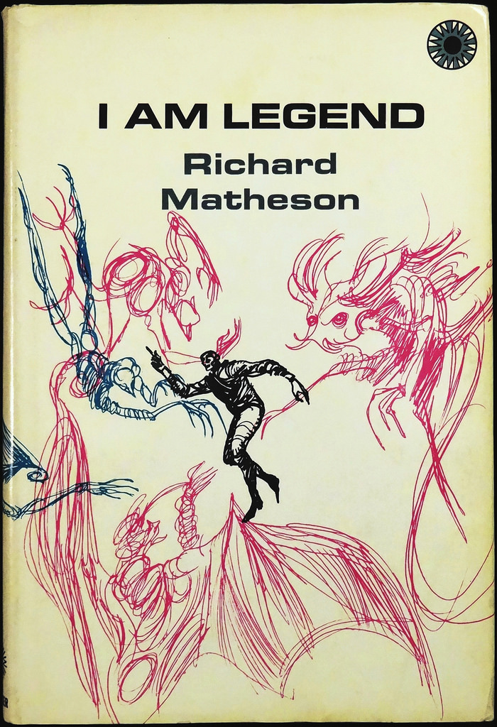
(1970 edition of I Am Legend (1954), Richard Matheson)

(1969 edition of Bug Jack Barron (1969), Norman Spinrad)

(1969 edition of The Whole Man (1964), John Brunner)
(1969 edition of A Specter is Haunting Texas (1968), Fritz Leiber)

(1969 edition of The Left Hand of Darkness (1969), Ursula Le Guin)

(1969 edition of Thorns (1967), Robert Silverberg)

(1969 edition of The Ship Who Sang (1969), Anne McCaffrey)

(1970 edition of The Stainless Steel Rat(1961), Harry Harrison)

(1970 edition for The Stainless Steel Rat’s Revenge (1970), Harry Harrison)
For more cover art posts consult the INDEX

I’ve always been impressed by how many different styles Gaughan could work in—a lot of his stuff was pretty mundane work for Ace, but he did some wild covers for Vance stuff in the ’60s, and in the ’70s he did some really stylized and trippy covers between more traditional fare.
These are pretty awesome and I hadn’t seen most of them… those last ones are kind of like the Powers school by way of a rorschach test. Thanks for sharing!
I’d seen both the Le Guin and the Lem in display cabinets as these are their first hardback editions (well, first English translation in pb or hb for the Lem)…. and they were pricey! So, I don’t own any of them unfortunately.
I have a new appreciation for Gaughan — some of his stuff never really settled with me….
Not surprised, a lot of his stuff is pretty mundane, typical action SF stuff. I should dig out some of my faves, but most of them aren’t this cool. Dig the minimalist designs and use of white space for the background… the Tenn and Blish covers are fantastic.
Wow! Thanks for the call out. Since they were all published by Walker in a fairly short period, around 1969 – 1970, I wonder if Gaughan was under pressure to complete all these covers quickly. They have an effortlessness look to them, an appealing flow to the lines. It looks almost as though they were dashed off quickly, yet I think these covers rank among Gaughan’s best work.
The only one I have is the Walker edition of ‘A Specter is Haunting Texas’ but of course the cover is long gone!
Thanks again for altering me to their existence!
If I could pick any one of them… hmmm…. I think it’s The Wanderer. But, I disliked the book when I read it years ago.
His stuff says “New Wave” to me in the same way that Frank Frazetta says “Sword &Sorcery”.
in the same way that Frank Frazetta says “blarghhhh…” hahaha
Don’t get me started on Frazetta! 😉
I remember nearly all of those books from when they came out. I once had an interior illo from Galaxy magazine by Jack Gaughan that I bought at a con auction. Sadly, I gave it away.
Were the Walker & Co. editions for SF bookclub? Or were they available in stores?
Sucks about the Gaughan illustration… Would kill for a Powers canvas (a figure of speech, I swear!).
Wonderfully striking. The LeGuin and McCaffrey are particularly stunning.
Yeah, I love how evocative the Le Guin cover is — really gets the sense of the two characters out in the icy wasteland…
Very evocative covers.They probably convey more graphically what’s inside the novels than realistic ones would.Simplistic,abstract and strange.
Yes, I agree with your words! In their simplicity they still express specific content and still jump out at the viewer.
Fantastic!Yes,sf should evoke through the power of it’s images that’s created.
Wonderful, wonderful covers:)). Thank you so much for going to the trouble of digging them out…
No problem!
I put covers up on twitter much more often than on my site nowadays.
I love how evocative these covers are with effective use of design elements such as line and color. The covers demonstrate it doesn’t take a complex scene to make a visually appealing layout.
Thanks Dale. What’s your favorite?
I’d have to say it’s “Of Men and Monsters” due to the creative sense of action each of the little figures projects.
Oddly enough, I have a bookcase filled with science fiction magazines like Analog, Galaxy and Asimov’s that I occasionally browse through for artistic inspiration. The covers provide some excellent examples of dramatic lighting that I study for painting techniques.
The reason these are so good, to me, is because they imply, they give an impression, that the viewer can participate in. I love these covers, because they’re actually allowing the reader to begin the experience in his/her mind while looking at the cover. I love more representative art, too, but I’ve been disappointed to see the evolution of SF cover art in the post-Star Wars era. You could see it back in the eighties, the covers of SF novels were by and large aimed at people who were probably coming to a SF book from SF movies and TV.
Don’t talk about the 80s! hahahahaha.
(but yes, other than a few of the earlier art stalwarts, Lehr, Powers, Gaughan, etc the 80s are profoundly lackluster SF art wise).
P.S. The only one of these I own is SOLARIS, but I like the Lieber one. For a second I thought Richard Powers did SOLARIS, as I got it around the time I got the hardcover of WIlson Tucker’s THE LONG LOUD SILENCE, with its excellent Richard Powers cover.
I’ve been ogling The Long Loud Silence (hardback or any edition really) — but they are not cheap online for some reason.
Yes! These are wonderful–thanks for putting this post together. I am lucky enough to own a first ed copy of ‘The Left Hand Of Darkness’ — an ex-lib copy, admittedly, but in nearly pristine condition nonetheless.
While I’m at it, I should also thank you for your recent post of three short reviews. Have already ordered myself a copy of the ‘Strete,’ and am excited to track down the two others as well.
Cheers, and keep up the great work!
I got your email. Thanks for the cover images! Glad some I missed were actually available online!
I hope you enjoy the Craig Strete collection — definitely New Wave + Native American myth + filmic experimentation + violence + oppression… a heady brew for certain! I remember finishing the collection (a year or so ago) and feeling emotionally drained… And I tried to write a story-by-story review and was utterly unable to do so. I didn’t think I could do the stories justice. And, they have a certain oblique quality that merits a reread…
Some stunning covers here Joachim, not what I was expecting from Gaughan at all to be honest but then I’m more familiar with his work on Ace Doubles than anything else. My favourite has to be A Specter is Haunting Texas, all the best.
Do you own any of these? Perhaps a new sequence of editions you could acquire? I suspect they are pricey….
I don’t own any of them unfortunately, I’ve never even seen them either so I suspect they’d be an impossibility to collect and assemble as a set. Nice thought though.
I understand completely — I took a peek on ebay (US), the Of Men and Monsters cover (one of my favs of the bunch) is $125. And only one copy is available…
Ouch! A bit too rich for my blood I think, I’ll pass on these then and just enjoy the cover shots in your post.
And, the Le Guin edition goes for ~$100…
Some of them (Brunner’s The Whole Man for example) are not that expensive on Abebooks — but, probably not in the condition you are looking for.
I am a bit of a stickler when it comes to the condition of books I buy, the collector in me always takes over and insists on at least a VG rating before purchase. It’s lead to a few near misses in the past but worth it in the long run I feel.
I THINK I might have that edition of the Blish book…And how ’60s is that cover for Bug Jack Barron? What a great novel. (I sought that one out after Ellison raved about it.)
I love Spinrad (I’ve read short fiction and two of his novels). I loved his experiment in The Iron Dream… I want to read Bug Jack Barron and I have a signed copy on the shelf (unfortunately, of the paperback first edition rather than this edition)… I have not been in the mood for whatever reason. But I will!
Funny: I haven’t read Iron Dream, but it’s sitting on my shelf… haven’t been in the mood for whatever reason. But I will!
From a current eBay auction.
From a current eBay auction.
From a current eBay auction.
I wonder if Gaughan felt freer as a graphic artist than he did as a painter. Some of the B&W frontispieces he did for Ace and DAW paperbacks have this same, more expressive quality.
Most of them are either surreal,morbid or nightmarish,but I’m glad there’s a few more humourous ones.There’s a lot of humour in sf of course,and he managed to capture it in some of them.He was quite versatile.
Here’s an example of a frontispiece, from “The Annihilation Factor” by Barrington J. Bayley (Ace Double):
Some of his paintings rise above his usual cover art. Though again, when he was being more graphical than illustrative. From “The Wrecks of Time” by Michael Moorcock (Ace Double):
Seems he was occasionally able to go beyond what Donald Wolheim (editor at Ace and DAW) normally wanted from him, while Walker and Company let him go all the way.
Tom, I can’t believe I missed this comment. I adore that second image. And yes, I think you are absolutely right in pointing out how Walker and Co. let him go his own direction…. It’s often easy to forget how much power editors had in directing an artist.