
(Cover for Fiction, #228 (1972), ed. Alain Dorémieux)
In the 60s and 70s the covers for Fiction—“the leading journal of science fiction and fantasy in France” until its cancellation in 2015—were characterized by simple color schemes punctuating by often delicate line work. Working within these strictures (I suspect to cut back on printing costs), a handful of artists pop out from the herd: Jean-Claude Forest, Philippe Curval, Wojtek Siudmak, Philippe Caza….
….and the mysterious Lacroix about which I can find little online. If anyone knows more about him, or if it’s a pseudonym for another artist, let me know!
I’ve included slightly more than half of Lacroix’s total SF art credits and two of them in particular resonate with me: Fiction, #228 (1972) (above) and Fiction, #197 (1970) (below). In the former the eyes staring out of the robotic body exudes horror and existential terror. And the mechanical body descends into some more sprawling contraption, losing its human form entirely…. In the latter, the delicate human chin and lips transforms into a fantastic city, spired, medieval…. Mutation, transformation, mechanization.
For a general history SF in France see SF Encyclopedia (although a handful of French SF fans I know have dismissed the article’s characterization of the current SF scene as needlessly bleak).
Other non-English language SF publication artists we’ve explored so far:
As always, thoughts/comments welcome! Any favorites?
Should I create additional art posts culled from Fiction? Thinking the 50s surrealism of Philippe Curval might be next!
Italy
The Galassia Covers of Allison aka Mariella Anderlini
Haunting Landscapes and Cityscapes: The 1970s Italian SF Art of Allison aka Mariella Anderlini
Portugal/Brazil
The Futuristic Cities of Lima de Freitas
For more art posts consult the INDEX
(Cover for Fiction, #199 (1970), ed. Alain Dorémieux)
(Cover for Fiction, #192 (1969), ed. Alain Dorémieux)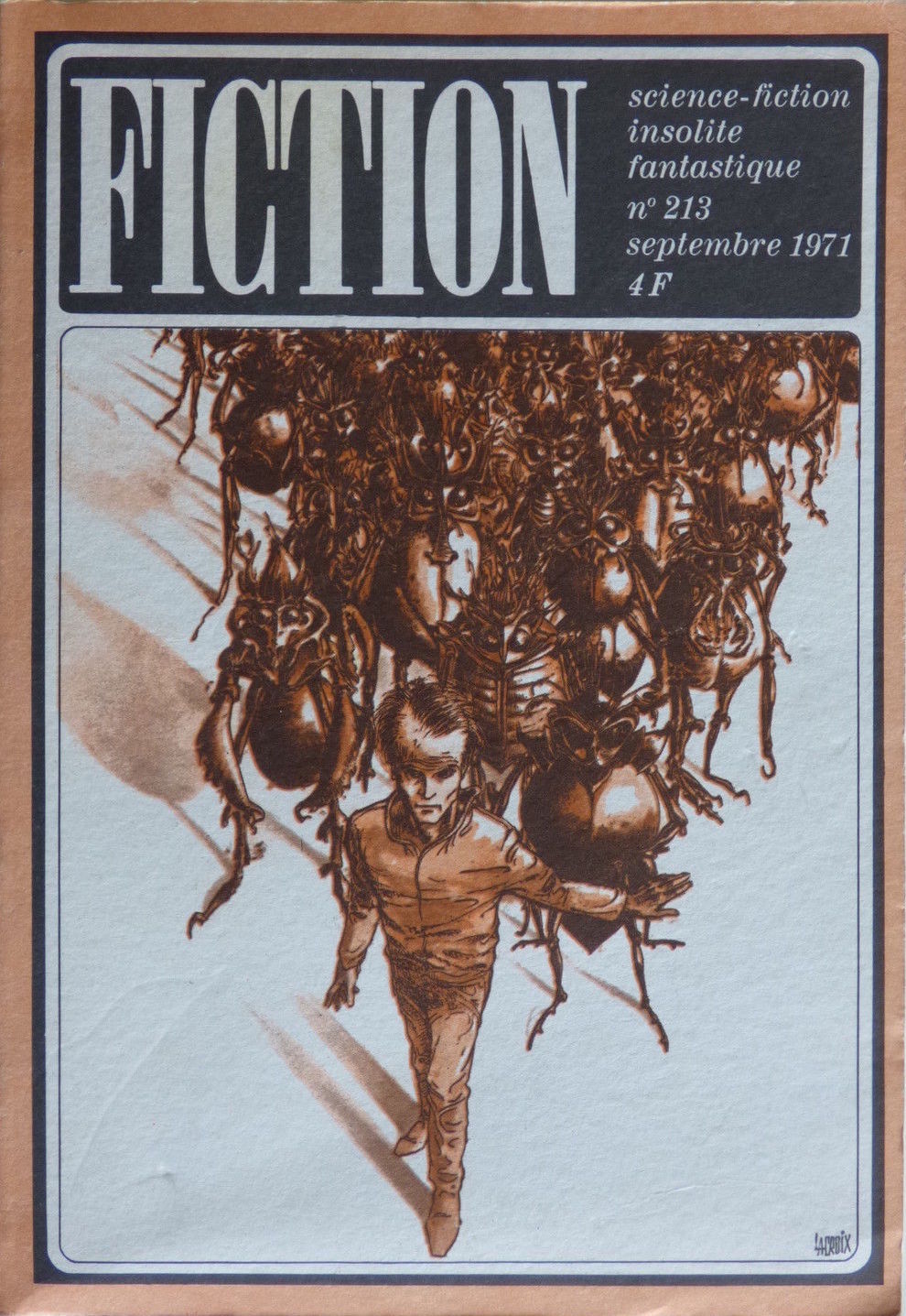
(Cover for Fiction, #213 (1971), ed. Alain Dorémieux)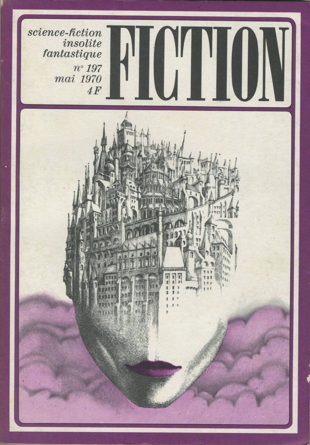
(Cover for Fiction, #197 (1970), ed. Alain Dorémieux)

(Cover for Fiction, #207 (1971), ed. Alain Dorémieux)
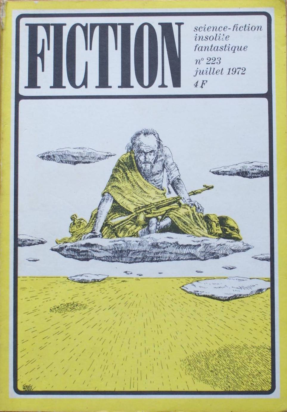
(Cover for Fiction, #223 (1972), ed. Alain Dorémieux)

These all are amazing covers, though the Head/city is the least liked with the last one. I very much like the first one and the blue one (#207).
Perhaps the purple clouds behind the head diminish its impact… I like the head city! I’m glad you enjoyed them.
Noosfere – the ISFDB for sf published in France – states Lacroix is Claude Lacroix.
There’s a page of illustrations at:
https://www.noosfere.org/icarus/livres/auteur.asp?numauteur=-50816&Niveau=illus
a brief bio of his career as a comic artist, in English:
https://www.lambiek.net/artists/l/lacroix_claude.htm
What remarkable covers! Once more – thank you for sharing them…
You’re welcome. Have a favorite?
Oh yes – the woman’s head with the city growing out of it… Such a powerful, memorable image:)
Noosfere – the ISFDB for sf published in france – states Lacroix is Claude Lacroix.
There’s a page of illustrations at:
https://www.noosfere.org/icarus/livres/auteur.asp?numauteur=-50816&Niveau=illus
a synopsis of his career as a comic artist, in English:
https://www.lambiek.net/artists/l/lacroix_claude.htm
Matthew, for some reason your comment went to my spam folder! I had no idea there was an isfdb.org for French SF. I suspect it’ll become an indispensable resource for me. I’ll edit this post with a note in the next few days to reflect this.
Thank you so much!
They’re very academic and less aesthetic outwardly compared to even some of the more radical artists you’ve recently reviewed,but their mordant style shows I think,the changes the French were aware of within the written genre,compared to the magazine covers produced by most of their Anglo-American cousins,with exceptions such as “New Worlds”.They’re revealng,unflinching and brilliant.
The top one you liked of the mechanised man,is immediate in evoking the existential angst and uncertainty of defining humans and machines in Philip K. Dick’s work,or perhaps David Bunch’s Modreran short stories of mechanical humanity in “Dangerous Visions”.The blue #199 one,with the cold,awesome machinery looming over the sinister but pathetic figure operating the machine at what looks like a piano in the empty space below,could easyly recall J.G.Ballard’s dissonance,or even Harlan Ellison’s acerbic homilies.Most of the others,could also quickly spring to mind several modern SF authors.I don’t think anybody has represented the intellectual and emotional content of modern SF more graphically.
Yes,they’re intricate,detailed and superbly illustrated.My reference to American and British covers,is exclusive to the magazines,not those of book covers.
Well, I did pick one of my favorite artists from Fiction… Remember, I am the one selecting from hundreds so I obviously go for a particular aesthetic. Selection bias!
Many French covers in Fiction are the standard SF scenes with tons of naked women. Not sure we can make grand arguments with cross Atlantic parallels from one artist and seven covers at that. So I wont.
I’m glad you enjoyed them!
No okay,but it’s absoulutely true of his stuff though.I’ve said the same though of other French or continental artists you’ve reviewed.
Yes I did.Thanks Joachim.
Richard, so you understand how much selection bias is going into my choices… here’s a typical Fiction cover from the early 70s (so contemporary with the ones I selected). This is why it’s hard to make general arguments…. without looking at the complete catalogue.
http://www.ebay.fr/itm/Revue-FICTION-n-219-Mars-1972-C-W-RUNYON-J-SAXTON-ill-CAZA-OPTA-/191915802873?hash=item2caf12c0f9:g:IY4AAOSwzJ5XfRyL
Okay,it’s definitely not,say,anywhere near as radical as Lacroix,and it is very erotic and fabular,but I quite like that cover.It’s very evocative I think of the more maverick SF that someone like Philip J. Farmer would have wrote.
No,I’m not totally disagreeing with you,and of course you have your personal preferences,but I did think the continental artists you recently reviewed were radical,but it was really more of a generalisation.I think I’ve probably overemphasized what I said.
Thanks for the link.
Likewise, although the SF itself was hardly surreal in the 1950s, inspired more by contemporary artistic ideas, Fiction’s covers from that decade showed more surreal touches. Connecting covers to contents can be a tough and futile thing to do….
I can’t really disagree with you,but notice that Ray Bradbury’s name is there.His stuff for the time,was surreal,darkly strange and of unusual language,as were his contemporaries,such as Sheckley and Bester.I’ve no doubt that most of it was standard science fiction fare,but something I thing was going on.
Thanks for the useful illustration.
Hi
These are really interesting, Quite different from the usual fare. It is impressive how they achieve so much interest and mood by just adding one colour to the white background and black shading. The line work is great it reminds me more of the interior illustrations in the SF magazines than the covers. I really like 228 also the wonderful feeling of menace in 213, is that the perspective or is his frontal lobe really big. It seems to combine the mutant threat with a wonderful insect/alien vide. Whatever is happening you know it is trouble. Using brown and yellow in some covers is unexpected and really striking.
Happy Reading
Guy
Hello Guy, I almost thing that the strict color guidelines (the same thing with Doubleday books by the way) yielded a different type of experimentation. That said, as I indicated to Richard, unfortunately a lot of the Fiction covers are rather run of the mill… Definitely why I focused in on Lacroix!
I’m glad you enjoyed them.
Wonderfully striking artwork – really good!
Have a favorite!? Thanks 🙂
The first one is great, but I also like #197 – the city skyline is very impressive!
Could this be Claude Lacroix ? http://www.philippe-ebly.info/index.php/14-les-illustrateurs-de-philippe-ebly-2
Can you find any evidence that he illustrated for Fiction in the early 70s?
It says so on his wikipedia page. I haven’t put too much time to research him, but it seems to fit,
Here is Claude Lacroix’s art listing on The Internet Speculative Fiction Database.
http://www.isfdb.org/cgi-bin/ea.cgi?141950
Does anyone else thing the covers are similar stylistically?
This one sort of is…. maybe?
And the link. https://fr.m.wikipedia.org/wiki/Claude_Lacroix
These are so wonderful and intricate! I love the imagination 🙂
Do you have a favorite?
Thanks!
My favourite is the one at the very top, (Cover for Fiction, #228 (1972), ed. Alain Dorémieux) amazing! and also the face which is a mouth, and the top of it is a building. Brilliant 😀
Really like that first cover.
Me too — one of my absolute favorites from Fiction.