
(Ludovico De Luigi’s “Thomas Mann,” 2007)
When you think of Italian SF art, the name that immediately springs to mind is the brilliant Dutch painter Karel Thole (1914-2000), who seemed to illustrate half of the Italian SF publications in the 60s/70s…. However, a whole series of fascinating artists were brought in for short spats of covers. Today’s focus is Ludovico De Luigi (1933-). Between 1971 and 1972, he created nine fascinating covers for the Italian SF press Casa Editrice La Tribuna. The majority include references to De Luigi’s favorite urban landscape–Venice–with a surreal touch. As an unabashed fan of the Italian style of vedutism (large-scale and highly detailed paintings of cities), both De Luigi’s recent paintings (the first and last image in this series) and his 70s covers appeal to my sensibilities. If you’re interested in his more recent paintings–including some for sale–check out his webpage.
My favorite of De Luigi’s covers graces Galassia #150 (1971) (an original collection of untranslated Italian SF by Piero Prosperi)–one of the few that doesn’t seem to reference Venice directly (although the style of the building hearkens back to a Renaissance palace along the Grand Canal). I love the deep earthy hues, the building seeping into murky masses along the edges…. Evocative!
Let me know your favorites!
Other Installments of my Italian SF Covers Art Series
- The Galassia Covers of Allison aka Mariella Anderlini
- Haunting Landscapes and Cityscapes: The 1970s Italian SF Art of Allison aka Mariella Anderlini
- The Reddish Figures and Constructing Cities of Alberto Cavallari

(Ludovico Di Luigi’s cover for Galassia #173 (1972), the Italian edition of Psi High and Others (1967), Alan E. Nourse))
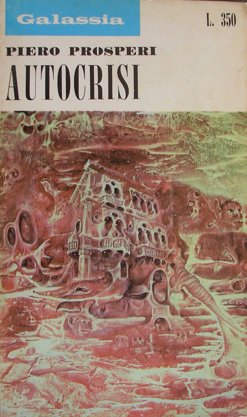
(Ludovico De Luigi’s cover for Galassia #150 (1971), a collection of original Italian SF by Piero Prosperi)

(Ludovico De Luigi’s cover for Galassia #169 (1972), reprinted by Bigalassia, containing Dean R. Koontz’s The Dark Symphony (1970) and Mauro Antonio Miglieruolo’s Come ladro di notte)

(Ludovico De Luigi’s cover for Galassia #155 (1971), an anthology of original Italian SF by Gianni Montanari, Livio Horrakh, and Franco Tamagni)

(Ludovico Di Luigi’s cover for the Italian edition of No Future in It (1962), John Brunner)

(Ludovico Di Luigi’s cover for Galassia #174 (1972), containing the Italian SF novella Dove stiamo volando, Vittorio Curtoni)

(Ludovico Di Luigi’s cover for Galassia #171, the Italian edition The Ring of Ritornel (1968), Charles L. Harness)

(Ludovico De Luigi’s “After Midnight,” 2010)
For more cover art posts consult the INDEX

Lovely, lovely images and beautifully rendered dreamscapes.
Those are really stunning but like you I’m drawn to the first one!
The first cover? Or his recent painting (the top image)?
Of the covers the second is my favorite: Galassia #150
Do you have a favorite?
Another good visual theme.
Thanks for visiting. Have a favorite from the bunch?
I wished you had a list of them so I could go back and decide.
Ah, my question is about the covers in this post.
I’ve provided you with a link to the index before: it’s at the top of the page. Click “SF COVER ART”: https://sciencefictionruminations.com/egregious-science-fiction-cover-art/
Also, at the bottom of every art post, I include a link to the index (this one included).
Sorry, evidently I didn’t come back to see replies the last time. But I did this time, so thanks. I’ll go look at all the themes…
No worries, have fun browsing.
Joachim, here are some of my favorite covers that are on my blog:
https://auxiliarymemory.com/2016/11/06/do-judge-books-by-their-covers/
Cool!
(I wish you included the artist and publication date)
I’ve featured the Gaughan covers in that publication series (the Le Guin cover you included) in the past: https://sciencefictionruminations.com/2015/12/21/adventures-in-science-fiction-cover-art-jack-gaughans-covers-for-walker-co-1969-1970/
I’m working on a new post about SF cover art. I’ll include the artist, publication, and date.
I look forward to it!
…which I apparently mentioned back in 2016 when I looked at that post. hah
Hi
I have to go with the first image, Ludovico De Luigi’s “Thomas Mann”, I just love the image. My wife and I are planning our second trip to Venice in Sept., we stay in the city for several days, no cruiseships. This is quite evocative of the city and monuments I remember from the first trip. I always enjoy the posts in this series.
Thanks
Guy
Yeah, definitely included it first for a reason!
That said, I enjoy the art used for the covers as well. I enjoyed Venice when I went. Although, it felt like a dead city — large portions of it exist for tourists only…. prefer Rome, etc.
I don’t think I’ve seen anything like these,even though you’ve had some brilliant foreign artists on your blog.It doesn’t bear comparison with any American artists such as Richard Powers though.I can’t pick out a favourite.
As in he’s different than Powers? Or far less appealing to you? I mean, De Luigi only made 8 covers… If I picked Powers’ first 8 covers to compare, he’d be an utterly different caliber artist. If you were trying to compare Powers to Karel Thole it would make a tad bit more sense (as in Thole in many ways helped define Italian SF art of that era and made hundreds and hundreds and hundreds of covers).
If you do a Google search for Ludovico De Luigi I think you’ll have a far better sense of what he accomplished than from the few covers I provided. He continued to produce art after 1972 — and is still productive.
For example, 11 years before his covers — “La Salute”, 1960.
Or this spectacular surreal Venice cityscape in the Venice Guggenheim collection: “Parnassus, Apollo and Papileo Macaon” (1970)
http://www.guggenheim-venice.it/inglese/collections/artisti/dettagli/pop_up_opera2.php?id_opera=113&page=
No,he isn’t less appealing than Powers,but I just did a Google search on Thole,and I think that both artists have more in common with each other than they do with Powers.He doesn’t bear comparison with the two
foreign artists though.He is great in his own right.
My favorite is that first cover, “Thomas Mann”, but the last cover “After Midnight” is very evocative, too.
Oh, neither of those are covers. Those are recent paintings of his that haven’t been turned into covers (which is why no book information is listed in the citation). But yes, they are lovely, which is why I included them as a “bonus.”
Some beautiful artwork there.
Thanks for visiting. Have a favorite?
I have hundreds of art posts organized by theme and by individual artist here: https://sciencefictionruminations.com/egregious-science-fiction-cover-art/
I really can’t decide which one is my favorite, but Galassia #150 doesn’t look like a sf cover, more like a cover for a Lovecraftian horror, or a haunted house, anthology.
I love 150…. the swirling organic colors and shapes turning into a building. Deeply evocative! But definitely, would work for a haunted house-themed anthology
The work is incredible. I see so many of the surrealists here: Paul Delvaux, Kay Sage, Max Ernst, Dorothea Tanning, Leonora Carrington. There’s also a lot of DeChirico and Ivan Albright. I enjoy how employs all these artist’s styles with a big focus on architecture.
I agree. I’m a big fan of architectural landscapes. Maybe in part genetic as I am the child of two architects. Haha.
Galassia #150 is probably my favorite, BTW, but honestly it’s difficult to choose.