
Canvas for the 1977 edition of Universe 7, ed. Terry Carr (1978)
The covers for Pocket Books and Popular Library tend not to scream “visual zeitgeist of the 70s” like the catalogs of DAW, Ace, and Del Rey/Ballantine Books (note 1). But amongst the former’s primarily forgettable stable of artists who are often uncredited (2), a few gems emerge–notably the work of Carlos Ochagavia (1913-2006) (3).
I cannot find more than a few sentences of biographical material on Ochagavia online. He was born in Spain and moved at a young age to Argentina. He arrived in the United States in 1937 to study in New York. He returned to Argentina and worked as an illustrator for a diverse range of publications (from paperbacks to UN commemorative stamps).
Ochagavia’s covers veer from permutations hinting at the jungle scenes of Henri Rousseau to the stark landscapes littered with surreal forms and shapes somewhat reminiscent of Yves Tanguy or Giorgio de Chirico . But Ochagavia has a visual language of his own–abstracted human forms interacting with scenes of classical art and Counterculture pop, bodies blending with landscapes, and an interest in diagrams and obscurantist symbology. Count me in!
Of the bunch, I’ve only read Orbit 8 (1970), ed. Damon Knight and John Morressy’s wonderful Frostworld and Dreamfire (1977).
Ochagavia’s stunning cover for Sam Dann’s The Third Body (1979) is the reason I put this post together. Reminiscent of the wrecked bodies in Fantastic Planet (1976), the fractured visages punctuate a field — the intact face imagines a verdant past (?). Gorgeous.
Which novels/collections have you read? Do you have a favorite Carlos Ochagavia cover?
Enjoy.

Cover for the 1st edition of Sam Dann’s The Third Body (1979)

Cover for the 1977 edition of Universe 7, ed. Terry Carr (1978)
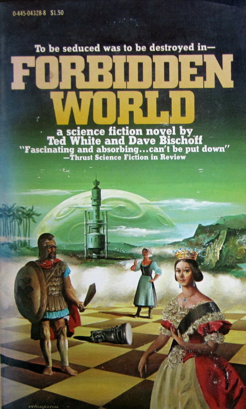
Cover for the 1st edition of David Bischoff and Ted White’s Forbidden World (1978)

Cover for the 1978 edition of Keith Laumer’s Retief and the Warlords (1968)

Cover for the 1978 edition of Keith Laumer’s collection Retief of the CDT (1971)

Cover for the 1978 edition of Mark Saxton’s The Islar: A Narrative of Lang III (1969)

Cover for the 1977 edition of Charles W. Runyon’s I, Weapon (1974)

Cover for the 1977 edition of John Morressy’s Frostworld and Dreamfire (1977)

Cover for the 1976 edition of Leigh Brackett’s The Nemesis from Terra (1961)

Cover for the 1979 edition of Terry Carr’s Universe 8 (1978)

Cover for the 1st edition of Kathleen M. Sidney’s Michael and the Magic Man (1980)

Cover for the 1977 edition of Universe 6, ed. Terry Carr (1976)

Cover for the 1978 edition of Keith Laumer’s Retief’s War (1966)

Cover for the 1977 edition of Stanley Schmidt’s Newton and the Quasi-Apple (1975)

Cover for the 1st edition of Howard L. Myers’ Cloud Chamber (1977)
Notes
(1) Richard Powers and Vincent Di Fate contributed a handful of covers. I do not want to overstep my comparison. The visual aesthetics of Pocket Books and Popular Library are eclectic amalgamations to say the least. There’s only so much Ed Soyka I can tolerate. Here’s a standard example.
(2) I’ve identified multiple stylistically similar Pocket Book covers that might be the work of the same unidentified/uncredited artist. I have asked Marta Randall and other authors with no success.
Here’s an incomplete list I’ve compiled of their work.
- The 1978 edition of Shadrach in the Furnace, Robert Silverberg (1976)
- The 1978 edition of Margaret and I, Kate Wilhelm (1971 (MY REVIEW)
- The 1978 edition of Journey, Marta Randall (1978)
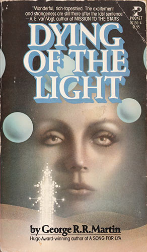
- The 1978 edition of Dying in the Light, George R.R. Martin (1977)
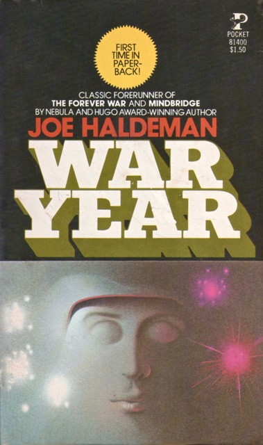
- The 1978 edition of War Year, Joe W. Haldeman (1972)
(3) A few other artists worth exploring come to mind—Charles Moll, Harry Bennett, and maybe Alan Magee?
For cover art posts consult the INDEX
For book reviews consult the INDEX
For TV and film reviews consult the INDEX

Didn’t know about Carlos Ochagavia at all. Wow! How could I have missed these?
Perhaps, as I mentioned, the eye tends to gloss over Pocket and Popular Library volumes. His handful of covers for other presses (Dell and Ace) are far less interesting…. you’ve probably seem seen some of his lesser works. Like this terrible cover for the 1977 Del Rey edition of Dick’s A Scanner Darkly.
That PKD title I have seen before, but it’s not spectacular, so I didn’t pay attention to it. And these aren’t titles I would have pulled from the shelves if I saw just their spines. I’m thinking I did see Universe 8 before. It triggers a few brain cells.
Yeah, it’s pretty atrocious. I think if his gorgeous cover for The Third Body appeared on an Ace edition he’d be far better known.
Do you have a favorite from this bunch?
Sometimes here, the covers are better than the novels themselves. And…uh…Sam Dunn? Mark Saxton? Who? Runyon was a minor league sf author, but was primarily known for his mysteries. Worst covers? Curtis Books. I have about half of these books, no favorites, I love them all.
I would love to know what was happening in the Curtis Books art department (if they had an art department). They have a kitschy charm.
“So, we have this cover, man + rocket aimed at young women in […]”
“Whatever, just go with it!”
“Are you sure!”
“Little spaceman plus pyr[…]
“Whatever the spaceman is with it’s great!”
There IS an alternate reality perception as to what people wanted to see on their paperback covers from Curtis. Were these people on crack? These covers may be why Curtis didn’t last long in the paperback field.
I think the market strategy was “it doesn’t have to be good, it just as to be weird and shocking, AND CHEAP.”
I’ve spent a long time researching Pocket Books cover art. I have the worlds largest Silverberg cover art collection of originals and I always fancied adding the Shadrach cover from 1978. Journey, Dying and War were by the same hand and I think I know who (not Carlos) but I’m waiting to see if his daughter will get back to us (he’s deceased). He also did Starchild Trilogy, Night-Child and Floating Worlds around that same time for Pocket. Margaret and I is a different artist. I know who but I’d have to look it up. Guys who mostly painted things other than SF.
Thanks for stopping by + and for commenting.
Well, if you can identify any of the uncredited Pocket Book covers, let me know!
This is also uncredited and very similar to Margaret and I.
http://www.isfdb.org/cgi-bin/pl.cgi?437022
I love this retro futurism, it makes my mind so happy
Thanks for stopping by. Do you have a favorite cover from this bunch?
I have 150+ art posts (themed — at the top, and by artist — half-way down) listed here: https://sciencefictionruminations.com/egregious-science-fiction-cover-art/