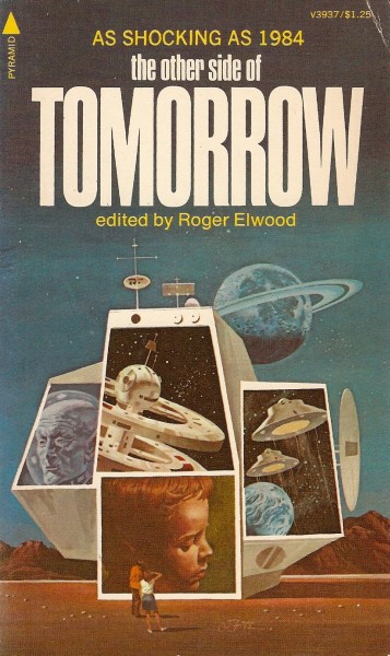
(Vincent di Fate’s cover for the 1975 edition of The Other Side of Tomorrow (1973), ed. Roger Elwood)
My second composite cover post — here’s a link to Part I if you missed it. I’ve included a few covers by Vincent di Fate who has always been one of my favorite illustrators of the 1970s. His cover for The Other Side of Tomorrow (1973) is top-notch. A conglomerations of screens are placed on a barren stylized landscape where two figures gaze intently at them. Each screen shows a different scene, a space station, spaceships, a boy’s contemplative face, an old man — and, a ringed planet looms in the background. Whether or not the screens illustrate individual stories in the collection is unclear — regardless, the composite nature of the illustration is fascinating.
I have a love / hate relationship with Hoot von Zitzewitz’s collages (Hoot von Zizewitz’s Fantastic Flights of Fancy) — sometimes they are possessed by a vibrant dynamism, other times they are poorly cut-out and clumsy. His cover for the 1968 edition of I, the Machine (1968) is in the former group. I’d love to hear your thoughts on his work — I have a soft spot for collages…
As always, what are your favorites? And, are the books themselves worth reading? Of all the volumes I’ve posted I’ve only read two of the novels — Barry N. Malzberg’s The Falling Astronauts (1971) and Jack Vance’s Showboat World (1975)…
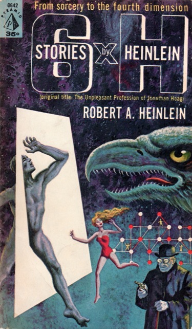
(Robert J. Engle’s cover for the 1961 edition of 6 x H (variant title: The Unpleasant Profession of Jonathan Hoag) (1959), Robert A. Heinlein)

(Robert Powers’ cover for the 1965 edition of The Case Against Tomorrow (1957), Frederik Pohl)
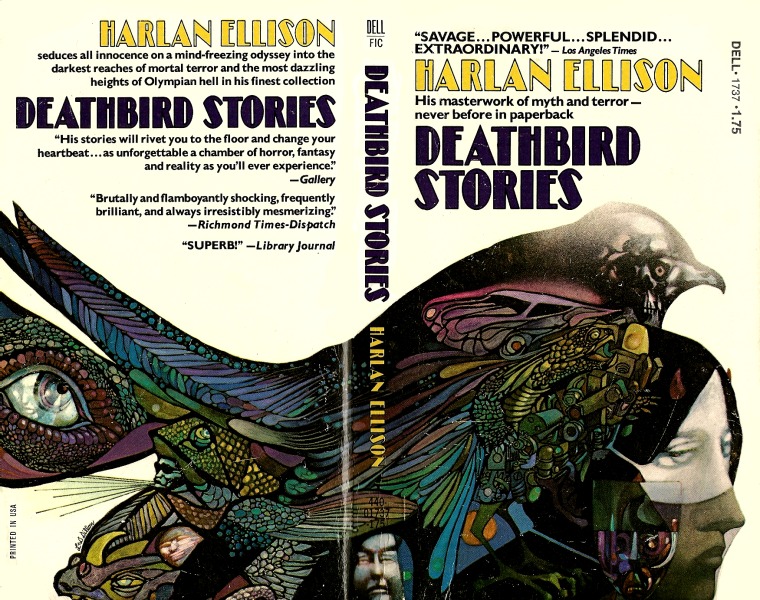
(Leo and Diane Dillon’s cover for the 1976 edition of Deathbird Stories (1975), Harlan Ellison)
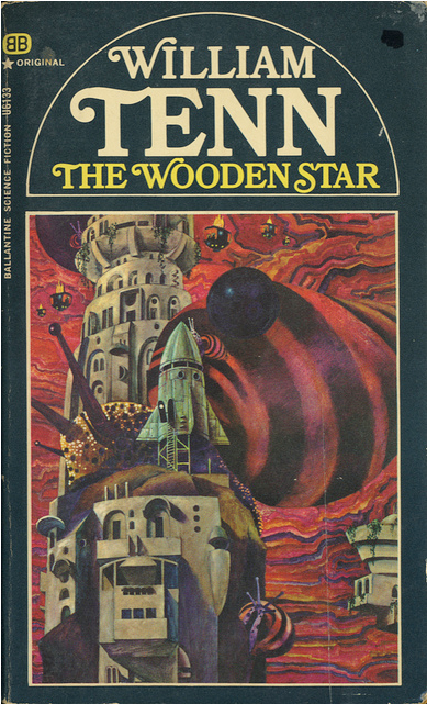
(Stephen Miller’s cover for the 1968 edition of The Wooden Star (1968), William Tenn)
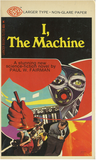
(Hoot von Zitzewitz’s cover for the 1968 edition of I, the Machine (1968), Paul W. Fairman)

(Gray Morrow’s cover for the 1965 edition of The Second Atlantis (1965), Robert Moore Williams)

(David Plourde’s cover for the 1972 edition of Earthstrings (1972), John Rackham)
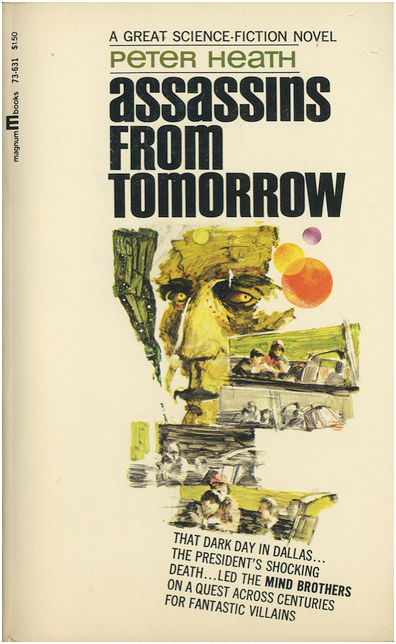
(Armand Weston’s cover for the 1967 edition of Assassins from Tomorrow (1967), Peter Heath)
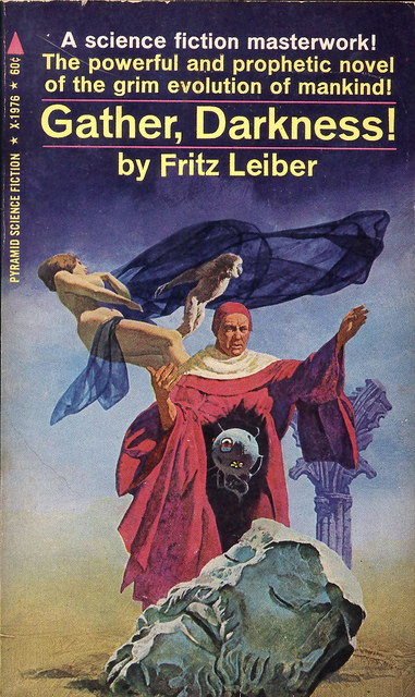
(Uncredited cover for the 1967 edition of Gather, Darkness! (1950), Fritz Leiber)
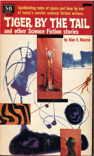
(Richard Powers’ cover for the 1964 edition of Tiger By the Tail and Other Science Fiction Stories (1961), Alan E. Nourse)

(Gray Morrow’s cover for the 1969 edition of Men on the Moon (1958), ed. Donald A. Wollheim)

(Uncredited cover for the 1971 edition of The Second Book of Australian Science Fiction (1971), ed. John Baxter)

(Bob Larkin’s cover for the 1980 edition of Disposable People (1980), Kenneth Kay and Marshall Goldberg, M. D.)
(Uncredited cover for the 1970 edition of New Writings in S-F 16 (1969), ed. John Carnell)
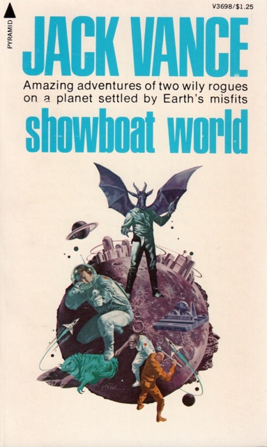
(Vincent di Fate’s cover for the 1975 edition of Showboat World (1975), Jack Vance)

(Henry Fox’s cover for the 1964 edition of Space Trap (1964), Thorton Bell (R. L. Fanthorpe)

(Vincent di Fate’s cover for the 1975 edition of Company of Glory (1974), Edgar Pangborn)
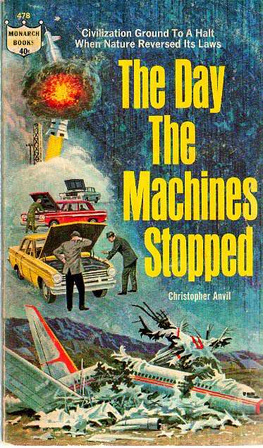
(Ralph Brillhart’s cover fort he 1964 edition of The Day the Machines Stopped (1964), Christopher Anvil)
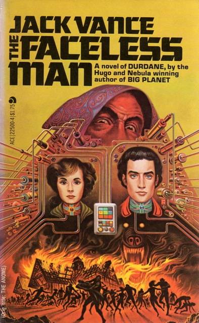
(Dave Meltzer’s cover for the 1978 edition of The Faceless Man (variant title: The Anome) (1973), Jack Vance)
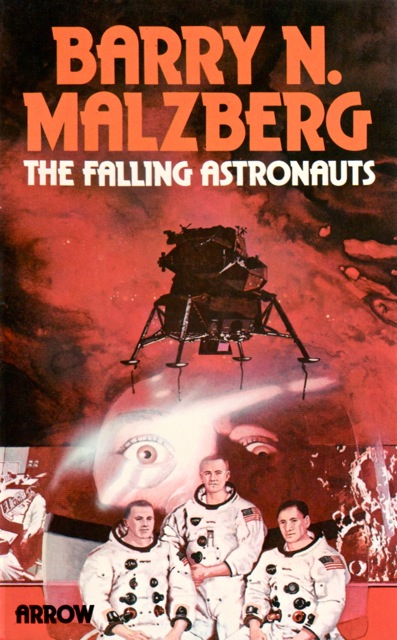
(David Bergen’s cover for the 1975 edition of The Falling Astronauts (1971), Barry N. Malzberg)
For similar pots consult the INDEX

I think the composite cover works great for short story collections/anthologies. Especially when they actually have something to do with the actual stories contained in the book. I’ve bought many an older book like this because of the cover and I like most of these you’ve featured in one way or another.
More recent examples of this sort of thing from books I’ve liked are the cover for Karin Tidbeck’s Jagannath and the Tachyon Press collection of Peter S. Beagle stories, Sleight of Hand.
I think it works for any sort of cover…. 😉
UNLESS, they take it way too literally — like Ralph Brillhart’s horrid cover for The Day the Machines Stooped (1965) — yes, airplanes stopped because they are machines, and cars, and spaceships (because this is sci-fi). We get it!
Combined with the fact that the book has a clumsy premise and Brillhart is a clumsy artist… perhaps worse than the too literal bit…
That is true. Some of my absolute favorite covers ever are Kinuko Y. Craft’s covers for Patricia A. McKillip’s fantasy novels. They contain myriad elements from the story in question woven into the painting, often little small things that you don’t even notice until several times looking at it.
But I particularly like this with collections as it makes me curious about what story might go with what picture element.
I’ll investigate them….
I agree with the second point completely.
I like the cover on Deathbird Stories. The creepy stained glass effect really works. 🙂
Leo Dillon and Diane Dillon have long been in the top tier or sci-fi illustrators in my opinion…
I have to agree with Grace, Leo and Diane Dillon’s cover for the 1976 edition of Deathbird Stories is just amazing.
Yah, they are two of the best — just look at the quality of their illustrations!
They feel strangely biblical… hmm…
Joachim, I love thed 2nd and 3fd DiFate covers–he used more muted colors in some of these covers, and when seen blown up the realism is startling.You should get his two books of his art, they are reasonably priced on Amazon; the first has kind of a silly text purporting to be `technical` info on the fictional machines in the paintings but it is worth it for the art, but the second is really well-written as DiFate traces his career chronologically as well as providing a nostalgic look at the s.f. history of each time–he`s a very good writer……I still have that copy of Deathbird Stories, the first Ellison or Dillon I owned. Strange Wine, The Essential Ellison and Shatterday also have montage covers by them, while many others are more specific illustrations, all excellent. I seem to recall they did another cover for the same collection that was another montage.
I will — eventually, the life of a grad student isn’t “blessed” with monetary happiness… haha
That is the edition of Showboat World that I own, and the cover always makes me laugh, because it is so insane and has absolutely zero to do with Vance’s story. I wonder if that wacky cover helped or hurt sales. And did it piss Vance off?
Incidentally, I thought Showboat World was quite fun, better than the somewhat similar Space Opera.
I own the same one as well. Showboat World was a great read — very solid, I have the first novel he set on the same planet waiting to be read — The Big Planet.
Big Planet isn’t bad, but I don’t think it is as good as Showboat World.
Vance novels are often picaresque journeys through wacky environments with bizarre societies. The environments and societies are always good, but sometimes the character or characters on the journey are boring; this is the case with the Tschai: planet of adventure novels and Big Planet. When Vance has good characters and good human relationships in the wacky picaresque story, like in the two Cugel books, the five Demon Princes novels, and Showboat World that is when his work really shines.
I feel comfortable recommending the three Durdane books, but they are probably below average for Vance, and I don’t recall much about them, though I enjoyed them when I read them.
Everything of Vance’s I’ve read so far has been solid if unspectacular.
Off the top of my head I would say Araminta Station, Eyes of the Overworld, Cugel’s Saga, The Face, The Book of Dreams, and Night Lamp are the Vance books I would put in the “spectacular” category… they are all at least a little bit better than Showboat World, in my opinion.
OK, now I want I, The Machine, and I’m leaning toward a couple of the others.
Hahahaha, I know very little about the author…. The book might be crap — but, then again if it entertains you for a few hours, well, it can’t be that bad….
Love these covers. FYI, the WIlliam Tenn cover is by Stephen Miller. He did 6 covers for editions of Tenn’s books in 1968 and all are wonderful. While the artist is not identified in the Ballantine editions, one of the paintings came up at auction in the near past, and that gave the artist’s name.
Thanks! I’ll definitely fix that.
I rather doubt that is Jeff Jones, who always worked in oil rather than acrylic, and never looked so photographic. (Gather, Darkness)
I’m sorry for taking so long to get back to this comment. Yes, my citations are based on isfdb.org — and they seem to have removed Jones as the listed artist.
http://www.isfdb.org/cgi-bin/pl.cgi?156291