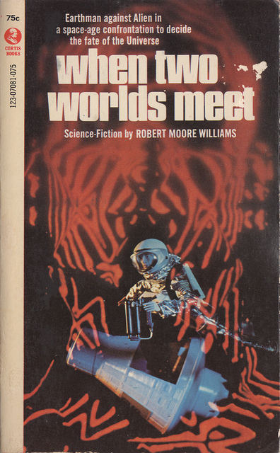
(Uncredited cover for the 1970 edition of When Two Worlds Meet (1970), Robert Moore Williams)
A while ago I put together a post on the theme of Models, Dolls, and Mannequins in cover art. Little did I know that Curtis Books (a rather minor publisher of generally minor authors) and Born, a Dutch imprint, used a substantial number of cover compositions comprised of manipulated photographs/collages etc of plastic toy spacemen in unusual alien environments. Also, a few more major publishers/magazines — Four Square Science Fiction and Analog Science Fiction Science Fact — had their own take on the theme.
I find these covers very charming and fun (sort of like a science fiction B-film from the 50s) — not necessarily artistic masterpieces. They certainly evoke childhood games with toy figurines — perhaps placed in the lawn or sandbox or amongst the grass. I’ve included a few from my previous post and another can be found in my post on Pyramids (spaceships + future earthscapes + alien temples).
I really wish I knew the artist for the Curtis book covers….
My favorite is the uncredited cover for the 1968 edition of All The Traps of Earth (1962) (by Clifford D. Simak) — the landscape evoked is hostile and alien. What are your favorites?
If you know of any other examples of covers using toy spacemen let me know.
Enjoy!
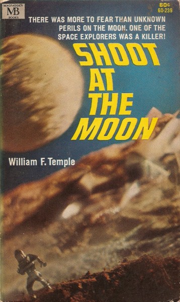
(Uncredited cover for the 1967 edition of Shoot At the Moon (1966), William F. Temple)

(Uncredited cover for the 1970 edition of Monte Cristo #99 (1970), John Jakes)
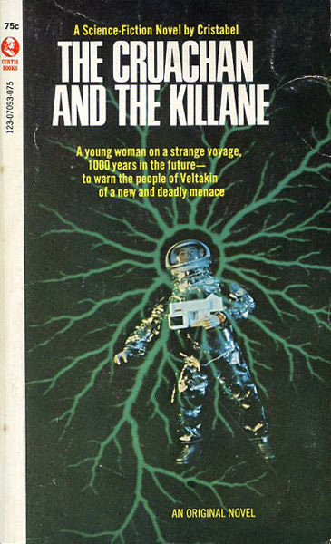
(Uncredited cover for the 1970 edition of The Cruachan and the Killane (1970), Cristabel)
 (Uncredited cover for the 1971 edition of Beyond Another Sun (1971), Tom Godwin)
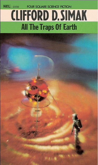
(Uncredited cover for the 1968 edition of All The Traps of Earth (1962), Clifford D. Simak)

(Alex Jagtenberg’s cover for the 1970 edition of From Carthage Then I Came (variant title: Eight Against Utopia) (1966), DouglasR. Mason)

(Studio Lemaire’s cover for the 1971 edition of Bedlam Planet (1968), John Brunner)

(Alex Jagtenberg’s cover for the 1972 edition of The Wind Whales of Ishmael (1971), Philip Jose Farmer)
(Unredited cover for the 1967 edition of FROOMB! (1964), John Lymington)

(Studio Lemaire’s cover for the 1971 Dutch edition of World Without Stars (1966), Poul Anderson)

(Alex Jagtenberg’s cover for the 1969 edition of Three Worlds To Conquer (1964), Poul Anderson) 
(Alex Jagtenberg’s cover for the 1970 edition of The Furies (1965), Keith Roberts)
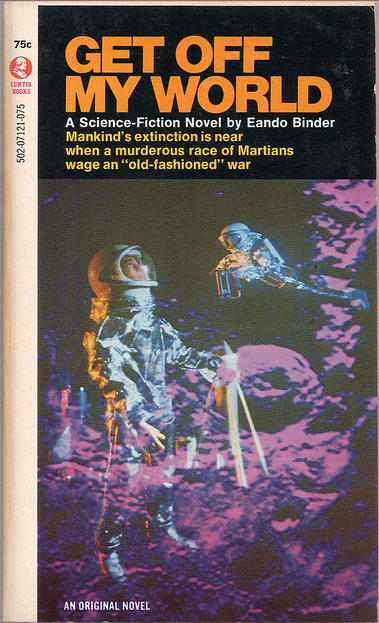
(Uncredited cover for the 1971 edition of Get Off My World (1971), Eando Binder)

(Mike Gilbert’s cover for the December 1974 issue of Analog Science Fiction Science Fact)
 (Uncredited cover for the 1971 edition of To Prime the Pump (1971), A. Bertram Chandler)
For more art posts consult the INDEX

So, Born really only had that one toy spaceman in that one pose—they used it on every one of their covers. haha 😉
Those are pretty interesting; just like you say, kinda charming for their childishness in the same way as a ’50s b-movie. Nice find!
I thought they were fun — glad you enjoyed them as well. Definitely a style restricted to the late 60s and early 70s.
What’s your favorite?
I kinda like the weird angle and text wrapping around the moon on Shoot At the Moon, the trippy terrain on All The Traps of Earth is a neat effect, and the giant neon bee bearing down on the toy spaceman on The Furies is hilarious.
Excellent as always
Thanks!
Those are too cool. The last one- To Prime the Pump… the art’s a little too literal there haha.
Haha, yeah, sci-fi art is often incredibly priapic.
Major Matt Mason, Mattel’s Man In Space, reduced to the role of male model. Oh, the ignominy!
Or, the honor… I mean, tramping across these landscapes might inspire many a reader to be an astronaut 😉
Oh my – these are just hysterical! Can you imagine the art director: “No, no, just turn the figure this way and no one will notice it’s the same figure we’ve used on the last five covers.”
And who would name a book Froomb! With an exclamation point! It’s just too much. Thanks for a chuckle this morning.
Glad you enjoyed them! But yes, John Lymington, the author of FROOMB! is a notoriously bad writing — although this is supposedly his “best.”
Re: All the Traps of Earth. That’s a Christmas tree ornament with landing legs and an antenna added on. Nice, but gluing on some macaroni would have made the ship’s surface texture more interesting, and raised the level of creativity considerably.
Regardless, still the most artistic of the bunch….. It does look like an ornament… hmm.
I don’t think that was the Major Matt Mason figure used on most of the covers – that is the original G.I. Joe Astronaut figure (seen here: http://www.flickr.com/photos/bobbdobbs/6879487906/)
Thanks for the image! Since I didn’t live during this period I have little knowledge of the toys the covers used (late 80s child)…. I never really had “nostalgic” fantasies of playing with plastic spacemen — science fiction was definitely something that came to me when I was a in my late teens.
All those are very fun. I wonder if Orbit books took inspiration from these when doing the Philip Palmer covers a few years ago.
Hmm, they do look similar. Wouldn’t doubt that the artist was inspired by these earlier examples!