
(Jack Faragasso’s cover for the 1971 edition of The Pyramids from Space (1970), Jack Bertin and Peter B. Germano)
This post is in a series on the interaction between television/film and science fiction cover art (The Statue of Liberty on Pre-1968 Magazine and Novel Covers and Cosmic Fetuses + Other Uterine Spaces). In the former, the scene at the end of Planet of the Apes (1968) drew directly on pre-existing pulp science fiction art tropes. In the later, Kubrick’s baby in a balloon scene in 2001: A Space Odyssey (1968) inspired many artists to reproduce the image of the cosmic fetus. There isn’t a direct line of influence in this post between these covers and Stargate (1994) and its sequels. I simply seek to illustrate that there has always been an obsession, verging into the sci-fi genre, with re-interpreting ancient civilizations as alien inspired. I suspect many of these published after 1968 were influenced by the “non-fiction” book Chariots of the Gods (1968).
The very thought of science fiction combining pyramids with any amalgamation of aliens, “History” Channel conspiracy content, space forces, and re-invented Egypt related mythology makes me cringe in disgust. Yes, I disliked all incarnations of Stargate although I did find its incredibly campy nature weirdly appealing… And no, I probably will not read any of the books (perhaps some of the magazines due to the variety of their content) I’ve scrounged up for this hilarious, and often artistically inept, group of covers.
We have levitating pyramids, pyramid spaceships, pyramidal temples, model spacemen, and even an egregious “Romance novel” tinged sci-fi cover with pyramids… As always, Paul Lehr’s interpretation of the theme is by far the best.
Enjoy!
If I’ve missed any let me know.

(Uncredited cover for the 1975 edition of From the Legend of Biel (1975), Mary Stanton)

(Paul Lehr’s cover for Three Trips in Time and Space (1973), ed. Robert Silverberg)
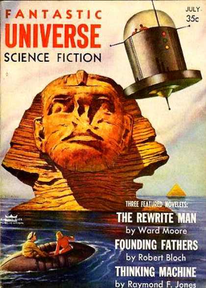
(Ed Moritz’s cover for the July 1956 issue of Fantastic Universe)

(Uncredited cover for the 1978 edition of The Epping Pyramid (1978), Colin Cooper)

(Curt Caesar’s cover for the 1954 edition of Pyramidopolis (1953), Gabriel Guignard)

(Uncredited cover for the 1971 edition of The Puzzle of the Space Pyramids (1971), Eando Binder)

(Boris Vallejo’s cover for the 1988 edition of The Vengeance of Orion (1988), Ben Bova)

(Malcolm Smith’s cover for the June 1952 issue of Other Worlds)

(Chesley Bonestall’s cover for the November 1954 issue of The Magazine of Fantasy and Science Fiction)
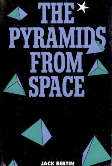
(Uncredited cover for the 1970 edition of The Pyramids from Space (1970), Jack Bertin and Peter B. Germano)
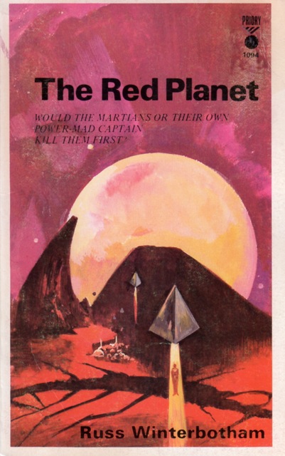
(Uncredited cover for the 1960s edition of The Red Planet (1962), Russ Wintherbotham)
For similar posts consult the INDEX

Yep…there be some pyramids! 🙂 Ha, not a one of these gives me the kind of curiosity itch that would lead me to pick up the book to read. It is not surprising given the present day beliefs of some that our pyramids are the result of alien construction that pyramids would play a prominent role in science fiction down through the last century. I’ve never been *that* interested in the melding of the two ideas to want to seek out science fiction that attempts to do so.
I do actually like the original Stargate film very much. Have never felt the appeal of the show, however. Watched half of the first season of Stargate: Atlantis because the cast looked interesting and may get back to it someday, but don’t feel any great desire to do so.
I watched all of Stargate: Atlantis — better than SG-1 in my opinion…. Hated Stargate: Universe — complete trash, a rather pathetic attempt to blend BSG (which I also didn’t like) with the original Stargate series…
But yeah, I don’t want any of these works — well, I take that back I’d snatch up the Fantastic Magazine issue and maybe even the Three Trips in Time and Space ed. by Silverberg.
And….
the November 1954 issue of The Magazine of Fantasy and Science Fiction
Oh yeah, I’d take a few for the covers…but I don’t think I’d be compelled to dive right into the story. I always enjoy Lehr’s work.
Great blog, but you spelled Chesley Bonestall’s name incorrectly.
Sorry, was currently reading through for another edit…
Thanks for the visit.
Great covers! Reminds me of the Chariots of the Gods? film poster which has stone gods, pyramids, a rocket ship AND a blue bubble with a figure inside…
Don’t get me started on Chariots of the Gods (film + book) — haha…. my grandfather had a copy of the book, and due to the fact that I’m a historian, liked to bring it up (he also had the The Spaceships of Ezekiel). But, I doubt he actually believed that drivel….
hmmm…I try to avoid a very odd man on the tram, he rants about the Spaceships of Ezekiel (and J F Blumrich) endlessly. A powerful disincentive to look at the stuff myself haha
Wow, these are some of the most awful, colour drenched, dull and uninspired cover artworks I’ve seen in ages – they truly are ‘inept’ as you say! I wouldn’t waste my precious time reading them either. Just like the utterly pathetic and irrational ‘2012 Apocalypse/Ascension’ predictions, the whole ‘Ancient Astronaut’ rubbish doesn’t appeal to me, either. Thanks for a very interesting post, nevertheless!
I agree. And lo and behold, this post gets freshly pressed (in the next few days) although it is one of my least favorite in terms of the actual art of all the gazillions I’ve posted….
While you are entitled to your opinion and in some cases it may be true, one does have to look at the art in the context of the times in which each was published – most of it was done by hand, the printing industry had none of the technology available now and nothing was done by computer… Some of them in fact, especially in the 1950s, were considered radical departures from the rather bland book covers consisting mainly of text available to the general public. We have become spoiled by the cheap availability of a photoshopped world where everyone is an artist and so tend to criticize without looking at the cultural history that surrounds these images. As an aside, if you had those issues in your library you would have a small fortune…
Thanks so much for stopping by!
EDIT: I realized after the fact that you were responding to Atomic Bark as well. In case you didn’t know, he is also exceedingly knowledgeable in the genre…. so please…
My original response:
I’m a historian by profession. Context is my game. I know this… In short, please please do not assume I’m ignorant. Also, I’ve done 50 + posts on the subject and read multiple monographs and looked through the entire cover art catalogues of every major and dozens of lesser known publishers (magazines, novels) of sci-fi up to the late 70s. There was PLENTY of brilliant work on paperbacks/magazines WAY (and I mean the 1920s) before this time in sci-fi. This particular group is very poor in comparison to the masterpieces on Astounding’s covers, any of Powers’ covers, Lehr’s covers, etc etc etc etc etc. In part because most of the presses are very average ones (I’m talking about the earlier covers in this particular post) which couldn’t afford the best artists.
Actually, I was only responding to Atomic Bark – I don’t assume anyone is ignorant, as a matter of fact you have a very interesting blog that fills a niche quite competently. While it may be true that this particular selection is not of the “best quality” as far as graphic representations of the genre go and some of it is downright clumsy, what I do have a problem with is statements that categorize others work as “inept” and not worth wasting “my precious time reading” – Is this really necessary? If your reader had phrased his response as you did by putting it into context, I would not have paid it any mind. As a historian, you are well aware that many of the artists that did these covers were inexperienced, poorly paid, overworked and many of them had little say in the “content” that they were asked to churn out – with that in mind, can’t we cut them some slack? As my grandmother once said, if you don’t have anything nice to say don’t say anything at all.. Let’s not all be critics, it is Christmas after all. Have a happy holiday!
Umm, I don’t understand this sentiment about why scholars or critics should not say something is poorly done if they are well informed about the genre (Atomic Bark runs a pretty well known sci-fi podcast etc). I mean, for example, this is a review blog primarily and I also have strong arguments for something’s merits or lack thereof.
I agree with your points about being underpaid/cranking work out etc. However, not sure you know the context of the artists in this particular post — most of the artists in the post are the MOST famous/highest paid sci-fi illustrators of their day.
Chesley Bonestell for example. The pioneer of realistic space art. The most famous sci-fi artist of all time. The particular cover in the post inspires none of the wonder his work generally does. Some of his work is on show at the Air and Space Museum….
Cover listing:
http://www.isfdb.org/cgi-bin/ea.cgi?494
Bio:
http://en.wikipedia.org/wiki/Chesley_Bonestell
You should realize that Jack Faragasso was NOT inexperienced and produced hundreds of covers and both of those are very poor in comparison to his normal output. Here are his credited covers if you are curious — of which there are hundreds of uncredited ones I identify by style.
http://www.isfdb.org/cgi-bin/ea.cgi?26524
Likewise, Lehr produced HUNDREDS of covers and was one of the best paid artists and won a Hugo award for it in 1980. Again, his cover is not nearly as well done as his normal work. If you wish to examine his incredibly MASSIVE collection to make your own comparisons here you go.
http://www.isfdb.org/cgi-bin/ea.cgi?1391
Boris Vallejo is also famous — again hundreds and hundreds of covers (his work is still in high demand) — I generally dislike his work due to my dislike of the 80s aesthetic.
http://www.isfdb.org/cgi-bin/ea.cgi?1810
So yes, a few are lesser known — generally the ones for the pulp magazines but the others are all famous/paid well for cover artists etc.
Thanks for the info.
You’re welcome 🙂 The Internet Speculative Fiction database (a lot of the links I provided) is a great resources for browsing catalogues of art and publication histories. Of course, it is incomplete but better than nothing!
I apologize if I was somewhat rude.
No problem – pre- holiday air is known to have toxic effects on all of us. Have a wonderful holiday and keep up the great work in the New Year!
Whoops, I meant ‘colour blanched’ there, not ‘drenched’!
No problem! I wish there was an edit feature.
When designing 2001, Kubrick, Clarke and collaborators considered giving the monolith a pyramid shape, but wisely chose to avoid any connection to Egyptology.
Let’s just say I’m so incredibly glad that they chose not to have a pyramid — the connotations would cheapen the film, add unneeded (and perhaps unintended) meaning, and would add unintended camp (especially considering Chariot of the Gods was published the same year the film was released)….
That’s way too many pyraminds. The sci-fi genre needs something more original than that! I mean, what’s so great about the pyramid? There are other shapes, like the Pentagon, that have more to them and are underused.
Well, the pyramid is used because of the references to ancient Egyptians. But yes, at least Kubrick’s monolith was not a pyramid 😉
I have an art post on mysterious spheres… and tens more images for later posts….
https://sciencefictionruminations.wordpress.com/2011/11/23/adventures-in-science-fiction-cover-art-spherical-spaceships-spherical-aliens-unidentified-spheres/
Science fiction and fantasy cover art, especially from the Golden Age, is one of the primary reasons that I became a fan of the genre. Exceptionally well done.
Thanks for the kind words. I prefer the more surrealist covers (Powers et al) from the 50s and 60s and 70s — but I do like Golden Age Art (1938-48)….
What a nice art cover on Wintherbotham’s book!
I think it might be Jack Faragasso’s work…
Reminds me of those Pink Floyd pyramids
Yup. That’s a lot of pyramids. I found your post really interesting. I’m going to take a poke around your blog for more. Congrats on being Freshly Pressed!
Well done on being freshly pressed Joachim! But where is Doctor Who and the Pyramids of Mars? If only I had my target novelisation to hand… Although admittedly, you don’t really see the pyramids in the TV show, no doubt due to budget constraints.
well, I was looking for non-novelizations of TV shows/movies etc… Thanks for visiting!
Reblogged this on The Markr.
Reblogged this on ARENA CAFFE.
Reblogged this on Modern Gotama and commented:
This post is in a series on the interaction between television/film and science fiction cover art (The Statue of Liberty on Pre-1968 Magazine and Novel Covers and Cosmic Fetuses + Other Uterine Spaces).
I know it’s science fiction – the fantastical, the extraordinary, etc., but sometimes I wish books didn’t have a cover illustration. It’s a book, I’ll make up my own pyramids, thank you very much, you know? Part of the joy of reading a book is imagining it for yourself, and these covers just kinda drain my cheer 😦
I disagree completely. Cover art can be truly be a work of art (these are not in the least) that adds to the experience — and I’m not talking about “correctly” representing the contents, I could care less. I’m referring to fascinating surrealist experiments etc…
For example:
https://sciencefictionruminations.wordpress.com/2011/08/01/adventures-in-science-fiction-cover-art-richard-powers-and-the-surrealist-cityscape/
And, cover art without doubt gets people reading…
I’ve heard that sentiment before too Livi and while I can respect it (even more so when the cover art is atrocious!) I am too big of a fan of the really good cover illustrators to agree. I have been drawn to read so many classic science fiction novels because of covers by Paul Lehr, Richard Powers, Michael Whelan, John Berkey…just to name a few. And I don’t find that it inhibits my imagination in regards to the story.
That is especially true with the older books whose covers often had nothing whatsoever to do with the story inside. 🙂
I hear what you’re saying. I guess I can’t take the bad examples as the general standard. I am a little traumatized by some romantic fiction covers I’ve seen in my grandma’s basement though 😉
But I have the complete works of H P Lovecraft, and the cover art is completely surreal, nothing to do with the stories. It works really well, because it looks gorgeous and captures the chaotic beauty of Lovecraft’s mind without being related to the stories. So in that case I don’t mind at all. It’s when illustrators try to put all the major plot points on the front of the book that it starts to bother me (Harry Potter, cough, cough).
I can agree with you there. I would rather see them try to capture the spirit of the novel.
Great collection of cover art! I worked on putting together an exhibition on the Polish school of film poster, which is also very surreal and symbolical.
One of my favorite scifi writers is Polish, Stanislaw Lem… he’s absolutely brilliant.
lovely work
Thanks for visiting!
Awesome post. Great to see those covers; they really supercharge the imagination. I’ve written a few unpublished novels, and I often dream about what the cover art will be like when the day comes. And I disagree with some commenters: Cover art is very important. And the art of creating book covers is a true art. Great post!
I have 50 + posts on cover art if you wish to explore more 🙂 Thanks for the reblog and the kind comments.
https://sciencefictionruminations.wordpress.com/egregious-science-fiction-cover-art/
I agree that it’s an important part of the book reading experience. Unfortunately, bad cover art often prevents people from buying good books.
Reblogged this on Cowboys Don't Swim and commented:
Loved these covers and had to reblog this!
Genius, great post!+
I didn’t see Chewbacca on any of those covers, he wasn’t born yet???
Nice post really enjoyed it.
-Ron
?
Good post with some dreadful artwork but I love it… Awful in gorgeous glory 🙂
Haha, couldn’t agree more. One of the more miserable groups of covers I’ve put together — at least artistically.
Fascinating! Love seeing common motifs run through stories and art.
A wonderful display of the way artistic styles have changed over the years, even when written themes haven’t. Thank you for sharing.
You’re welcome! Thanks for visiting.
I wonder why inverted pyramids haven’t been commonly used in fantasy and science fiction–seems they’d be really bizarre and other-worldly.
You forgot Thundercats 🙂
How precisely? These are sci-fi novel/magazine covers not sci-fi shows….
I’ve never seen this edition of Winterbotham’s The Red Planet. I think the Monarch Books cover is more appropriate… And one of my favorites. The astronauts on that cover tote rifles to fend off the toothy Martian quadrupeds and sport spacesuits of the sort which would soon become more familiar on Major Matt Mason.
Of course I am probably a depraved and decadent individual because I love the Curtis Books cover to The Puzzle of the Space Pyramids. There were several Curtis covers that used 12″ G.I. Joe dolls and toys (One employed the G.I. Joe Mercury capsule).
The Puzzle of the Space Pyramids is a lot of fun if you like early space exploration stories. The “novel” is an assemblage of stories first published in “Thrilling Wonder Stories” from 1937-1942, with a few minor changes to… bring it up to date… sorta. Each episode is told in the form of broadcasts from the expedition “via etherline radio” – The original stories were titled “Via Etherline”, “Via Venus” etc – always “Via” something-or-other.
It is a rather unknown edition — to quote isfdb — “Priory Books is a London publisher who had the books produced in Israel. Most if not all books have no copyright or printing dates.”
I do know the Monarch cover — never been a fan of Ralph Brillhart’s works — but that is probably one of his best covers.
I actually enjoy the model covers — I did a post on them a while back — will make a part two eventually as I’ve since found a lot more on the theme.
https://sciencefictionruminations.wordpress.com/2012/08/05/adventures-in-science-fiction-cover-art-models-wire-toys-spaceships-dolls-manikins/
The convenient invisible-from-the-half-butt-down move for Pyramids From Space was pretty priceless.
Haha, the art of just covering enough is a sci-fi (well, at least the cover art) staple…
You’ve used this one before so I’m surprised you didn’t remember it would work well here.
“Surprised that I didn’t remember it” — what a weird thing to say to someone… first of all, these galleries are in no way supposed to be encyclopedic collections of every relevant cover. (one reason I often have a part II and III to some themes! I identify more that fit!). There are probably hundreds that fit that I haven’t included. Secondly, try having thousands of cover images on your computer and going through them all for a themed post (it’s easier doing the one artist posts that I’ve done recently). Thirdly, I try (the operative word) not to use duplicate covers for more than one post — although I probably have in the past.