
(Uncredited cover for the 1976 edition of Mindfogger (1973), Michael Rogers)
It’s been more than four months since my last Adventures in Cover Art post…. Here is a bizarre, and perhaps less than artistically satisfying, collection of 50s-70s covers. So what do we mean by a multiplication of faces? The multiplication of a single face might be a more apt title. The theme evokes images of mind echoes (whatever they might be), bifurcated realities, abnormal, mental abilities, the manifestation of unusual nightmares, awesome alien might.
I am not sure I have a favorite although Howard Winters’ cover for the 1969 edition of The Man Without a Planet (variant title: Siege Perilous) (1966) by Lester del Rey is genuinely creepy….
Let me know if you enjoy these cover art posts. I might try to intersperse them with my reviews more regularly in the future.
What are your favorites? Are any of the works worth reading?
Enjoy!
For more cover art posts consult the INDEX
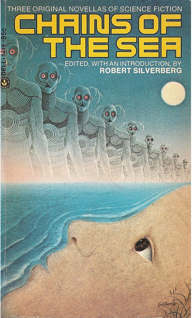
(Gervasio Gallardo’s cover for the 1974 edition of Chains of the Sea (1973), ed. Robert Silverberg)

(Richard Weaver’s cover for the 1969 of Step Outside Your Mind (variant title: New Worlds of Fantasy) (1967), Terry Carr)

(Uncredited cover for the 1976 edition of Perchance to Dream (1972), ed. Damon Knight)
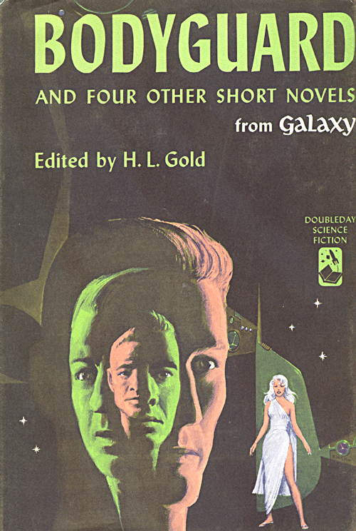
(Ed Emshwiller’s cover for the 1960 edition of Bodyguard and Four Other Novels (1960), ed. H. L. Gold)

(Uncredited cover for the 1963 edition of Split Image (1955), Reed De Rouen)

(Uncredited cover for the 1974 edition of The Byworlder (1973), Poul Anderson)

(Bob Larkin’s cover of the 1976 edition of The Face of Him (1976), Irving A. Greenfield)

(Howard Winters’ cover for the 1969 edition of The Man Without a Planet (variant title: Siege Perilous) (1966), Lester del Rey)

(Davis Meltzer’s cover for the 1977 edition of Victory on Janus (1966), Andre Norton) 
(Peter Rauch’s cover for the 1971 edition of Where Do We Go from Here? (1971), ed. Isaac Asimov)

(Milton Charles’ cover for the 1966 edition of Wild Talent (1953), Wilson Tucker)

(Richard Weaver’s cover for the 1969 edition of The Weisman Experiment (1969), John Rankine a.k.a. Douglas R. Mason)

(Uncredited cover for the 1958 edition of Split Image (1953), Reed De Rouen)

Some great covers there Joachim, a few of which grace my own library shelves. I particulary like the artwork for Where Do We Go From Here? which looks pefectly of its time. I’d love to see a few more posts like this, it’s always great to ogle some covers!
Haha, at one point I put these types of posts up regularly… nearly 90 of them at last count.
But yes, I think Where Do We Go From Here? is easily the best cover.
My favorite is chains of the sea
I bet it is one of the best books as well….
I miss these posts.
Haha, thanks.
They are fun to make — and I get to look through my entire image collections.
Cool covers! Been too long since the last batch 🙂
What’s your fav?
I own a hardcover of Bodyguard and Four Other Short Novels from Galaxy (no jacket, alas) and read at least some of the included stories in 2007. I remember liking “The City of Force” by Daniel F. Galouye. I don’t remember much about the title story by Christopher Grimm, but my notes suggest I liked it.
Yeah, I’ve wanted to read Galouye’s short fiction. I loved The Dark Universe and hated Scourge of Screamers. Hoping his short fiction can evoke some of the joy I experienced reading the former novel.
I think that I still have the Victory on Janus book with that cover!
Is it worth reading? (I find her juveniles very underwhelming)
I reread it a few years back and it was, as you say, underwhelming. However it also held great nostalgic value for me. As a kid in the 70s i consumed Andre Norton’s books with a passion, as i did with Heinlein’s juvenile fiction. ☺
I first found your blog via your cover art posts – very enjoyable!
Thanks! 🙂
I was going to pick Where Do We Go from Here because I think it has the best overall design. But I find myself drawn to the Weisman Experiment cover because it’s very old style, B&W, kind of creepy.
Please keep the cover art posts! I missed it & I enjoy your perspective and the way you arrange them.
It definitely is creepy. Here’s my favorite of Weaver’s covers…
Great post. “Wild Talent” is an interesting cover – there seems to be a mismatched face in there – makes me wonder what’s going on. I like the overall design for “Victory on Janus”. Modern covers have gotten so “vanilla.”
I think there are two pairs of faces in the Wild Talent cover.
Well, I don’t think that these particular covers are very indicative of the brilliance of some of the 40s-70s art used.
You’ve obviously pored over a lot of covers and put together a very representative list, but why do I get the feeling there are still many out there with echoed faces, fractious faces, faces within faces…
If most of my books weren’t in boxes I’d have a look… Nice post. 🙂
Of course, I try not to imply coverage in these types of posts…
I have made numerous other face themed art posts in the past (including one on Richard Powers’ faces) — one of my favorite SF art themes.
For example, I just found this crazy cover! (wish I owned a copy)