
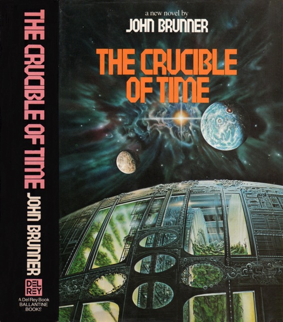
(Don Dixon’s cover art for the 1st edition of The Crucible of Time (1983), John Brunner)
This post is about a Don Dixon SF space art cover that gives me nostalgic chills. But first, a rumination….
As with so many new readers, my first science fiction adventures–almost a decade and a half ago–followed the Hugo Awards closely and the back catalogue of the established male “masters” (often those whom my dad remembered reading in his childhood–Heinlein, Clarke, Brunner, Herbert, Pohl, Anderson, etc.). And boy did John Brunner feature heavily! I read everything of his I could get my hands on. From the genius that STILL is Stand on Zanzibar (1968)–my first New Wave SF novel–to the half-hearted pulpy adventures (Born under Mars, Meeting at Infinity) that scream paycheck. These novels were some of my first reviewed works on my site (John Brunner review list below). As my readers know, my tastes have changed radically as my willingness and knowledge of lesser known authors and/or “unpopular” authors expands as I read more along the edges. Brunner’s radical New Wave SF (and at some degree his short fiction) remains a constant.
All of this is to say that it’s unsurprising that Don Dixon’s cover art to John Brunner’s The Crucible of Time (1983) provides one of the few SF covers that fills me with “nostalgic” yearning. Of all the John Brunner books I read, I remember little of the story itself—the cover commanded my attention. The depths of space arrayed with alluring stars and unknown planets… And, most importantly, the unusual spaceship filled with trees, hurtling into the unknown reaches of the galaxy. Although I seldom pay attention to these types of covers anymore when I peruse the shelves of used bookstores, Dixon’s vision casts a special mnemonic spell–a vision of a younger me exploring Brunner’s varied and expansive oeuvre and finding favorite places among all the tattered spines.
Yes, my tastes have changed from the expansive canvases of Don Dixon and his ilk to Anita Siegel‘s collages and the uncanny bodies of Wojtek Siudmak, but whenever I see The Crucible of Time on my shelf I pause a moment and reflect.
______
I’d love to know your nostalgic piece of SF art–be it space art or not… Perhaps the first cover that you “remember” or really inspired you to read more science fiction.
If you need a place to jog your memory, check out the following tumblr 70s SF art and browse my 150+ SF art posts.
______
List of John Brunner’s novels + collections I’ve reviewed.
- Bedlam Planet(1968)
- Born under Mars(1967)
- Double, Double(1969)
- The Dramaturges of Yan (1982)
- Entry to Elsewhen (1972)
- Interstellar Empire (1976)
- Meeting at Infinity (1961)
- The Wrong End of Time(1971)
- Total Eclipse(1974)

As a teenager, I was enthralled by Dean Ellis’ cover for Dhalgren by Samuel Delany.
Thanks for the comment! Yeah it’s a good one (I placed the link below for anyone who is curious).
Did you read it as a teenager?! In my particular case, I remember virtually nothing about The Crucible of Time — other than it was from an alien perspective….
http://www.isfdb.org/wiki/images/8/80/DHLGRNWQFR1975.jpg
The Chris Foss Asimov covers take me back to summers in the 80’s reading science fiction in the garden. I think I owned at some point every single one of them. Also the fact he did an album cover for Ian Gillan helped at the time.
http://www.chrisfossart.com/2011/07/asimov/
As an American, I seldom encountered Foss’ covers in used book stores. I do remember seeing an art book of his work (or containing his work) on a trip to Philadelphia…. But yes, he definitely seems to be one of THE “nostalgic” SF artists.
His covers were prevalent in the UK for many authors. You are right since coming to the US the covers are not really seen a shame as he had a unique feel for alien spacecraft.
Confession time: To the chagrin of all my UK friends (and others), I am not a fan of Chris Foss’ art.
BUT, as this post was about the “nostalgia” behind covers, I absolutely understand his allure and especially how compelling his work must have been for teens encountering SF.
Don’t worry, the ability to drag the teenager into the world of space-opera and other sf is a skill. My tastes have developed and I still remember the joy of seeing a new Boss cover on the shelves.
Do you have any particular Foss Asimov cover that resonated with a young you?
I think the Naked Sun or Bicentennial Man resonate particularly. I think it is the giant robots/machines. Foundation was the first Asimov book I bought, I remember being disappointed that the book was not as exciting as the cover. I read many authors because of those covers, Philip K Dick, Van Vogt and Smith and Niven. I would actively search for the covers in bookstores. My tastes have changed but the covers are unforgettable.
Asimov’s The Currents of Space (1952) was the first SF novel I read — long before I was interested in SF as a genre… but the edition I read (one of the few my dad still had from his youth) was “graced” with a miserable Allan Mardon cover.
I’m a new enough SF reader (ca. 2005-06, if I exclude the sporadic books read in high school, etc.), so I don’t have that “nostalgic” link to the genre that others might have. However, as far as influential covers, one that comes to mind is Alex Ebel’s art for “Left Hand of Darkness”:
I think I first read this book in the heart of winter, and that + the folklore components in the book are sort of mixed together in my memory.
I have the same edition. When I read it as a teenager, I’m not sure I made any connection between the cover and its contents. I, for one, am only now noticing the incredibly small figure at the base of the ice!
Yep. That was a detail I didn’t notice right away either!
You know, I really should have looked at this cover when I read the book years and years ago—the single ice monolith attempts to show the androgynous nature of the Gethen people.
I now spend a great deal of time looking at the art while perusing the shelves….
Regarding Brunner, I never read him as a kid and dropped reading sci-fi for a couple of decades in my 20s and 30s, When I rediscovered science fiction, I was lucky enough to read several of Brunner’s better novels (Stand on Zanzibar, Shockwave Rider, The Sheep Look Up, and Crucible of Time — not coincidentally his best selling books) before stumbling across and reading almost all of the large number of mediocre and awful novels he wrote. The worst is almost certainly The Atlantic Abomination, which would very probably be a favorite for the award — if there was an award — for Worst Science Fiction Novel Ever. As for The Crucible of Time, it’s a fix-up novel and is a well written story about the triumph of science over religion, and attempted escape from a star system endangered by a nearby supernova.
I am not sure what it is about Brunner, but one feels compelled to seek out other little bits of his genius that must exist in his legions of pulpy and forgettable adventures…. As a younger person, it took me a while to realize he needed a consistent paycheck to allow him to give him the opportunity to write his best works — hence the piles of lesser (short) schlock.
I have not read The Atlantic Abomination — but its cover has always been memorable. The piled bodies holding up the shapeless abomination….
Another one of my favorite authors, Robert Silverberg, receives at least one of the “Worst Science Fiction Novel Ever” awards — Master of Life and Death (1957).
Mine would probably be the Corgi SF Collectors’ Library edition of Arthur C Clarke’s ‘The Other Side of the Sky’ — I was probably eleven or twelve when I bought this, back in the early 70s. (I can’t conveniently look up the artist or cover designer at the moment, since my books are packed for a move.) The Corgi covers haven’t dated well, and nothing about the glossy pebbled finish, the lurid purple backgrounds, or the title typeface apparently purloined from a second-rate scimitar & sorcery potboiler exactly says ‘SF’. But this would have been one of the first SF books I read — Clarke was my gateway into written SF — and it helps somewhat that the spaceship on this cover bears a passing resemblance to the Mars explorer vehicle which features in the Thunderbirds ‘Zero-X’ movie (which, in turn, would have been the first big-screen SF I saw, back in 1968 or so).
There are clearly far better SF covers out there, but this one resonates for reasons having nothing to do with its artistic qualities.
Thanks for the comment.
The Corgi covers are often ridiculously fun — I’m unabashedly a fan of Josh Kirby’s odd art.
Do you mean the 1963 Corgi edition? (Kirby is the artist)
Or this one? (I suspect this Tim White space art cover is what you’re referring to).
If not, here is the full publication listing: http://www.isfdb.org/cgi-bin/title.cgi?38041
I see that the 1966 Corgi edition of the collection reused Brillhart’s art for PKD’s Martian Time-Slip!
Joachim,

The one piece of art that I remember as having the biggest impact for my early reading was the December 1964 issue of the World of If magazine I likely read it in 1965. The cover was Gray Morrow’s painting of a time machine shaped like a triceratops for Robert F. Young’s When Time was New. My mother threw the magazine away during house cleaning and it took me over thirty years to find a buy another copy.
I completely understand how this would be THE nostalgic cover…. it’s especially effective as the T-rex is facing us — and we can’t see the control panel. It’s a wonderful cover.
Reblogged this on cozZzmonautica and commented:
Thanks for your thoughts on Brunner and giving in to ‘nostalgia’ on this one post. The Dixon cover is great also a
has a strong Silent Running (one of my favorite space classics) Biospherics feel. First covers to heart for me where – two book from the Romanian sci-fi collection collage art by Peter Pusztai – Overlords of War and Michael Crichton Andromeda Strain as well as a French cover version of Arthur C Clark 2010 Space Odyssey.
I was also thinking of Silent Running! (A film I wanted to love but couldn’t — that said, I watched it years and years ago).
I’ve not heard of Peter Pusztai before. I’ll look him up.
I’ve featured only one post on Romanian SF art in the past — the 60s/70s covers of Marcela Cordescu.
https://sciencefictionruminations.com/2018/01/13/adventures-in-science-fiction-and-fantasy-art-women-sf-illustrators-of-the-1960s-70s-part-v-the-eerie-figures-of-marcela-cordescu/
Great to see the covers by Marcela Codrescu – anyway congrats on the whole woman artists covers series. On a personal level Legendele Țării lui Vam with its brooding otherworldly prehistoric world veering into weird literature invented mythologies really marked my childhood.
Recently I’ve see an incredible exhibition at gallery One/Sofia Bulgaria with historical examples of socialist era sci-fi cover art. Especially the work by Tekla Aleksieva for the phenomenally popular Biblioteka Galaktika series. All their covers are exceptional. I’ve been posting some here https://www.instagram.com/p/BjUyiifFAjp/?utm_source=ig_share_sheet&igshid=l56zt50xh83i
If you want to do a guest post on Bulgarian SF covers, send me an email at ciceroplatobooks(at)gmail(dot)com. Those are fantastic…. I want to know more.
For some reason I missed your comment — my apologies! (better late than never?)
Thank you for the link. I’ll browse it immediately….
No particular cover, but I was impressed and awed by the comic work of Gray Morrow, Steve Ditko, Bernie Wrightson, and Mike William Kaluta. I was also impressed by the paperback, and magazine covers of Jeff Jones, Mike Hinge, James Bama (those Doc Savage covers), and Ken Barr. I also loved the magazine covers of Earl Norem, Kelly Freas (that Analog December 1972 cover), Ron Walotsky ( http://www.isfdb.org/wiki/images/b/be/FSFJUL70.jpg) and the March 1973 cover of F&SF http://www.isfdb.org/wiki/images/c/c9/FSFMAR73.jpg by the Dillions. And of course, anything by Virgil Finlay. All had that sense of wonder that an early me couldn’t get enough of.
You’re in luck! Last night I posted a quick write-up on a selection of Hinge’s magazine covers.
My most formative SF art wasn’t a book cover, but a book. And I don’t know what it was.
It was a book of spaceships, each one with a description and full-page artwork. As I remember it, it was in the style of Foss, but I don’t know if it was actually him – if it was, I’m not sure what it could have been. I’m also not sure if it was serious worldbuilding for a specific setting, or whether it was ad hoc retconning to explain the artwork. Wish I knew what it was, so if that jogs a memory for anyone…
(it was in my school library, so I never actually had a copy)
I was more a fantasy reader than a SF reader as a child, so the really formative artwork for me was Tolkien, Lee and above all Howe, as well as Geoff Taylor (who created the covers for David Eddings and Raymond Feist). And I guess Josh Kirby for his Pratchett covers.
In SF, I guess the earliest covers that struck me were by Asimov (some by Foss – nightfall! – and some by Tim white). Later, I found Steve Weston’s Pern covers.
Hmm….. I too encountered a spaceship art book in a used book store in Philadelphia on a trip which had Foss-esque art. My dad did not buy it for me but I remember paging through it fondly.
I was also a fantasy reader — but it was maps rather than lame fantasy art covers that pulled me in! The map at the beginning of The Hobbit, the map in Le Guin’s Earthsea series, and all the maps in a wonderful book my uncle got me — Alberto Manguel and Gianni Guadalupi’s The Dictionary of Imaginary Places.
…obviously I didn’t consider them “lame” at the time. And mostly I still don’t. I don’t see why, say, the iconic, stylised Tolkien cover for The Hobbit, or Howe’s fall of Gondolin on the cover of The Silmarillion, is any “lamer” than your SF covers mentioned here.
I should not have lumped the entire genre into my comment.
However, to be clear, I’m not talking about my favorite covers or ones of particular artistic value in this post or in any of the discussion above. I’m talking about nostalgia and cover art. What I remember nostalgically does not necessarily sync up with artistic worth. And my nostalgic memories are NOT your nostalgic memories. I have no nostalgic memories of any particular Tolkein cover! But I adored the maps!
And thus, yes, I snark at cruddy covers like Darrel K. Sweet’s The Eye of the World (1990) — which is what immediately popped into my mind as it was fantasy cover I remember vividly from my childhood.
Ironically, that’s probably the best of the WOT covers…
And yes, there are some cheesy fantasy covers, but there are also some appalling sci-fi covers! It doesn’t have to be genre-against-genre…
But yes, the map from The Lord of the Rings was wonderful, and even more so the weirder style of map from The Hobbit. I would go on to spend an entirely undue amount of time poring over the maps in Eddings and Feist novels, not to mention Dragonlance and Forgotten Realms. And, dipping back into sci-fi, Pern, with its confusing, apparently scientifically calculated, plots of threadfall patterns. Oh, and Narnia, of course! At least, I remember the one from The Horse and His Boy.
I even have Fonstad’s Atlas of Middle Earth…
Umm, again, not trying to implying any genre-against-genre comparison. I am simply talking about covers that are nostalgic to me as I encountered them as a young person. And the fantasy covers I remember were cheesy…
Was it this one?
Wow!
I don’t know, but it certainly looks like it could have been something from that series, yes. Tempted to buy it just to find out…
Thanks!
Yeah, I think the book I referenced encounting was also in this series.
My nostalgic covers were the ones that Jack Gaughan did for the mid-60’s run of E.E. “Doc” Smith’s Skylark series, but especially the Lensman series. Those bug-like spaceships really caught my eye. My parent’s would go shopping on a Friday night and just leave me in front of the magazine and book rack of the store. I made my way through the entire Lensman series that summer, one Friday night at a time.
Have you ever reread Smith’s series? I tried desperately to read one of them a few years ago — I found it so dry and stodgy….
I’ve always found Gaughan something of an artistic chameleon. He moved so easily between those fantastic pulp art visions (spaceships, ray guns, action!) to his more artistically adventurous covers for Walker & Co.
https://sciencefictionruminations.com/2015/12/21/adventures-in-science-fiction-cover-art-jack-gaughans-covers-for-walker-co-1969-1970/
All in all, no wonder you found that set some compelling as a kid!
Let’s see if I can post a link to my blog where I go on and on about this:
https://bernalalpha.blogspot.com/2011/02/galactic-patrol.html
The Crucible of Time is actually my favorite Brunner novel. The first chapter alone is unimpeachable and wonderfully imagined. Suggest you add it to the review list.
I have fond memories of it, despite the vague nature of the memories. That said, I rarely reread. This would not be the Brunner I’d return to.
This Ed Emshwiller cover for A. E. Van Vogt’s The World of Null-A (spotted in an Edmonton, Alberta used bookstore) turned this lifelong scifi fan into a pulp scifi obsessive!
It spawned a sizeable collection of vintage paperbacks and even a tattoo!
https://pictures.abebooks.com/inventory/31329179525.jpg
https://www.instagram.com/p/DWw_p9pArVG/
Nice. I enjoy the art — the book? No so much.
For my most recent SF reading projects, definitely check out my year-in-reviews:
2025
2024