
Allison’s cover for the 1978 Italian edition of Tanith Lee’s Volkhavaar (1977)
Mariella Anderlini (aka Allison) (d. 1992) was a behemoth of Italian SF art (note 1). Her covers graced entire years of science fiction editions for various Italian presses—for example, she illustrated the complete Slan. Il Meglio della Fantascienza series for Libra Editrice. Her work was ubiquitous and fantastic.
Over the years, loose cover art post sequences emerge from the back catalog of my site (both conscious and unconscious)–and one topic I return to regularly are SF covers by Italian women. Female Italian cover artists in the decades I am most interested in (50s-mid-80s), made up a far larger percentage of covers than in the US or the UK. The majority, including Luciana Tom Matalon and Fulvia Levi Bianchi (post forthcoming), were mainstream artists whose work was used occasionally used by SF presses.
Earlier posts in this sequence (includes two on Allison):
- The Cosmic Glimpses of Luciana Tom Matalon
- The Galassia Covers of Allison aka Mariella Anderlini
- Haunting Landscapes and Cityscapes: The 1970s Italian SF Art of Allison aka Mariella Anderlini
This post combines two of my favorite creators: Tanith Lee–Electric Forest (1979) and Don’t Bite the Sun (1976)–and Allison. While I’m not sure these are Allison’s best covers (see the two posts linked above), the combination weaves a compelling spell. Allison enjoys solitary figures arrayed against an evocative landscape. There’s a brittle isolation that permeates the layers. I am also fascinated by the popularity of Tanith Lee in Italy–most of her early novels were translated and released within a few years in the Italian market.
What are your favorite covers from the bunch?
Note 1: I do not know much about her biography — including her birthday and whether she is still alive. Let me know in the comments if you know more!

Allison’s cover for the 1981 Italian edition of Tanith Lee’s Day by Night (1980)

Allison’s cover for the 1977 Italian edition of Tanith Lee’s The Storm Lord (1976)

Allison’s cover for the 1978 edition of Tanith Lee’s The Birthgrave (1975)

Allison’s cover for the 1978 edition of Tanith Lee’s Don’t Bite the Sun (1976)

Allison’s cover for the 1978 Italian edition of Tanith Lee’s Vazkor, Son of Vazkor (1978) and Quest for the White Witch (1978)

Allison’s cover for the 1982 edition of Tanith Lee’s Electric Forest (1979)
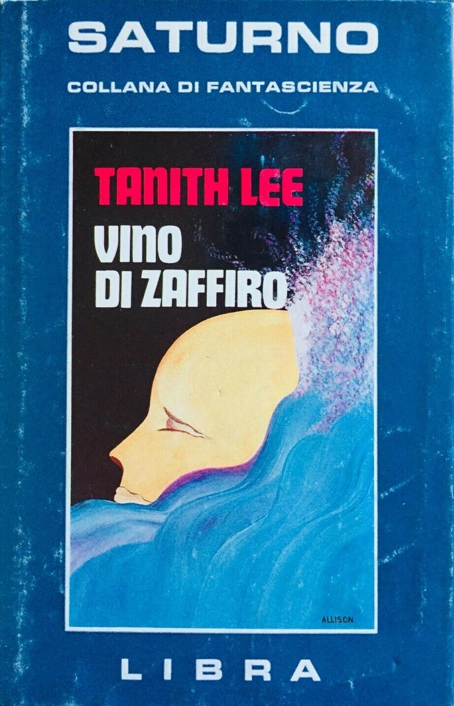
Allison’s cover for the 1978 Italian edition of Tanith Lee’s Drinking Sapphire Wine (1977)
For cover art posts consult the INDEX
For book reviews consult the INDEX
For TV and film reviews consult the INDEX

Lovely! Does it reflect the content?
Which one? I’ve only read two Tanith Lee novels. My conclusion from the two I’ve read is “slightly…” I mean The Electric Forest cover has two trees. And the Day By Night cover is the moon in the daytime. And the Don’t Bite the Sun (1976) cover might be a desert? (which is a plot point). That’s about as far as the content matching goes….
Note: I’m not of the mind that reflecting the content is important. I think the general “feel” is more than enough. And ubiquitous blobby spaceships populated UK covers like some virulent disease and few complain about endless Foss, Elson, and Hay monstrosities. hah.
Those are certainly better than any generic stock pictures. At the same time, I like the cover to give away something essential.
I buy books based on the author — not covers (although I bet there’s an instance where I have). Nor was I alive at the time, so I have no memory of a particular style that I currently enjoy. From this perspective, I rather it simply be nice art!
I‘ve bought books only for its cover. Eg the Special Dune edition with sprayed edges. Didn’t need it, I have it multiple times.
A cover helps and appeals. It shouldn’t be the only thing though.
To some people they must!
I often make a distinction — while I compulsively buy old books, I’m a reader not a collector. I own no duplicate editions. If I accidentally acquire one, I send them to friends in exchange for books I don’t own. I also regularly purge my collection of the chaff. And when my cat peed (I know, wonderful) on a pile I’d read and enjoyed a few years ago, I did not purchase new copies.
There is nothing more noble than a cat‘s blessing. 🤣🙀
Check out her cover for Simak’s City — which I suspect you’ve read.
I think you’ll see how she interacts with the material.
https://sciencefictionruminations.com/2016/07/23/adventures-in-science-fiction-art-haunting-landscapes-and-cityscapes-the-1970s-italian-sf-art-of-allison-a-k-a-mariella-anderlini/
That’s great and has a different style.
I can’t remember if I‘ve read City. No, it’s on the tbr.
Let’s just say, to be more than just a random futuristic “city” you’d need a dog or a robot to indicate that the artist read the book. I suspect, but I do not know, that the press would commission a large quantity of canvases which the artist might not know much about what they’d appear on.
I like the cover for the 1978 edition of Tanith Lee’s Don’t Bite the Sun (1976). Maybe because it’s vaguely suggestive of a Monet – if only in terms of the floral details.
Yeah, it has an impressionist palette but more surrealist forms.
Lee’s novel is interesting as well: https://sciencefictionruminations.com/2019/06/29/book-review-dont-bite-the-sun-tanith-lee-1976/