
(David Bergen’s cover for the 1978 edition of Sea-Horse in the Sky (1969), Edmund Cooper)
Here’s Part II of my cover art series on the delightfully nebulous theme of mysterious spheres (Part I). I’ve selected a variety of spheres: including spheres elevated in the air (balloon representations of the sun? planets? large scale planetary orbit models?), spherical eggs hatching men?, alien warships, alien (and human) transportation devices, strange atomic technology, obvious Death Star ripoffs, fields littered with the perplexing shapes….
… and even the simple unadorned sphere held aloft to indicate the pure delight of mystery, or a mysterious planet waiting to be explored in the vastness of space.
I had no idea that David Bergen was capable of such fantastic cover art. His cover for Edmund Cooper’s Sea-Horse in the Sky embodies sheer wonder/utter mystery — I would desperately want to pick up that cover if I found it in a shop! (alas, I’ve found that Edmund Cooper’s works generally do not convey that sort of wonder).
The uncredited cover for the 1963 edition of Gateway to Tomorrow (1954) is also in the top tier of covers I’ve come across so far… And the uncredited cover for the 1980 issue of Michael Moorcock’s Behold the Man (1969) certainly makes the viewer behold the man!
What are your favorites?
Enjoy!

(Uncredited cover for the 1971 edition of Digits and Dastards (1966), Frederik Pohl)

(Bruce Pennington’s cover for the 1980 edition of 3 to the Highest Power (1968), ed. William F. Nolan)

(Uncredited cover for the 1963 edition of Gateway to Tomorrow (1954), ed. John Carnell)
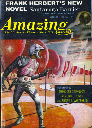
(Uncredited cover for the October 1967 issue of Amazing Stories)

(Uncredited cover for the 1980 edition of Behold the Man (1969), Michael Moorcock)
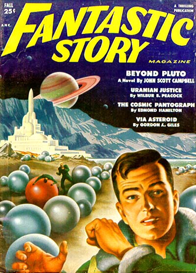
(Uncredited cover for the Fall 1951 issue of Fantastic Story Magazine)

(Leo Summers’ cover for the June 1969 issue of Analog Science Fiction/Science Fact)

(Uncredited cover for the 1956 edition of The Silver Locusts (variant title: The Martian Chronicles) (1950), Ray Bradbury)

(Virgil Finlay’s cover for the May 1942 issue of Super Science Stories)

(Howard V. Brown’s cover for the january 1940 issue of Thrilling Wonder Stories)

(Uncredited cover for the 1972 edition of The Eyes of the Overworld (1966), Jack Vance)

(Uncredited cover for the 1969 edition of The Evil That Men Do (1966), John Brunner and The Purloined Planet (1960), Lin Carter)

(Bernhard Borchert’s cover for the 1949 edition of Atomgewicht 550 (1935), Hans Dominik)

(Uncredited cover for the 1973 edition of Tomorrow is Too Far (1971), James White)

(Carl Lundgren’s cover for the 1982 edition of Where The Time Winds Blow (1981), Robert Holdstock)

(Gray Morrow’s cover for the November 1965 issue of If)

(Frank R. Paul’s cover for the December 1932 issue of Wonder Stories)

(Jack Gaughan’s cover for the 1968 edition of World’s Best Science Fiction: 1968 (1968), ed. Donald A. Wollheim and Terry Carr)
For similar posts consult the INDEX

Fine set of mysterious balls there. I have a couple of these books, although an earlier edition of 3 to the Highest Power which isn’t so globule-based.
Thanks for the comment and the visit! Is the earlier edition simply a planet? http://www.isfdb.org/wiki/images/1/1a/TTHHTPWRED1968.jpg
How are the actual novelettes in the collection? I’ve still not gotten around to reading any of Chad Oliver’s works — I want The Winds of Time for Richard Powers’ stunning cover…
The planet cover is the edition I got, yes.
I enjoyed the Oliver story — “The Marginal Man” — but I’m kind of a sucker for Oliver and have him on my buy-on-sight list. That’s about the exploration and contact people examining the Planet of the Weekians and finding them all the more curious until one of the explorers feels kinship with the locals. That’s the sort of very gentle anthropological story that Oliver did best, and pretty near uniquely for the time. (He was a real anthropologist in his day job, and bits of the expository pieces feel like what he might have been explaining to his Intro classes at the university; if so, he was an interesting lecturer with a friendly, natural style.)
The Bradbury piece was “The Lost City Of Mars” where the lost city turns up whatever the humans intruding into it want to imagine. I don’t remember being impressed by it, probably because the premise has worn off its novelty by now.
Sturgeon’s was “One Foot And The Grave”, about which I confess I don’t remember anything. Other reviews, including one from The Onion AV Club, note it’s got witchcraft and a meddling fool who develops a cloven foot, but I just haven’t got an opinion about it at this remove.
Well, witchcraft and meddling fools makes me NOT want to read the Sturgeon… i’ve never been much of a Bradbury fan but that one seems slightly interesting. Oliver seems like my cup of tea…. hmm…
Amazing what you can do with a sphere.
Most definitely…. 🙂 Thanks for visiting.
My alltime favorite Mysterious Ball cover has to be a Paul Lehr cover for Lem`s SOLARIS. It`s big, it`s weird, it`s cool, and it has nothing to do with the story, which makes it a winner in my book. Plus Paul Lehr can do no wrong where I am concerned.
This one?
Yeah, it’s great.
I dunno, some of his human forms can be pretty lame.
At least the background in the second one is cool, the first, not so much.
But yes, one of my favorite sci-fi artists, although I enjoy Powers’ work more.
Oh my god, Hans Dominik… I loved his novels to pieces when I was, umm… twelve? Wouldn’t touch them with a ten-foot pole today, of course (I seem to remember that he was very popular during the Third Reich).
My favourite by a wide margin is the one for the Moorcock volume, just love the concept and the colours on that one (although the stark black letters rather ruin the effect).
Hmmm, yeah, I had never heard of him. But, I tend to find lots of cool covers browsing through people’s flickr sets on sci-fi art. Hmm, I wonder why he was popular during the Third Reich.
I enjoy the Moorcock volume but prefer the uncredited cover for the 1963 edition of Gateway to Tomorrow (1954) and the first illustration (for its sheer wonder).
I don’t think you missed anything for not having read Dominik – I admit my memory is a tad vague after all those years, but I remember him as something like the German version of E.E. Smith – rather militaristic and a rather disturbing tendency for the villains making life hard for our fair-skinned heroes to be of Asian extraction. The versions I read would probably have been abridged of his worst excesses, but the original novels are supposed to be quite openly racist, lots of stuff about the superiority of the white race and its destiny to rule over inferior black and yellow races… well, you can imagine it, pretty unsavoury stuff.
And I’d probably agree on the Moorcock covers (if I knew what they looked like) – but do those have Mysterious Spheres on them? 😉
I like the first cover for “Sea-horse in the Sky” Reminds me quite a bit of a piece of art I’ve seen in the strategy game Sins of a Solar Empire. Perhaps it provided some inspiration?
Do you have an image of the art? I have no idea — who knows what game designers are inspired by or dredge up from their childhood reservoir of images (perhaps from sci-fi they no longer know the titles of).
I’ll see if I can get an image of it!
Yes, that is the SOLARIS cover, I really dig that one. It looks like a particularly tough miniature golf hole, but I like it. His human figures are stylized, sure, but so are H. R. van Dongen`s [ or Giger`s] or El Greco`s, and Powers`s, too…..Powers is phenomenal, his work is in the tradition of a couple 20th century painters whose names my cough syrup-drenched brain won`t regurgitate. Another 20th cent. surrealist in a totally different style was Burchfield, whose stuff looks like killer plants growing wild. But Powers and Lehr are among the SF artists who take truly SF+like approaches–not just illustrating quasi-realistically but doing daring, ODD art.
I agree with your statements on Lehr and Powers…
That cover to Gateway to Tomorrow rocks out. Nice selection!
I agree. I wish I could figure out the artist. It appears, due to the style and the elevated spheres on poles, to be the same artist as the one who did the cover for Bradbury’s The Silver Locusts above as well….
The ‘Sea-Horse’ cover made me think you should post a series of covers containing robed figures carrying scepter like objects. One of the ‘A Canticle For Leibowitz’ covers comes to mind.
Haha, I know the very cover you are referencing….
We’ll see. I have other plans up my sleeve at the moment.
Nice to see one by Robert Holdstock……have you read his “Mythago Wood”?It’s a fabulous novel I can’t describe it if you haven’t.
I have not yet. Although, I have heard of it and even remember what the cover looks like!
Haven’t read that one though.
That the British one by Grafton?