
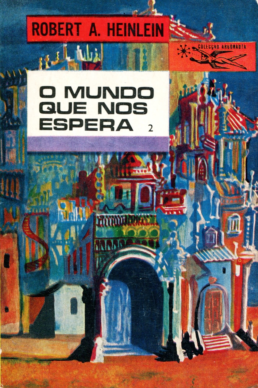
(Cover for the 1967 edition of vol. 1 of The Moon is a Harsh Mistress (1965), Robert A. Heinlein)
The Portuguese painter and illustrator Lima de Freitas (1927-1998) created a vast number of covers for the Portuguese press Livros do Brasil. For more on the range of art he produced in his career consult his wikipedia page [here].
A while back I reviewed Mordecai Roshwald’s Level 7 (1959) and discovered de Freitas’ amazing cover (below). More than any of the US editions, it evokes the claustrophobic tone of the novel (and even some of the surreal elements).
As the son of two architects, architecturally inclined SF covers always fascinate. Thus, as an introduction to his art (if you do not know it already) I have collected a handful of his cityscapes. They are surreal masterpieces. Lima de Freitas’ covers emphasize the city as a canvas, the textures of human occupation–for example, the 1964 edition of Edmund Cooper’s Seed of Light (1959) (my review).
For a catalogue (in Portuguese) of Livros do Brasil‘s SF novels (published under the Argonauta imprint) consult this encyclopedic site Colecção Argonauta. Even if you cannot read Portuguese (me!), browsing the images will be well worth your time.
A new favorite SF artist….
It is fascinating seeing non-English language covers for some of the great classics of the SF genre—Asimov, Heinlein, Simak, etc. Although, you couldn’t pay me to reread Heinlein’s agonizingly awful Farnham’s Freehold (1964). Also, Livros do Brasil published quite a few French SF authors in translation–Stefan Wul, Paul Frenchm Pierre Versins, etc)–which remain (mostly) unavailable for English readers.
As always, what are your favorites? Why? Has anyone read novels/short fiction by the French SF authors below?
Enjoy!
For more Adventures in SF art posts consult the INDEX
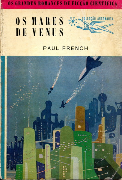
(Cover for the 1959 edition of Lucky Starr and the Oceans of Venus (1954), Isaac Asimov)
(Cover for the 1964 edition of Seed of Light (1959), Edmund Cooper)
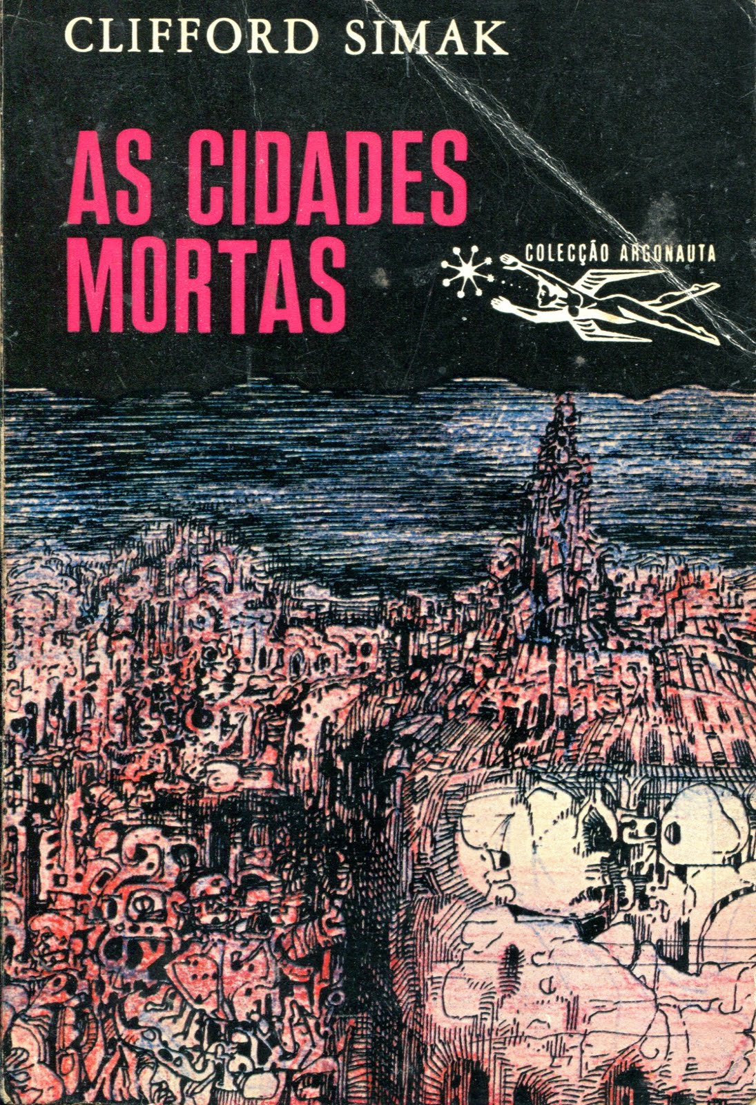
(Cover for the 1967 edition of City (1952), Clifford D. Simak)
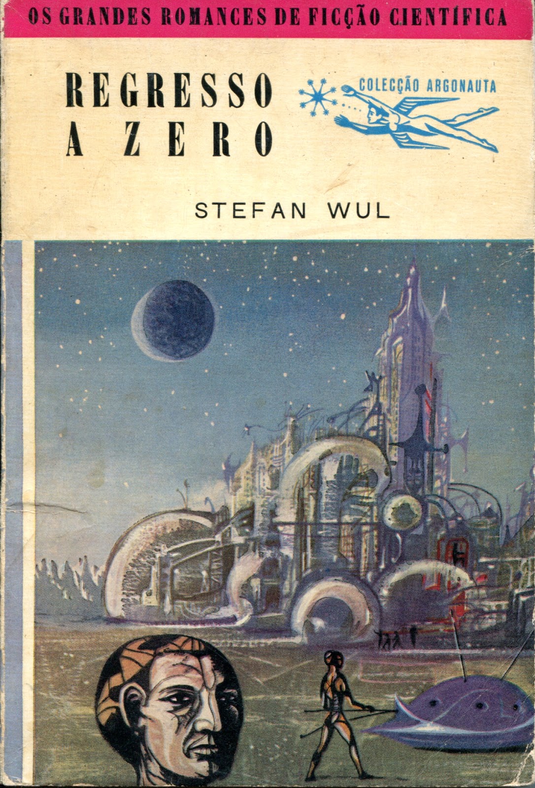
(Cover for the 1959 edition of Retour à “O” (1956), Stefan Wul)

(Cover for the 1956 edition of Lucky Starr and the Pirates of the Asteroids (1953), Isaac Asimov)
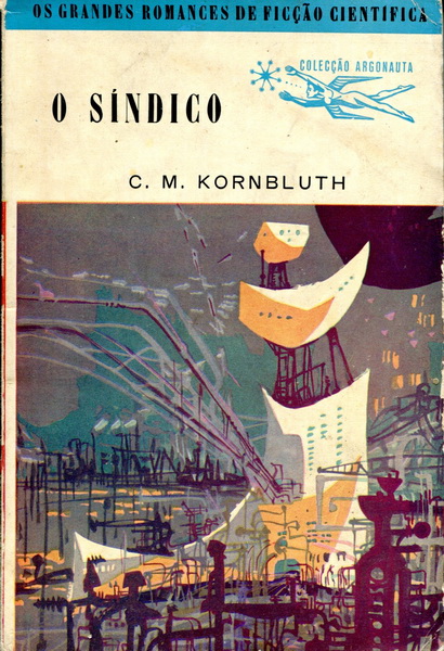
(1957 edition of The Syndic (1953), C. M. Kornbluth)
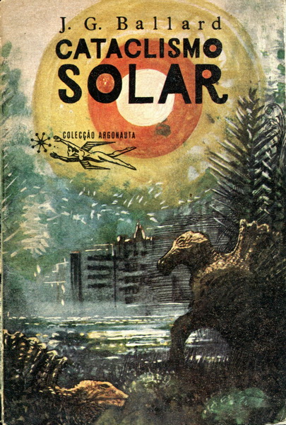
(Cover for the 1966 edition of The Drowned World (1962), J. G. Ballard)

(Cover for the 1964 edition of Foundation and Empire (1952), Isaac Asimov)
(Cover for the 1967 edition of vol. 2 of Farnham’s Freehold (1964), Robert A. Heinlein) 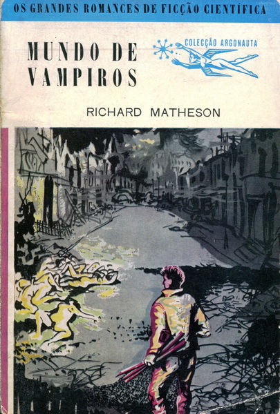
(Cover for the 1958 edition of I Am Legend (1954), Richard A. Matheson)
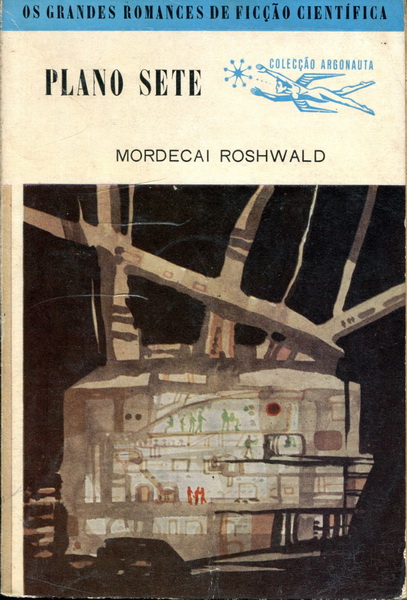
(Cover for the 1963 edition of Level 7 (1959), Mordecai Roshwald) 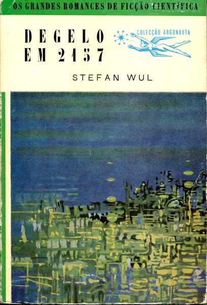
(Cover for the 1963 edition of La peur géante (1957), Stefan Wul)
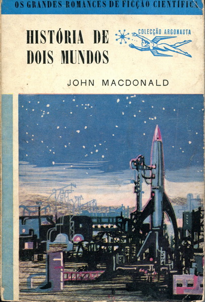
(Cover for the 1958 edition of Wine of the Dreamers (1951), John D. MacDonald)

(Cover for the 1957 edition of En avant, Mars! (1955), Pierre Versins)
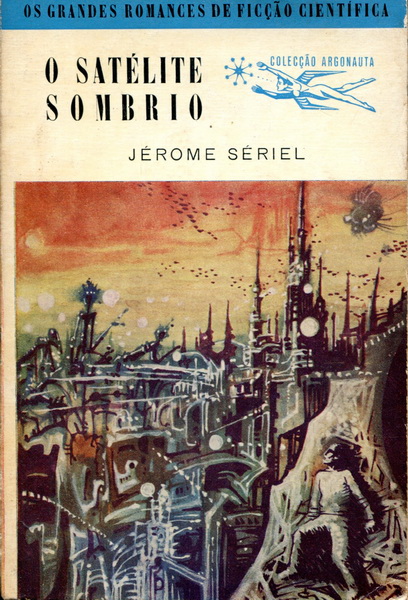 (Cover for the 1964 edition of Le satellite sombre (1962), Jacques Vallée)
(Cover for the 1964 edition of Le signe du chien (1960), Jean Hougron)

Love pulp covers, but never seen these before, and absolutely love them.
Thanks!
These don’t really match the pulp aesthetic, not sure I would call them that… He was an established artist (neorealism) in non-SF circles. I definitely see how he plays with the conventions of pulp art.
Those are wonderful! Really individual and atmospheric – thanks for sharing them!
Thank you for commenting!
What are your favorites? I love his textures, and lines. So beautiful.
The first Heinlein is pretty spectacular but I love the Kornbluth too.
Crudely but effectly done.Very atmospheric.It’s difficult to pick favourites,but most of them I like.I’m not fond of the Roshwald one;doesn’t seem to say anything.
You’re definately anti Heinlein.I don’t really blame you,but many of the best science fiction authors grew-up reading his stuff,and were inspired by him.I don’t see how the genre would have developed without him,but it’s difficult to be objective about him.Also though,he never managed himself to escape from the restraints the genre placed on him.
The last thing I would ever call them is crude….
Have you read the Roshwald novel? It might help understand the cover — the characters deep underground, tenuously connected to the surface, claustrophobia…
As for Heinlein, yes. Of course I understand his influence (pretty sure I have never denied it nor would I want to!). But, read Farnham’s Freehold (1964) and tell me what you think (if you haven’t already).
Okay,sorry,crude was the wrong word.Simple but very detailed would sound better I think.They’re evocative for that.Also vividly coloured.
No I haven’t read it.Because it didn’t catch my attention the way the others did,I didn’t take notice of the details.I can see what you mean now though.
I haven’t read “Farnham’s Freehold”,but don’t disbelieve it’s as bad as you say.You’ll probably recall I did read but couldn’t finish “Methusalah’s Children” last year,which was written during one of his peak periods!If I’d had continued to have kept reading his books,instead of the very few I did,I would have read “Stranger in a Strange Land”.I feel it might be one of his better books,because it was more controversial.
In almost all cases, I am more interested in the art on Heinlein novels than the contents. I’ll leave it at that.
Have you looked up the other non-SF art of Lima de Freitas? He’s an actual neorealist of some stature. He is very clearly adopting a particular style for his SF covers. It is not “simple” or “crude.” Perhaps what you mean is that it’s abstracted… you can see lines of paint or ink rather than some realistic spaceship.
Heinlein isn’t a favourite of mine,so I’ll agree with what you say,despite his historical influence.
Yes,abstracted describes his work perfectly I think.Like the best cover artists,he’s trying to convey the essence of the books,not the generic content.
If you don’t like the covers you don’t like them! Not trying to compel you…. But yes, walking into a modern art museum will elicit a range of reactions. And, for me, his SF art fascinates me…
For example, I am intrigued endlessly by the early French surrealists inspired by African art.
But then again, neither would I call something as intentional and planned like Giorgio de Chirico’s The Red Tower (1913) “simple” or “crude.” And I definitely have heard people characterize him (and others of his ilk such as Paul Klee) as such.
I do like them though,or I wouldn’t say so.Your other posts featured excellent artists who also could be described as abstract.
The fact that Giorgio de Chirico painted as he did to convey loneliness,isolation and melancholy,was lost on those then that called them “simple” and “crude”.
That’s my point about Lima de Freitas (and the only reason I argued with you about the terms in the first place)!
It was probably a wrong choice of words,but I meant well.Okay.
His best known illustrations are for Don Quixote… they are also wonderful.
You keep past science fiction alive for future writers to appreciate.
Thanks 🙂 Any favorites from this collection?
Hi Joachim
Almost every title I looked at I went wow, I settled on The Drowned World after much soul searching but Lucky Starr and the Pirates of the Asteroids, Retour à “O” and Level Seven were all tempting. I have to say that I think Asimov’s Lucky Starr series ( which I have seen but not read ) has never had better covers. I really liked many of these because they were interesting treatments of some really iconic novels “I Am Legend” by some of the most significant writers of the period. The recent series of posts you have done on covers artists for translated or non english SF has made me think I should get some of these books, which of course I can’t read, but since I already have too many waiting to be read in English I don’t need to expand my collection. I guess you are saving me from myself because I can admire the covers here. I have to say Farnham’s Freehold was not just one of the worst Heinlein but one of the worst SF novels I have read. And two thumbs up to de Chirico, I also love Rousseau whose work often seems crude and primitive in reproduction but really powerful up close.
Happy Blogging
Guy
Thanks Guy!
As someone who can read French (although at a really slow rate), I have been tempted over and over (especially when I lived in Paris for a few summers) to buy various French authors whose works are not translated. But, I read academic French for my profession and I don’t find it that enjoyable — and SF is for relaxing!
A two Stefan Wul novels have been translated: A 1973 translation of The Temple of the Past (1957) and a 2013 translation of Niourk (1957). More were translated into RUSSIAN than English! It annoys me to no end!
Ah ah ah, Stefan Wul is the author of Oms en série (1957) adapted as the amazing SF film Fantastic Planet (1973) — it was translated into English in 2010. So three of his novels are available…
Hi Again
Just clicked the link you supplied for Colecção Argonauta. Thanks again, these covers are wonderful.
Guy
They really are something else… As I mentioned, I wish his work appeared on at least a few US edition covers.
I like the intricate detail of the Simak and Edmund Cooper covers. It’s interesting seeing how the titles are sometimes altered in translation. ‘I am Legend’ becomes ‘Vampire Planet’, and Simak’s ‘City’ becomes ‘Dead Cities’.
Vampire Planet has a much different vibe than I Am Legend for sure… as does Dead Cities vs. City!
The human figures in Retour à “O” remind me a bit of Powers, or, am I grasping? hah.
Powers spent some time in Spain late in life where he had a long friendship with the artist Manuel Ortega. Perhaps he met De Freitas as well?
Don’t think there’s a single cover there which doesn’t sell the book inside, at last not to me. But I love a good big SFnal city.
SF cities are wonderful, even if they are in ruins….
I definitely agree with you on how they make you want to open the book!
Absolutely stunning covers here Joachim, I’ve seen a few of these over on Flickr but this collection is wonderful. I’d be more than happy to have any of these framed and hung on my wall. Thanks for the recent shout out too my friend, much appreciated. All the best.
You’re back! I haven’t seen a post in a while…. Are you going to start posting again?
I’m building back up to it Joachim, the past few months have been pretty hectic for me. Thanks for the shoutout too, much appreciated my friend. All the best.
Good good! I look forward to your next post 🙂
Very cool covers, awesome to see some retro styles.
Thanks! Any favorites?