
(František Muzika, Z Českého ráje V (Ležící torzo), 1944)
František Muzika (1900-1976), a key member of the Czech New Wave scene, created haunting paintings that blended human form with the surrounding landscapes. His painting that heads this post inspired me to collect various science fiction covers (from a mix of English and non-English language presses) that showcase the interlacing of human and landscape — the body (or body parts) as landscape. There are many many many more covers on this theme and perhaps I’ll gather them for a later post. I am torn over my favorite! Leigh Taylor’s cover for the 1967 edition of J.G. Ballard’s The Disaster Area (1967) certainly embodies (no pun intended) the feel of Ballard’s fiction. And of course, Karel Thole always puts in a good shift—and his cover for Howard Fast’s The General Zapped an Angel (1970) has long been one of my favorites….
What are your favorites? Why? Know of any other covers I could include in future posts on this theme? I’d love to hear from you.
Enjoy!
For more SF art posts consult the INDEX (for example on Doomed and Domed Cities)

(Leigh Taylor’s cover for the 1967 edition of The Disaster Area (1967), J. G. Ballard)
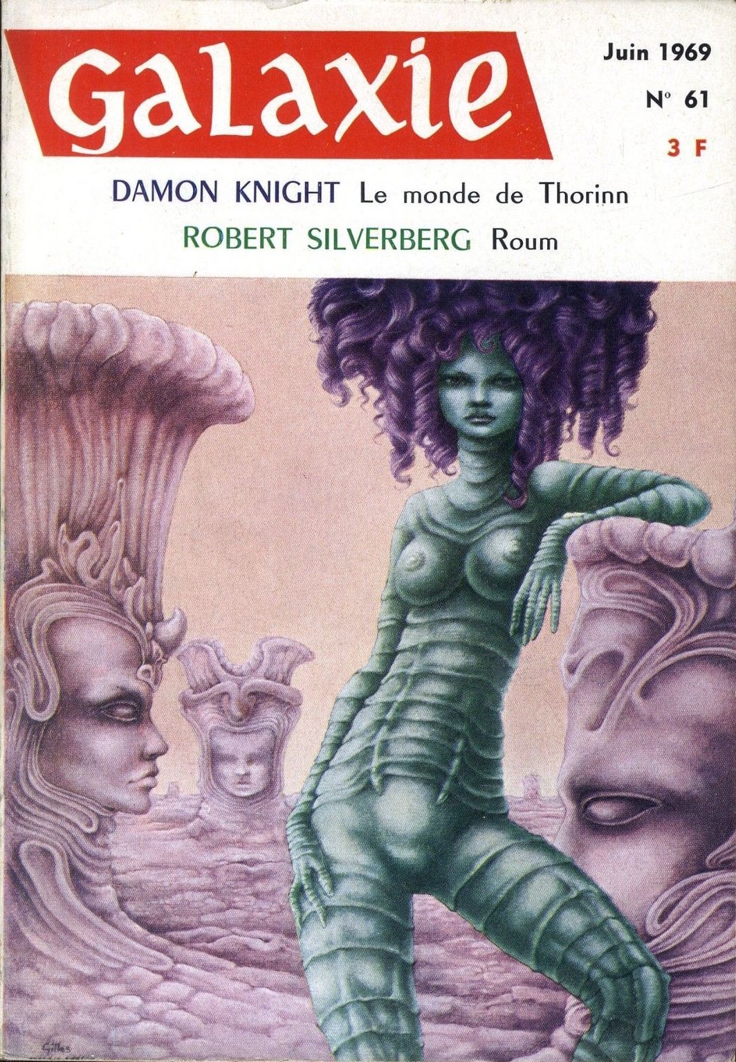
(Gilles Rimbault’s cover for Galaxie (2ème série), #61 (1969), ed. Alain Dorémieux)

(Karel Thole’s cover for the 1970 edition of The General Zapped an Angel (1970), Howard Fast)

(Karel Thole’s cover for Brainrack (1974), Kit Pedler and Gerry Davis)
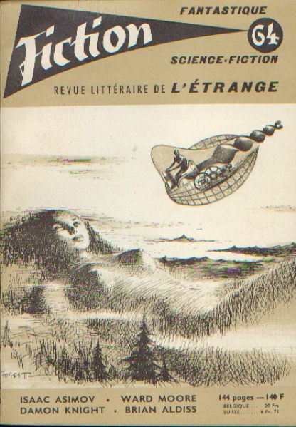
(Jean-Claude Forest’s cover for Fiction, #64 (1959), ed. Alain Dorémieux)

(Paul Stinson’s cover for the 1978 edition of Karma: A Novel of Retribution and Transcendence (1978), Arsen Darnay)

(Wojtek Siudmak’s cover for the 1978 edition of Darker Than You Think (1948), Jack Williamson)
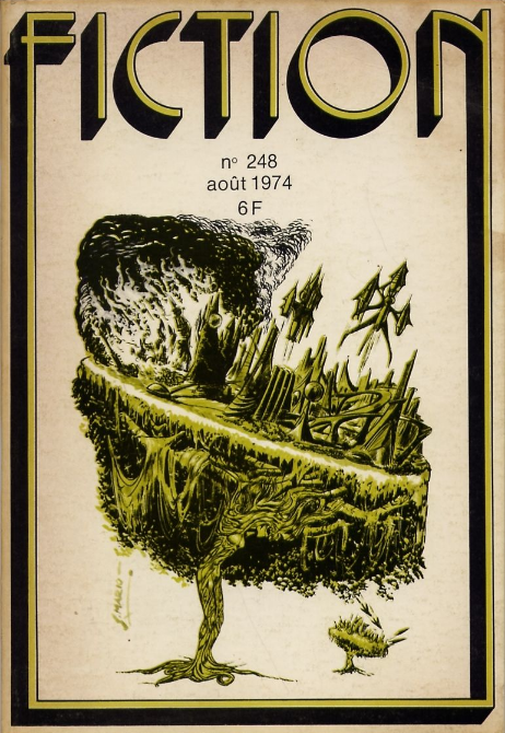
(Mario Sarchielli’s cover for Fiction, #248 (1974), ed. Alain Dorémieux) (Jean-François Jamoul’s cover for Fiction, #300 (1979), ed. Daniel Riche)
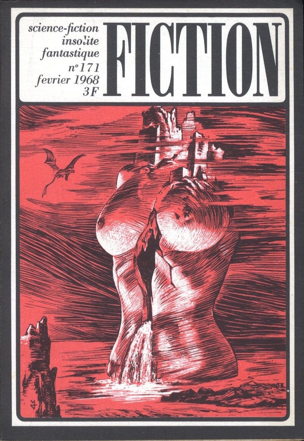
(Michel Desimon’s cover for Fiction, #171 (1968), ed. Alain Dorémieux)
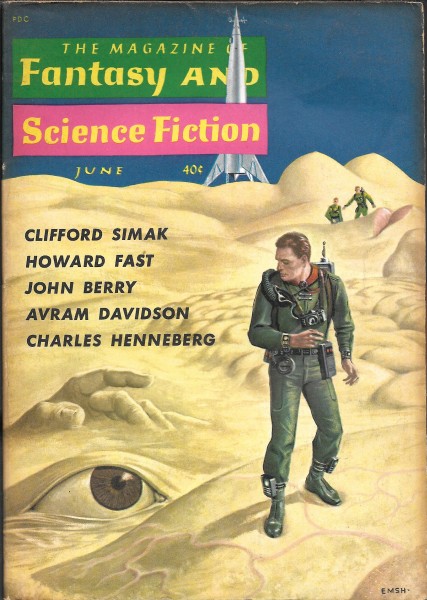
(Ed Emshwiller’s cover for the June 1960 issue of The Magazine of Fantasy and Science Fiction, ed. Robert P. Mills)

Karel Thole’s cover for The General Zapped an Angel – That’s either an odd coloured sea or an extreme amount of blood! Very evocative.
It’s a scan of my edition — very happy to have it as I’ve wanted a copy for a long time. Thole (as you might know) mostly illustrated for Italian and German presses but he occasionally created wonderful covers for a handful of American ones…. He’s one of my favorites.
Thanks Tom. I’ve read and reviewed the book (many years ago) — and it’s hard not to forget that Lehr cover!
https://sciencefictionruminations.wordpress.com/2011/07/17/book-review-the-last-starship-from-earth-john-boyd-1968/
(have a favorite from this bunch?)
The Emsh cover for F&SF really struck me. There’s more to it than what meets the eye (ha ha). Emshwiller’s cover (1960) appears to have beaten Lem’s Solaris (1961) by a year with the idea of a planet-spanning organism-intelligence (a desert rather than an ocean) that can physically manifest objects. Now I’m curious whether it actually illustrates one of the stories in that issue.
According to ISFDB.org The Emshwiller cover illustrates a French SF story “The Non-Humans” (1958) by Charles Henneberg (note a lot of Henneberg stories were written by his wife).
http://www.isfdb.org/cgi-bin/ea.cgi?849
Yes,I’m quite fond of the Ballard one too.It speaks of entropy,that prevades his stuff.It also looks naturalistic in forming the structure of the landscape,rather than being like the surrealistic landscapes,that describe the other covers.Ballard’s writing was heavily influenced by the Surrealist painters however,as you know,particularly Magritte and Tanguy I think,whose embodiment of facial features and body parts into the fabric of their paintings’ environments,can be seen to have influenced nearly all nearly all the covers here too.
So cool great selection!
Thanks for the comment! Have a favorite?
For me it has to be the general zapped an angel, such a phenomenal and powerful work of art!
Karel Thole’s work is very good. Check out his listing at The Internet Speculative Fiction Database: http://www.isfdb.org/cgi-bin/ea.cgi?1879
what a brilliant site! Thanks for sharing Joachim
I think this deceptive landscape cover by Mark Salwowski for an English edition of Howard Waldrop stories is sort of halfway between Tanguy and Arcimboldo. It’s even odder since most of his work is standard 80s sf/fantasy airbrush illustration.
I’ll definitely keep this one for my next installment — it is a favorite theme of mine.
And I’ve not looked through any of Mark Salwowski’s art catalogue.
As for Waldrop… hmmm…. wasn’t thrilled with the only story I’ve read of his.
Thanks Matthew!
Seeing this body as landscape art I’m reminded of the scene in Ken Russell’s Altered States, when, at the end of one of William Hurt’s trips, Blair Brown turns into a Sphinx-like creature and is then blown away by the sands of time.
There’s a previous post on this site where JB looks at cover art visualizing time:
https://sciencefictionruminations.wordpress.com/2012/10/26/adventures-in-science-fiction-cover-art-visualizing-time/
A lot of the artists there rely on the face of the clock to represent time. I think the way Russell shot this was a very creative way to put across the idea of the vastness of time.
Anyway, one of my favourite scenes in a sci-fi film. Looking at František Muzika’s art, I wonder whether Russell was inspired by him when he conceived of it.
I apologize for the delayed response — I’ve been traveling in Scotland!
I’ll watch the clip in a bit.
I don’t get the sense that Muzika was a very famous figure in the Czech New Wave. Although I could be mistaken….
Russell would have been exposed to all the other surrealists who created similar images.
I liked Karel Thole’s The General Zapped an Angel the best, and I, too, bought the book specifically for the cover as it reminded me of the surrealists. Another cover you might add is Alidss’ Earthworks (unknown artist): http://www.isfdb.org/wiki/images/0/01/RTHWRKSBNM1967.jpg
I’m certain the cover for “Earthworks” is by Don Ivan Punchatz.
The Earthworks cover does appear to be similar to known Punchatz efforts in the late 1960’s, as identified on the isfdb.org site. The elements in Earthworks are different, but the simple background and the blending of the foreground make me agree with you, Tom Hering.
I reviewed Earthworks a while back. The image I included first in my review also fits the theme– I’ll try to remember to include both when I put together new installment.
https://sciencefictionruminations.wordpress.com/2011/05/02/book-review-earthworks-brian-w-aldiss-1965/
(note: back then I didn’t include cover citations — the artist for the Doubleday edition is credited to Margaret Peall and Trevor Heath)
Hi
An interesting post, I looked through some of my books but nothing jumped out at me. I really like the Ed Emshwiller’s cover for the Magazine F&SF.
Happy Reading
Guy
The Emshwiller cover definitely has a unique power. Partial to the more surreal experiments though — haha.
Read anything wonderful lately?
Joachim