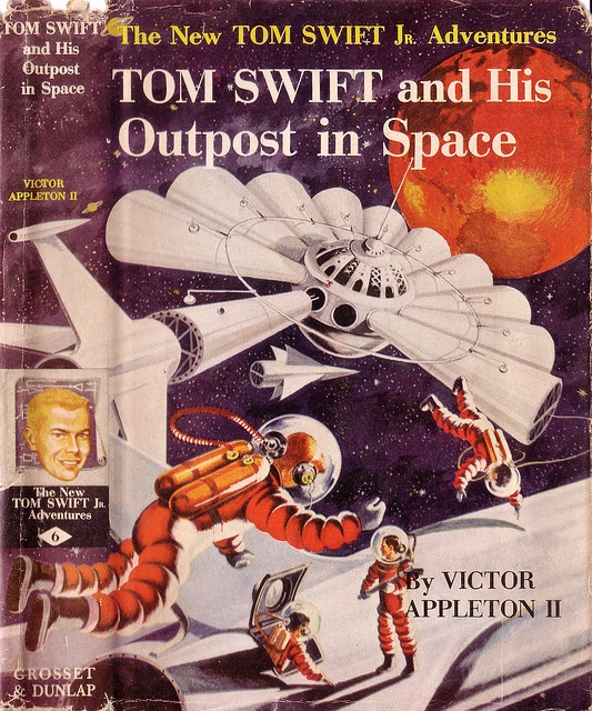
 (Graham Kaye’s cover for the 1955 edition of Tom Swift and his Outpost in Space (1955), Victor Appleton II)
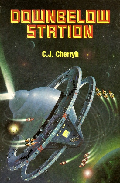
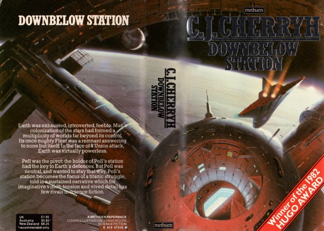
This is Part III of my series on space stations (Part I + Part II). Ever since I watched 2001: A Space Odyssey (1968) as a teen I’ve been fascinated by space stations — platforms for further space exploration! I can only imagine how exciting it was for fans of science fiction who read about stations before they existed to see them finally constructed. The fact that they became reality — well, perhaps not (yet) as a launching point for space going exploration vessels — almost vindicates the scientific extrapolation of some of these early visions. Also, Arthur C. Clarke’s Islands in the Sky (1952) happened to be one of my first science fiction novels….. And C. J. Cherryh’s Downbelow Station (1981) was one of the first Hugo winners I purposefully scoured the shelves for.
My favorite of this collection of covers the (50s) realism of Gerard Quinn’s cover for the 1952 edition of Islands in the Sky (1952) by Arthur C. Clarke. Despite my general dislike for 80s covers Darrell K. Sweet’s cover for the 1985 edition of Space Cadet (1948) by Robert Heinlein manages to convey some genuine wonder that the juvenile itself imparts.
What are you favorites? Do you know of any others on the theme?
Enjoy!

(Darrell K. Sweet’s cover for the 1985 edition of Space Cadet (1948), Robert Heinlein)
(Rego’s cover for the 1981 edition of Downbelow Station (1981), C. J. Cherryh)
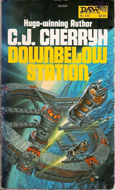
(David Mattingly’s cover for the 1981 edition of Downbelow Station (1981), C. J. Cherryh)
(Chris Moore’s cover for the 1983 edition of Downbelow Station (1981), C. J. Cherryh)

(Rick Sternbach’s cover for the 1982 edition of Futures Past (1982), James White)
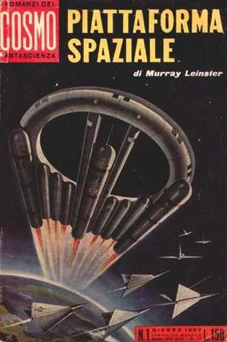
(Uncredited cover for the 1957 Italian edition of Space Platform (1953), Murray Leinster)
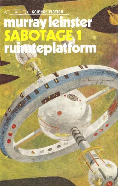
(Richard Powers’ cover for the 1972 Dutch edition of Space Platform (1953), Murray Leinster)

(Gerard Quinn’s cover for the 1952 edition of Islands in the Sky (1952), Arthur C. Clarke)
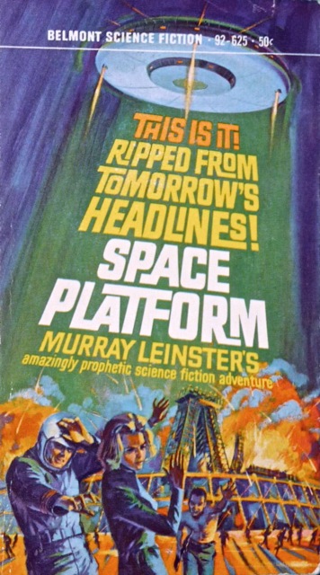
(Uncredited cover for the 1965 edition of Space Platform (1953), Murray Leinster)
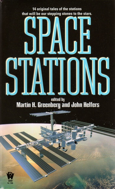
(Uncredited cover for the 2004 edition of Space Stations (2004), Martin H. Greenberg, John Helfers)
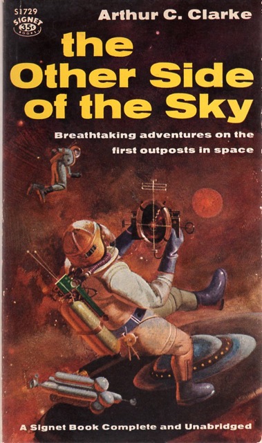
(Uncredited cover for the 1959 edition of Other Side of the Sky (1958), Arthur C. Clarke)

(Vincent Di Fate’s cover for the 1976 edition of The Triune Man (1976), Richard A. Lupoff)
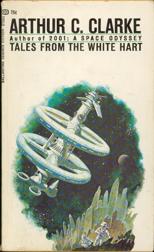
(Uncredited cover for the 1970 edition of Tales from the White Hart (1957), Arthur C. Clarke)

(Uncredited cover for the 1970 edition of Tales from the White Hart (1957), Arthur C. Clarke)
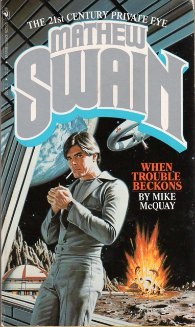 (Bob Larkin’s cover for the 1981 edition of When Trouble Beckons (1981), Mike McQuay)
For similar posts consult the INDEX

I grew up at an age when our grade school library had all the Tom Swift Jr. books with the Graham Kaye covers – they were like techno-porn for us, with insanely mechanistic titles, like Tom Swift and His Subocean Geotron! The plots actually were pretty decent, too.
If I saw one in a used book store I’d snatch it up! I can only imagine how exiting they must have been….
That 1970 edition of ‘Tales from the White Hart’ (the one with the white background) is a classic of that time. Too bad it’s uncredited.
I had not seen a lot of early Richard Powers’ work, I had seen that cover for ‘Space Platform’ before, but didn’t know it was his!
I have some old Analog issues from the early 60’s. Check out the June ’64 cover if you can, it’s better than average for a magazine cover. Artwork by Schoenherr that reminds me of the upcoming ‘Gravity’ movie.
Is the June ’64 one a space station? Perhaps the contents of the story would explain… But yeah, it’s an interesting cover.
Powers’ cover is just a small part of a larger canvas he made. It’s the back of his 1953 cover for Fletcher Pratt’s The Undying Fire.
http://s7.photobucket.com/user/mindelec/media/ebay/006257.jpg.html
The cover is more memorable than the story! I do believe it is a space station, I seem to remember the space man having to fix some kind of solar panel.
That Fletcher Pratt cover is impressive, I didn’t know it had a wrap around cover like that!
The Pratt story is supposedly awful…. (according to my father) — but yes, one of my most prized Powers covers I own due to the wrap-around/vibrant colors….
I had a couple of titles in that Clarke paperback series, the cover art of which tied in nicely with “2001”, still popular in 1970.
I don’t know anything about Mathew Swain, but now I want to see the set of late 70s/early 80s movies that’s poster art for.
You’ve found some great ones. I’ve been collecting space station images on Pinterest – http://pinterest.com/johnlday/scifi-space-stations/
Yes, I’ve seen them! Hopefully some of the images I’ve dredged up have added to your collection…
How can something be “ripped from TOMORROW’s headlines”?
The obsession (all the SF authors who comment on the book) with blathering about THIS IS THE FUTURE irks me to now end. Rather, this is literature about what might happen if, or, an intriguing story set in a world that really might never happen but is ultra cool and says something about the present.