
(Peter Goodfellow’s cover for the 1979 edition of The Moment of Eclipse (1970), Brian Aldiss)
Make sure to take a peek at Part I if you enjoyed this collection!
In Part I I described how I was inspired by Ed Valigursky’s stunning and powerful cover — with its giant eye, running figures, and perspective lines drawn across the artificial field heightening the tension — to look through my image collection and find similar examples. Since I made the last post I’ve collected quite a few more examples (from my own collection and image collections online) along similar lines.
Mitchell Hooks’ cover for the 1958 edition of The Big Eye (1949) by Max Ehrlich has long been one of my favorite covers and it has cropped up in various posts over the years…. The uncredited cover for the 1969 edition of The Cosmic Eye (1969) by Mack Reynolds illustrates the principle — the eye symbolizing some otherworldly power, or oppressive government, or alien presence — in its archetypal simplicity.
Karel Thole’s cover for the 1962 edition of The Cosmic Puppets (1956) by Philip K. Dick is rather more complex — and artistically stirring. The cityscape, the strange sky evoking the microscopic cells, and the eyes situated within the cell-like matrix…
What are your favorites? Have you read any of the works?
Enjoy!

(Karel Thole’s cover for the 1962 edition of The Cosmic Puppets (1956), Philip K. Dick)

(Tom Adams’ cover for the 1970 edition of Timepivot (1970), Brian N. Ball)
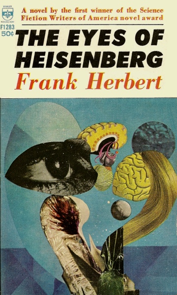
(Hoot von Zitzwitz’s cover for the 1966 edition of The Eyes of Heisenberg (1966), Frank Herbert)

(Jack Schoenherr’s cover for 1962 edition of The Flying Eyes (1962), J. Hunter Holly)

(Uncredited cover for the 1969 edition of The Cosmic Eye (1969), Mack Reynolds)

(Mitchell Hooks’ cover for the 1958 edition of The Big Eye (1949), Max Ehrlich)

(Richard Powers’ cover for the 1963 edition of When They Come From Space (1962), Mark Clifton)
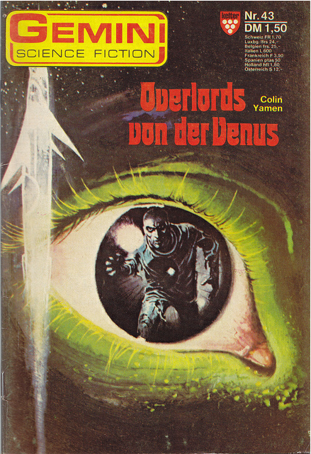
(Uncredited cover for the 1976-77 edition of Overlords von der Venus (1976-77), Colin Yamen)

(Uncredited cover for the 1966 edition of The Deep Fix (1966), James Colvin i.e. Michael Moorcock)
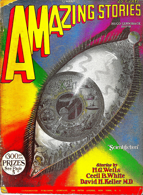
(Frank R. Paul’s cover for the April 1928 issue of Amazing Stories)

(Ed Soyka’s cover for the 1975 edition of The Mote in God’s Eye (1974), Larry Niven and Jerry Pournelle)

(Uncredited cover for the 1961 edition of The Mating Center (1961), Frank B. Long)

(W. F. Phillipps’ cover for the 1964 edition of Guardians of Time (1960), Poul Anderson)
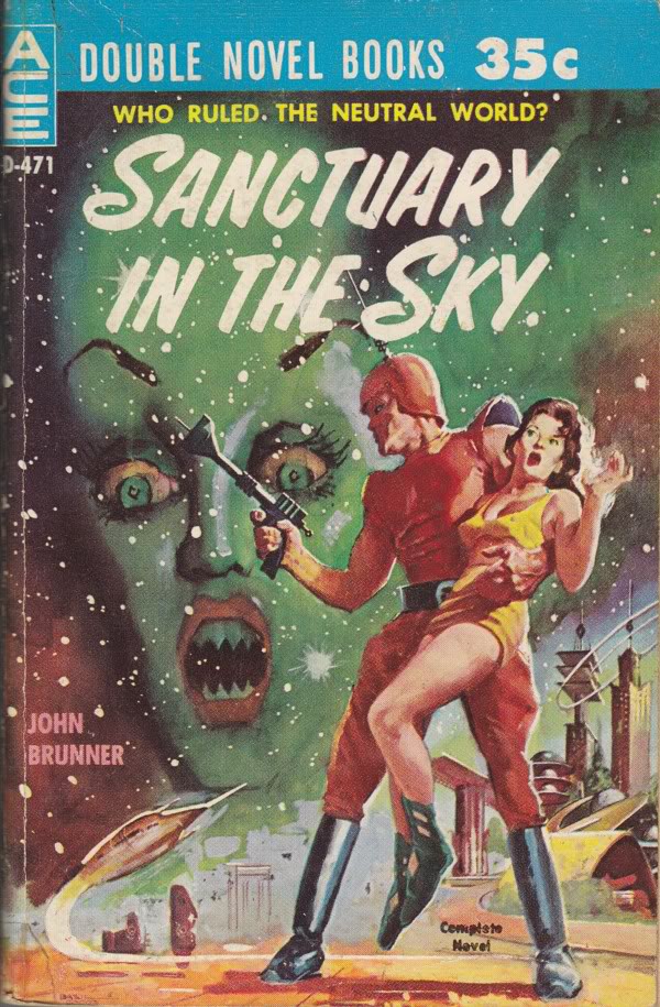
(Uncredited cover for the 1960 edition of Sanctuary in the Sky (1960), John Brunner)
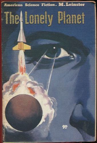
(Uncredited cover for the 1954 issue of American Science Fiction, #23)
For similar posts consult the INDEX

Wow, the naked ear is really disturbing. Surprised they would have it on the cover.
Why are you surprised they’d have it on a cover? Many covers from that era are on the edgy side…. That’s for sure.
Even the giant eye in the sky looks like it’s a little disturbed by the naked ear person/thing. Or perhaps it’s going “Hey, stop stealing my thunder!”
I weirdly like the cover… It’s rather harrowing. Despite the fact that it’s not the focus, the eyeball is creepy!
Amazing, thank you as always
Thanks! What’s your favorite of the covers?
My first choice is the cover by Tom Adams. Second would be the cover by Hoot von Zitzwitz. I’m guessing Richard Powers must have had at least one bad day in 1963.
Yeah, he had a rather too cartoonish turn of style in the 60s for some of his covers. Not sure why.
I find Mitchell Hooks’ cover absolutely brilliant. The cityscape, the eye, the colors, the brush strokes!
I kind of love all of these, for one reason or another — except the one on “The Mote in God’s Eye.” It’s very…literal.
I really love that Amazing Stories cover, though. The pic posted here has some cross-hatching from the scan, so I looked for a clearer copy (that, and I really wanted to see what was going on in that eye.) Gorgeous — almost proto-steampunk.
http://pressandpolicy.bl.uk/imagelibrary/displaymedia.ashx?MediaDetailsID=898&SizeId=3
I can’t seem to open it 😦
Hmm…I tried to link the copy and failed utterly. Sorry!
The Mitchell Hooks cover is the best, though I do like the one for The Deep Fix, very much ‘of its time’
I’m intrigued by The Flying Eyes book. I wonder if it is literally about flying giant alien space eyes, weird.
I wonder why Moorcock originally published those stories in The Deep Fix not under his own name… One is co-written with Barrington J. Bayley — who I must admit, is a rather imaginative writer despite his poor prose. I took my pseudonym from one of his novels (hehe).
Aha! The source is revealed! And I had thought it was from the two characters from the Old Testament, Joachim being the father of Mary and Boaz a figure in The Book of Ruth.
For me, Moorcock is one of the most interesting figures in Sci-Fi. His life story sneaking its way into a lot of his work, especially how he was affected by WWII. The novel version of Behold The Man is one of my favorites. I know he used quite a few pseudonyms, but I can’t imagine why he used so many. It’s not as if he is so prolific that he didn’t want to flood the market!
Well, that as well 😉 They are the names of the columns of the Temple of Solomon — so, as a result it has Masonic symbolism.
Also, Russell Hoban uses it in the title of one of my favorite works of lit — The Lion of Boaz-Jachin and Jachin-Boaz (1973).
That’s right, the temple of Solomon, I knew there was another use of those names.
Yup yup. In Bayley’s novel The Pillars of Eternity (1982) the character wakes up with a re-built body and decides to name himself Joachim Boaz….
Guardians of Time by Poul Anderson is my all time favorite…gotta love his Time Patrol stories.
Ah, I’ve never read Guardians of Time — Poul wrote so much…. Love the Powers cover for the first edition.
Karel Thole did another Eyeball-in-the-sky for the German translation of Piers Anthony’s ‘Macroscope’ (Heyne Verlag, Munich 1975), that may be the grossest of them all:

I’ve always enjoyed his art… Thanks! I’ll definitely use in Part III if I can find enough images.