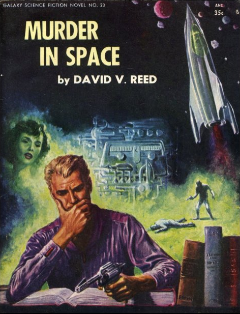
(Ed Emshwiller’s cover for the 1954 edition of Murder in Space (1944), David V. Reed)
Ed Emshwiller’s cover for the 1954 edition of Murder in Space (1944) perfectly embodies the composite cover comprised of sequences from the narrative. Our hero (or villain) plots the murder in the foreground (guns, books, furrowed brow), commits the murder in the background, his love interest looks over his left shoulder (she’s constantly on his mind), and some random astroids/planets (let’s call them space rocks), a spaceship, and a strange piece of technology alert us to the science fiction aspect of the narrative… The uncredited cover for the 1955 edition of The Altered Ego (1954) is another wonderful example of this — although, slightly more difficult to decode without reading the work.
Bill Hughes’ cover for the 1969 edition of the short story collection Two Dozen Dragon Eggs (1969) is a different sort of composite cover — the large egg is broken down into twelve parts. Weither or not any of the stories link up with the pictures in any meaningful way is another story. Likewise, the composite nature of the always brilliant Richard Powers’ cover for 1966 edition of Ballard’s collection The Impossible Man (1966) may or may not relate to the contents but do indicate an impression of parts due to the variety of stories within. Regardless, the composite nature of the collection is transmitted to the cover — Tito Salomoni’s cover for the the 1986 edition of Artificial Things (1986) and David Meltzer’s cover for the 1971 edition of The Inner Lanscape (1969) are similar.
The type of third composite cover are more thematic or surrealist in nature. For example, Alex Schomburg’s cover for the September 1954 of Fantastic Universe — illustrating Lester del Rey’s Life Watch (1954) — includes the necessary rocket ships and planets to indicate the future setting, an atom to indicate science, and a heart, indicating, quite obviously LIFE! Others are more surreal — the fantastic, and unfortunately uncredited, cover for the 1968 edition of A. E. Van Vogt’s Slan (1946) is a sequence of photos that may or may not relate in anyway to the narrative.
What are your favorites?
Enjoy!

(Alex Schomburg’s cover for the September 1954 issue of Fantastic Universe)
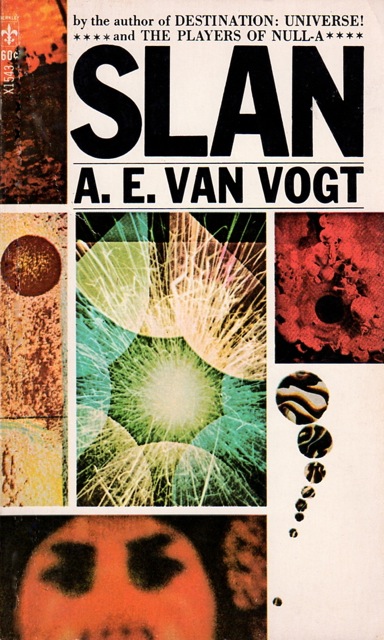
(Uncredited cover for the 1968 edition of Slan (1946), A. E. Van Vogt)
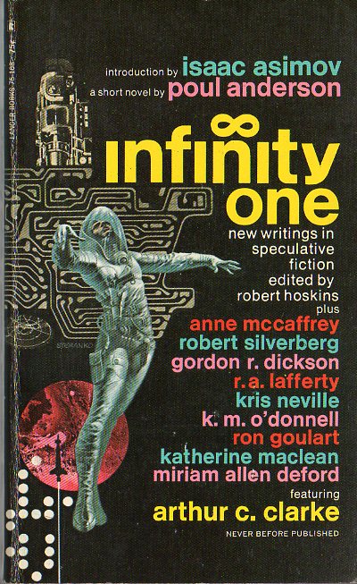
(Jim Steranko’s cover for the 1970 edition of Infinity One (1970), ed. Robert Hoskins)

(Tito Salomoni’s cover for the the 1986 edition of Artificial Things (1986), Karen Joy Fowler)

(Uncredited cover for the 1966 edition of B. E. A. S. T. (1966), Charles Eric Maine)
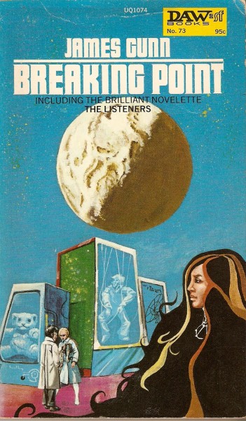
(Michael Gilbert’s cover for the 1973 edition of Breaking Point (1972), James Gunn)

(Gray Morrow’s cover for the October 1969 issue of Galaxy)

(David Meltzer’s cover for the 1971 edition of The Inner Lanscape (1969), ed. Michael Moorcock)
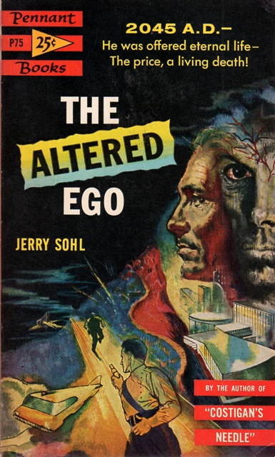
(Uncredited cover for the 1955 edition of The Altered Ego (1954), Jerry Sohl)
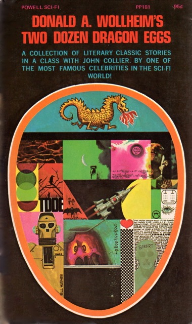
(Bill Hughes’ cover for the 1969 edition of Two Dozen Dragon Eggs (1969), Donald A. Wollheim)
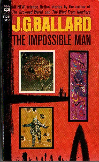
(Richard Powers’ cover for the 1966 edition of The Impossible Man (1966), J. G. Ballard)
(Brian Lewis’ cover for the October 1958 issue of New Worlds Science Fiction)
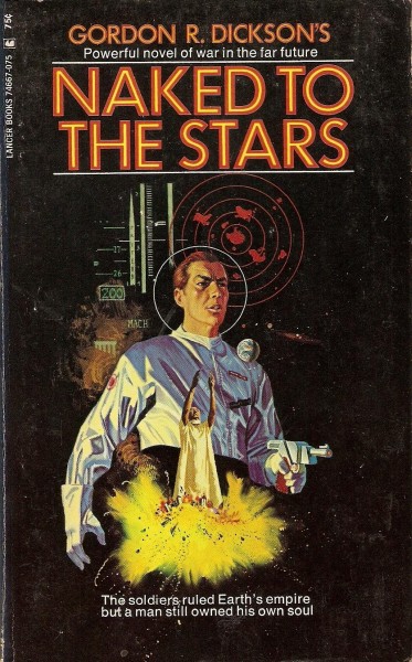
(Uncredited cover for the 1970 edition of Naked to the Stars (1961), Gordon R. Dickson)

(Richard Powers’ cover for the 1955 edition of Another Kind (1955), Chad Oliver)

(Uncredited cover for the 1971 edition of New Writings in SF-18 (1971), ed. John Carnell)

(Gray Morrow’s cover for the 1967 edition of The Key To Irunium (1967), Kenneth Bulmner)

(Uncredited cover for the 1981 edition of Last View Of Eden (1981?), Ralph Hayes)
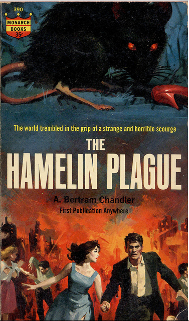 (Bob Maguire’s cover for the 1963 edition of The Hamelin Plague (1963), A. Bertram Chandler)
For similar art posts consult the INDEX

Any idea if this sort of cover layout is more common in the sf genre than others? I’m tempted to say that it is, but I don’t think I have sufficient knowledge to support that thesis. The Schomberg, Steranko, and Powers (esp. the Ballard) covers stand head and shoulders above the others, in my estimation. The Morrow cover for Galaxy is awfully good, too! Honorable mention to the SF-18 cover, too!
I’m not sure — I sort of made up the category when I was browsing through my cover art archive. Haven’t been on the lookout for similar covers from other genres… But, they do seem to more often than not accompany short story collections — for obvious reasons.
But yeah, the Powers’ cover for the Ballard collection is downright gorgeous — as his work often is.
I think I like “Gray Morrow’s cover for the October 1969 issue of Galaxy” the most.
It’s intriguing but I think it’s somewhat on the muddled side…
I wonder how many book cover artists read the books they illustrate. Thanks for sharing these covers, and the other covers and book reviews.
I didn’t intentionally leave out the Emshwiller. I just forgot it was there! I love his colors. He was one of the most amazing and prolific sf artists, ever. A truly wonderful artist!
It certainly illustrated the theme of the post very well! hehe
My favorite composite cover is by the Dillons for Harlan Ellison`s Deathbird Stories, which uses elements from many of the stories contained in the book.
I have a good 20 more waiting to be put in a post — perhaps I’ll include it!
I think the Schomburg, Steranko and (anonymous) SF 18 cover are the best out of the bunch. I don’t think the normally genius Powers is that on form with this particular one.
One of my own favourites has always been Peter Goodfellow’s composite cover art for the 1965 UK Corgi edition of Ray Bradbury’s (brilliant) Dandelion Wine :
I do enjoy the Bradbury cover…
Do you think that the SF 18 cover is the same work as Jim Steranko’s cover for the 1970 edition of Infinity One? They look artistically similar….
Reblogged this on Nerdy Life of Mine.
Thanks!
Your welcome!
Looks kind of like a young James Coburn on the Galaxy cover!
My pick would be The Impossible Man.
I don’t know who James Coburn is (had to look him up on imdb) — showing my age I guess! haha
You have to see the ‘Flint’ movies ! It’s the Austin Powers of the 60’s.
Have’t seen Austin Powers — but yeah, doesn’t sound like my sort of film — hehe
That Bradbury one is a goody. There is one for The October Country that`s good too. Jim Burns`s cover for THE ILLUSTRATED MAN is outstanding.
My favorite Bradbury cover for the 1955 Corgi edition…. I desperately want a copy.
Unfortunately, uncredited — alas — and not a composite image 😉
Joachim, Regarding your comment on cover artists reading the books, one who almost NEVER did is Chris Foss. I have the beautiful bookof his art that came out last year this fact is highlighted. I am not near my art books but will get the pertinent info and post it. Michael Whelan definitely does. Bruce Pennington and the Dillons, too. My best friend is a professional illustrator and he would probably say most illustrators do. However, Whelan has mentioned that art directors and/or editors may specify certain scenes or images they want for a cover; I suspect that is done all the time these days, as the cover is THE crucial visual in book advertisements, determining the entire campaign`s visual theme. I imagine most artists read the books, but most publishers specify the image, or elements.
I suspect some did but the majority didn’t. For example, I suspect Powers sent the publishers his latest paintings and they randomly selected them for the covers 😉 tehehe
Any professional cover illustrator these days would definitely read the book before finalizing their designs – not so sure that was always the case though, as you note.
Many publishers certainly will determine key visual elements and/or scenes to illustrate, particularly if the illustrator isn’t well known. Also, the illustration will need to be positioned correctly within the available area (title, logos etc.), which is often as important as the imagery, so this information needs to be clearly outlined and planned for.
It was most definitely NOT always the case 😉 But, I could care less — I just want nice art… I don’t really care if it adequately conveys the timber of the tale.