
(Richard Powers’ cover for the 1969 edition of Cosmic Engineers (1939), Clifford D. Simak)
The theme of this post is the future metropolis as canvas where the entire surface of the cover is arrayed and ordered by the forms and forces of the city. The city as a matrix that holds the scene unfolding amongst its spires… Richard Powers’ masterful cover for the 1969 edition of Cosmic Engineers is the perfect example. The mass of the buildings arch, indistinct, upward — causeways and platforms amongst the cityscape hold faceless humanoid forms that “look” at the viewer.
Ed Emshwiller’s cover for the 1956 edition of Chessboard Planet (variant title: The Fairy Chessmen) (1946), Lewis Padgett — i.e. Henry Kuttner and C. L. Moore is another brilliant example. The city that fills the entire cover bends, fragments, writhes with the hero in the center. His agony is reflected in the city around him.
Gray Morrow’s cover for the Febuary 1967 issue of Worlds of Tomorrow, ed. Frederik Pohl is an archetypal cover of this theme. The almost birds-eye perspective allows the city to fill the entire frame of site. The action, in this case a high speed chase, unfolds across the cityscape. Many of the earlier pulp covers I’ve included below from many decades earlier reflect adhere to this archetype. Gray Morrow is clearly homaging these earlier pulp traditions.
What are your favorites?
Enjoy! (I have many many more SF city themed art posts — here)

(Ed Emshwiller’s cover for the 1956 edition of Chessboard Planet (variant title: The Fairy Chessmen) (1946), Lewis Padgett — i.e. Henry Kuttner and C. L. Moore)

(Gray Morrow’s cover for the Febuary 1967 issue of Worlds of Tomorrow, ed. Frederik Pohl)
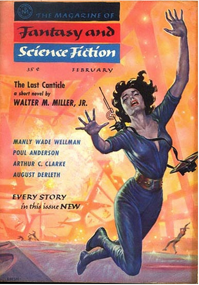
(Ed Emshwiller’s cover for the February 1957 issue of The Magazine of Fantasy and Science Fiction, ed. Anthony Boucher)

(Stanley Melzoff’s cover for the 1954 edition of The Demolished Man (1952), Alfred Bester)

(Howard V. Brown’s cover for the January 1936 issue of Astounding Stories, ed. F. Orlin Tremaine)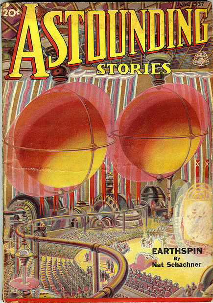
(H. Wesso’s cover for the June 1937 edition of Astounding Stories, ed. F. Orlin Tremaine)

(Earl Mayan’s cover for the 1963 edition of Doomsday Wing (1963), George H. Smith)
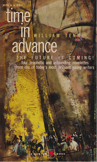
(Uncredited cover for the 1958 edition of Time in Advance (1958), William Tenn)
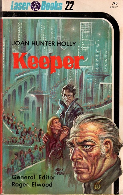
(Kelly Freas’ cover for the 1976 edition of Keeper (1976), Joan Hunter Holly)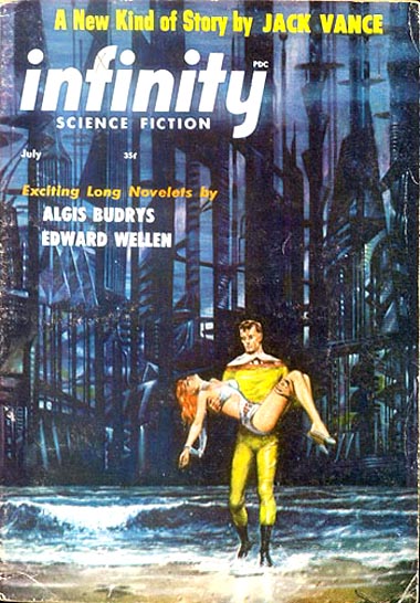
(Ed Emshwiller’s cover for the July 1957 issue of Infinity Science Fiction, ed. Larry T. Shaw)
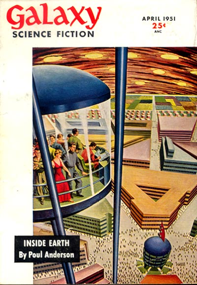
(John Bunch’s cover for the April 1951 issue of Galaxy Science Fiction, ed. H. L. Gold)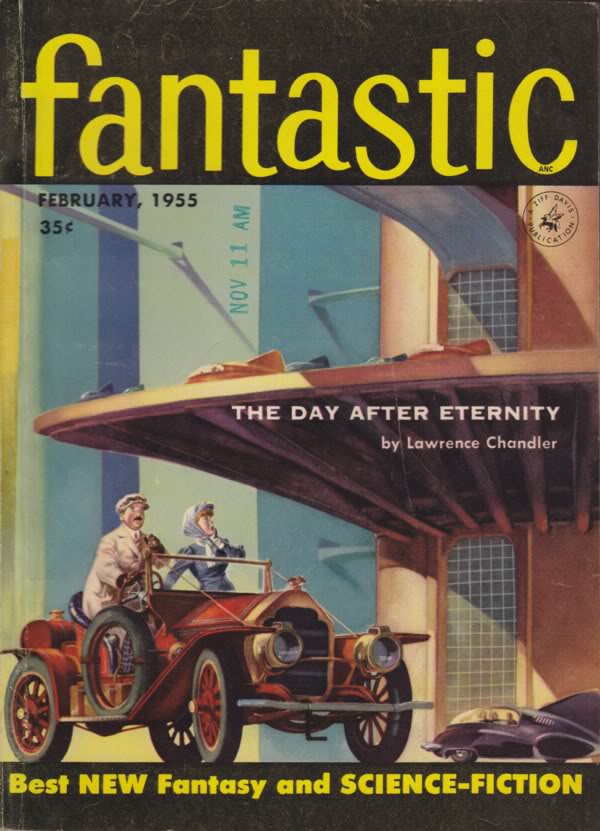
(Henry Sharp’s cover for the February 1955 issue of Fantastic, ed. Howard Browne)
(John Richards’ cover for the May 1955 issue of Authentic Science Fiction Monthly, ed. Herbert J. Campbell)
(Ron Turner’s cover for the 1950 edition of 2,000 Years On (1950), Vargo Statten — i.e. John Russell Fearn)
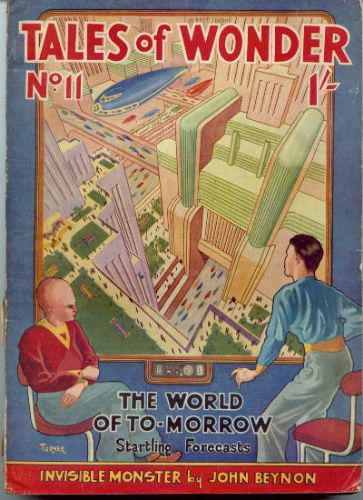
(Harry E. Turner’s cover for the the Summer 1940 issue of Tales of Wonder, #11, ed. Walter H. Gillings)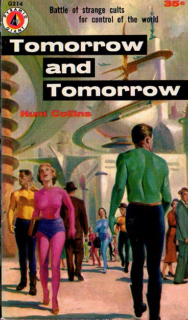
(Bob Lavin’s cover for the 1956 edition of Tomorrow and Tomorrow (variant title: Tomorrow’s World), Hunt Collints — i.e. Evan Hunter)
(Mitchell Hooks’ cover for the 1962 edition of The Immortals (1962), James Gunn)
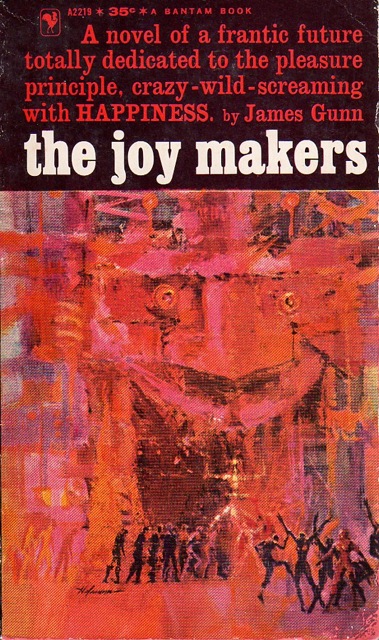 (William Hofmann’s cover for the 1961 edition of The Joy Makers (1961), James Gunn)
For similar posts consult the INDEX
Make sure to follow me on twitter.

I like the cover for ‘Time in Advance’, too bad it’s uncredited.
Me too. It’s always been one of my favs.
I agree, that’s the best one I think 🙂
I love the textures! It has depth, and the figures hint at something almost bacchic …
Your blog really makes me appreciate cover art. That Richard Power’s cover for Simaks’ Cosmic Engineers is so good I could frame it and display it proudly on the wall. It also makes me want to read it… The only Simak book I’ve ever read was City, and I really enjoyed that… Might be time to delve into some more of his work.
Thanks for the kind words! I’ve reviewed a few of his novels here — I’d avoid Cosmic Engineers, it’s one of his earliest (1939!) and very very pulpy.
I recommend his highly underread/underrated Why Call Them Back From Heaven? (1967).
https://sciencefictionruminations.wordpress.com/2013/07/20/book-review-why-call-them-back-from-heaven-clifford-d-simak-1967/
Really good work. It was fun to see them.
Thanks. Which one is your favorite?
Fantastic. There is something so thirties about the style. Love the colors etc. I use to love Doc. Savage.
Ah, yeah, more a fan of the 50s/60s stuff myself — namely Powers.
I like the January issue of Astounding Stories. It’s very crisp and bold, it presents an image that is is exciting and mysterious. I wonder if it’s a shiip taking off or a really tall futuristic wind turbine.
It’s definitely some futuristic wind turbine of sorts…. I don’t think it’s a spaceship.
But yes, a great cover! I love the Astounding Stories pulp covers depicting futuristic cities — there are many many many more of course. I included my favorite on this theme, H. W. Wesso’s cover for the 1938 issue of Astounding Science Fiction, in an earlier post if you’re curious — https://sciencefictionruminations.wordpress.com/2012/06/18/adventures-in-science-fiction-cover-art-my-15-favorite-science-fiction-covers/
If I ever did a second edition or special edition cover for my novel Reborn City, it might look like the city itself.
Which one? I posted many….
No, you misunderstand. I might have someone create what I think Reborn City looks like and make that the cover.
Ok.
Yes…. Sounds like a good idea.
These are so great! I don’t read a lot of science fiction but I love the “classic” cover art – a few years ago I saw a great exhibit of cover art (with some of the original drawings) at the Museum of Science Fiction in Seattle. Of the ones you’ve posted, I think I like the 1936 Astounding Stories cover the best – it’s like futuristic Art Deco.
Howard V. Brown and Hubert Rogers were big proponents of the futuristic Art DEco type style. Here’s a great example — a vast spaceship….
Ooh! Love that one too!
Well, then I recommend heading over to the Internet Speculative Fiction Database and search some of these artists by name and browse their listings (not all have complete sets of images).
For example, Hubert Rogers’ listing.
http://www.isfdb.org/cgi-bin/ea.cgi?1245
What wonderful choices and true art!
Which one is your favorite?
Like. (I don’t think the “like” button is working on my phone right now. Either that, or you just got 100 “likes” from me.) The Joy Makers cover got my attention.
Yeah, The Joy Makers cover is fantastic.
So is the book!
https://sciencefictionruminations.wordpress.com/2012/09/29/book-review-the-joy-makers-james-gunn-1961-magazine-publication-1955/
That was fascinating! Thank you
You’re welcome! I have quite a few similar posts (60+).
I Love Doomsday Wing. It uses such interesting colors to instill a sense of Chaos. The non traditional (and often used in opposition i.e. soothing) Greens and blues threaded throughout is great. As well the way things just look like they are slightly melting . LOVE IT! Cover art is so highly undervalued by the mainstream and in Science Fiction especially ,Cover Art is such an integral part of selling stories. I cant even count how many times the cover art has guided my book browsing choices.
Hmm…. not a fan of that one. Looks somewhat crude and child-like in style. But yeah, the colors are definitely the best part about it.
They really don’t make em like they used to. Love the old school artwork.
Definitely! Thanks for visiting.
Made me remember going through my father’s boxes of Analog, and Astounding Stories. That’s when I really became an avid reader. I can almost smell the old paper and the anticipation.
You should pick up some of the old classics! It would be a wonderful nostalgic (and worthwhile) experience 🙂
Not infrequently the cover art was superior to what it covered. Thanks for sharing.
Haha, although, I do love SF from this era….
What a fantastic set of covers! Science fictional city landscapes are certainly one of my favorite things portrayed in both classic and contemporary book cover illustration. Oh to be able to see these originals! That would be so amazing.
Thanks. I’ve always wanted to own an original canvas… Of just about any cover. But, would definitely prefer a city!
I am helping out this year with the grass roots marketing for Spectrum Fantastic Art Live 3 and was over at Arnie and Cathy Fenner’s house the other day (editors of the Spectrum annual art book) and was awed by their originals. Most are of more contemporary artists, but they are gorgeous. There is something about seeing paint on canvas that makes non-artists like me wonder just how it is done. They did have a John Berkey (not an sf one but a female study) that was beautiful…oh, wow!!!
One of my favourites is the Kelly Freas Fantasy & Science Fiction magazine cover for Deskful of Girls, also Bruce Penningtons art for the Lost Worlds Panther paperbacks. Really evocative art.
I really like that you post the names of the cover artists. So many folks post pulp covers for their art value, and they don’t name the artist. ❓❗
As a historian I guess I automatically cite my evidence 😉
And a good historian you are… 😀👍
This is one of my favorites.
Me too, I was thinking about putting together a Part II.
One reason this post is so good is it is longer than most of the other cover galleries. More of my favorites.
That cover for James Gunn’s TIME IN ADVANCE is surely by Mitchell Hooks – compare with James Gunn’s THE IMMORTALS.
I wouldn’t doubt it. But I go by what isfdb.org says. If you have clear evidence, you can always get the editors at isfdb.org to change the entry! https://www.isfdb.org/cgi-bin/pl.cgi?51475